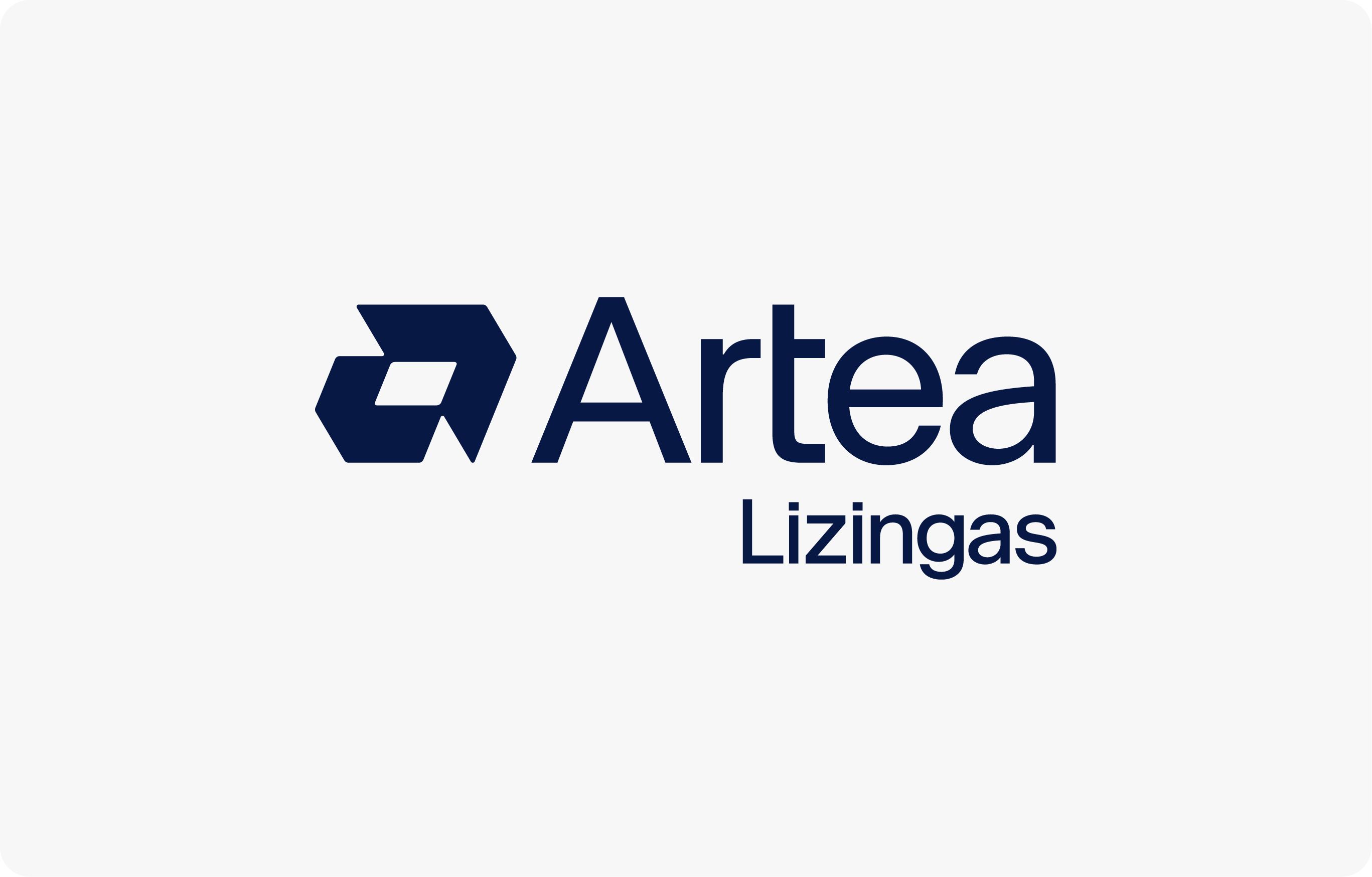
Our logo is always used in one of two colours: Artea Blue (#071844) or White (#ffffff), depending on the background colour.
Main logotype colour version
If you are using a light background – Artea Blue (#071844) colour. In situations when coloured logo version is impossible – you can exceptionally use logo in Black (#000000) colour.
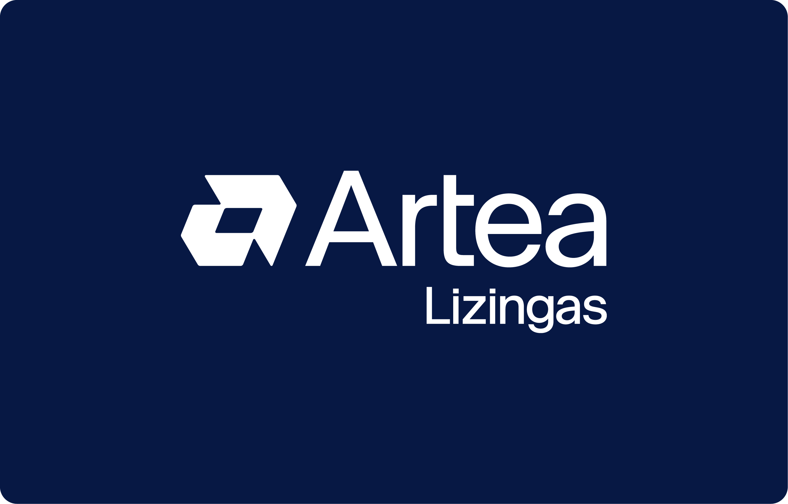
White logotype colour version
If you are using a dark background – use the logo in White (#ffffff) colour.
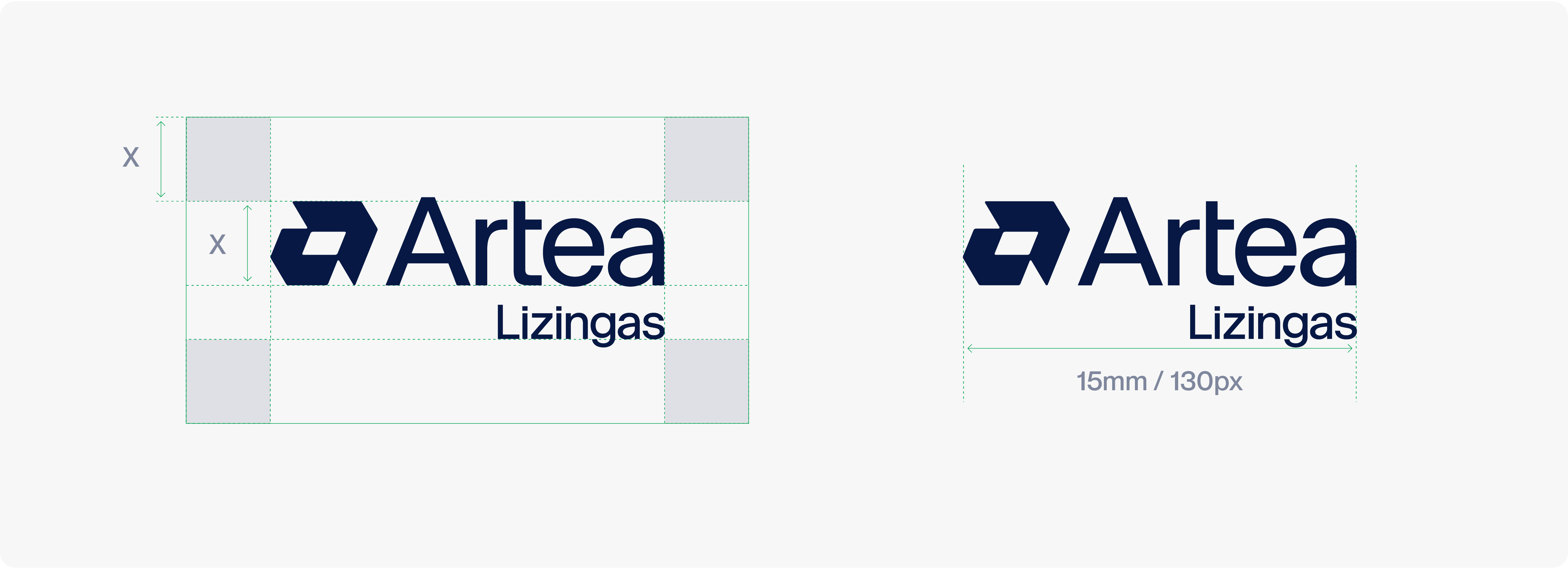
To protect the strength and integrity of the logo, a clear space area, free of competing visual elements should be maintained. Both versions of our logo share the same safety zone, which is determined by the full height of the symbol.
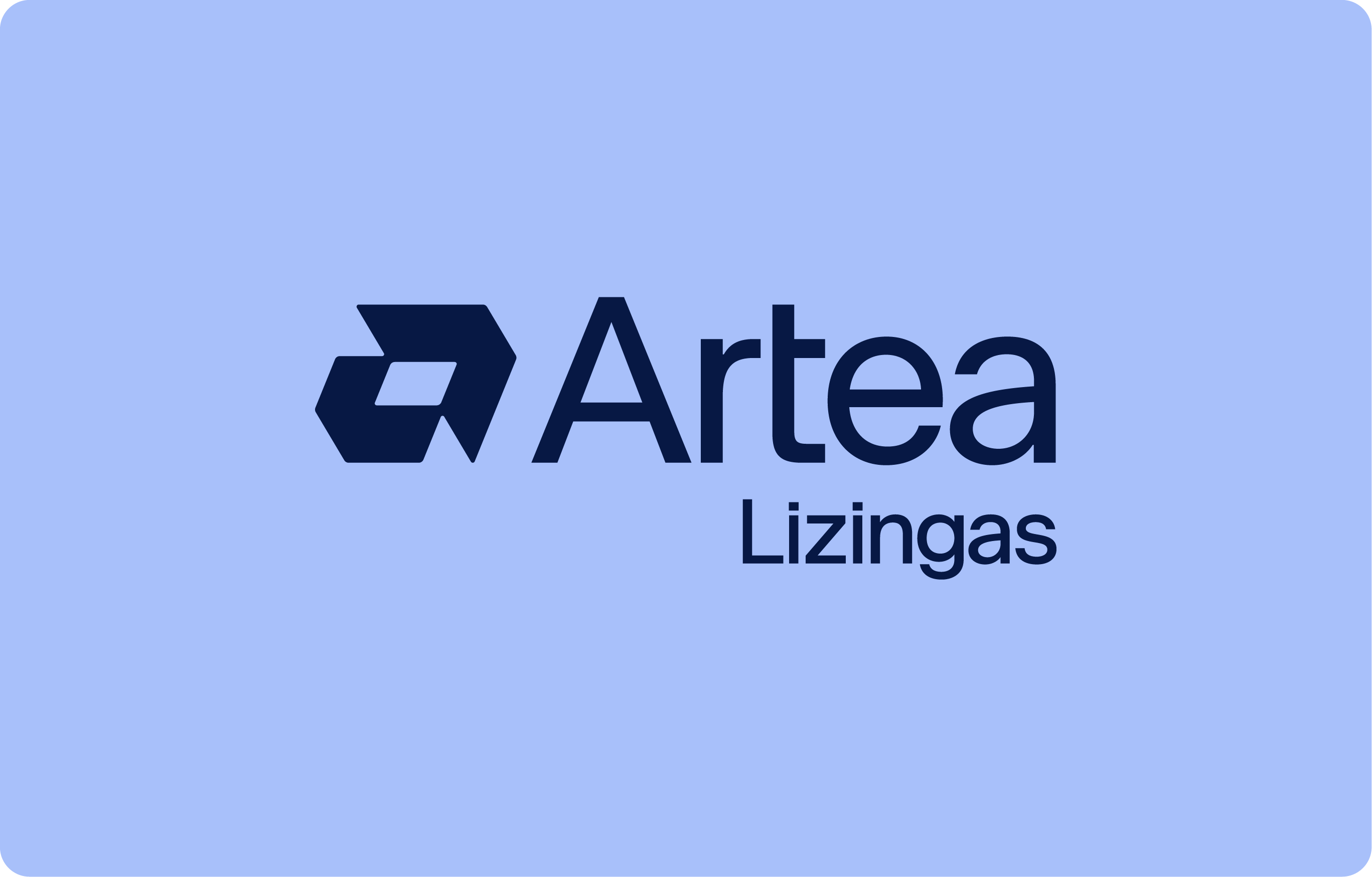
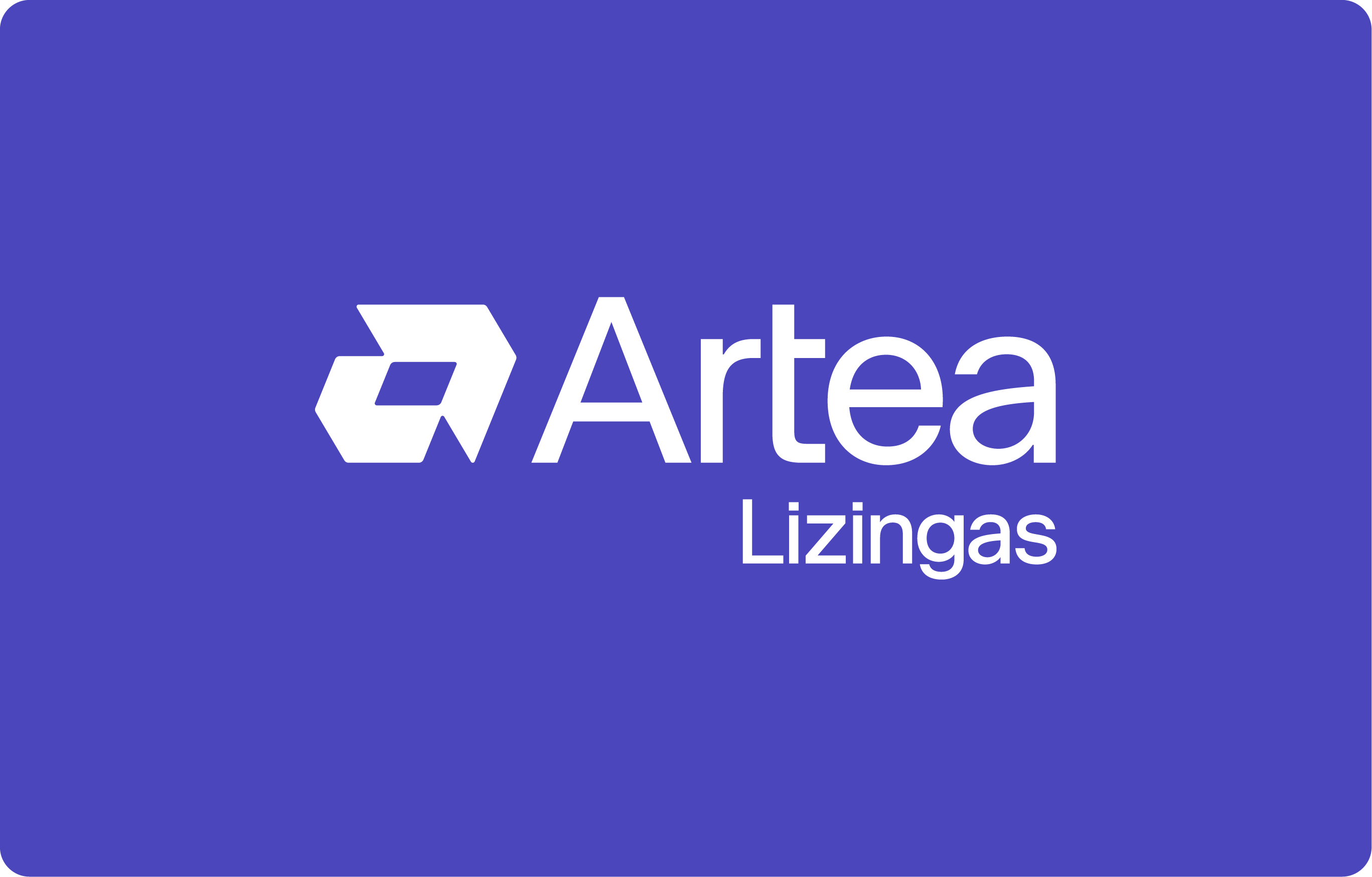
Always use a 0-degree angle. / Always use correct proportions and composition of the logo. / Always leave the logo some space to breathe. / Always use the correct logo version on light or dark backgrounds. / Always use the correct logo version on colorful backgrounds.
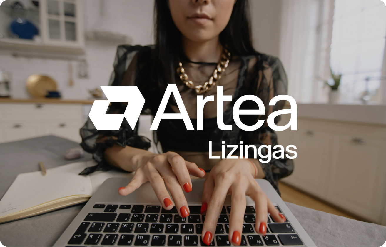
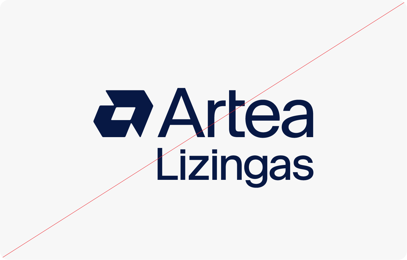
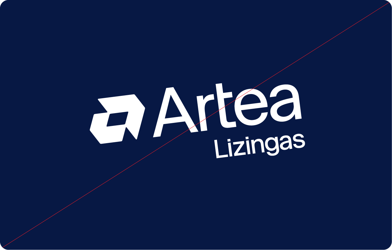
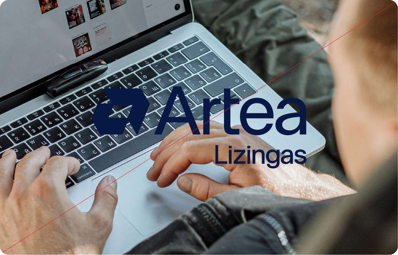
Do not change logo proportions / Do not rotate the logo. / Do not use the logo in smaller than its minimum size. / Do not apply any effects. / Do not superimpose the logo on any image or background that would make it hard to see. / Do not use the logo in colours that are not from the brandbook.
Our colour palette consists of these colours: Artea Blue, White, Iris, Light Cyan.
White, Iris and Cyan are our main colors, primarily used for backgrounds. Artea Blue and White are used for texts and graphical patterns.
-
#071844Artea BlueRGB: 7, 24, 68CMYK: 100, 93, 38, 49Pantone: 2758 UPantone: 2758 CRAL: Ambassadorblau 280 20 30
-
#d1f3fdLight CyanRGB: 209, 243, 253CMYK: 16, 0, 0, 0Pantone: 7457 UPantone: 7457 CRAL: Mintblau 210 85 10
-
#4c47c0IrisRGB: 75, 70, 187CMYK: 80, 78, 0, 0Pantone: 2369 UPantone: 2369 CRAL: Hyazinthenblau 280 40 45
-
#ffffffWhiteRGB: 255, 255, 255CMYK: 0, 0, 0, 0Pantone: WhiteRAL: 9003
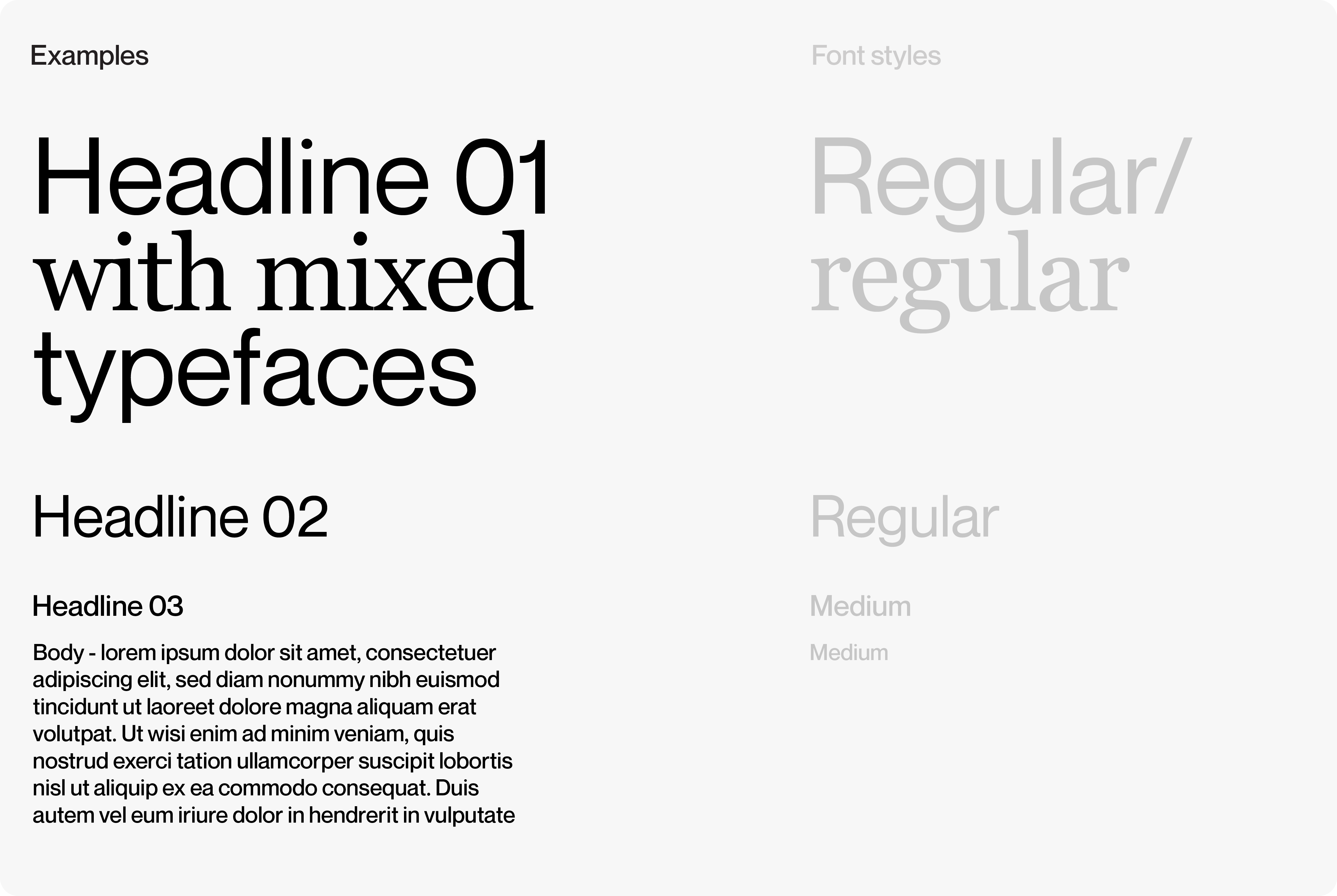
Our main typeface is Neue Montreal. We use it in al external communications.
In cases, where we have more space for branded content – we can use a mix of two typefaces – Neue Montreal and Georgia.
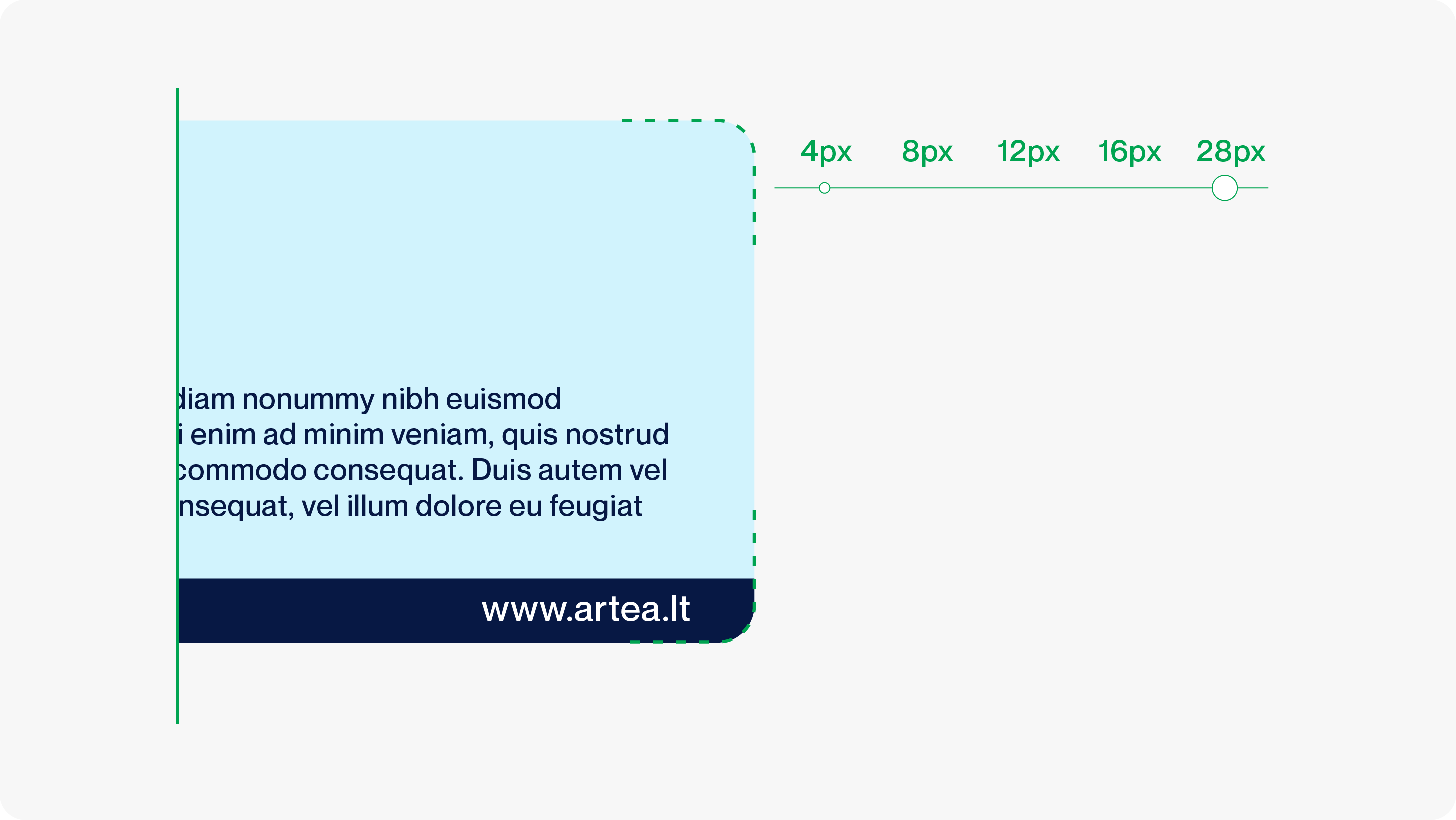
We use shapes to compose photos and texts.
Depending on the format, you should also choose the shape’s corner rounding, which has 5 levels:
– Extra small (4px)
– Small (8px)
– Medium (12px)
– Large (16px)
– Extra large (28px)
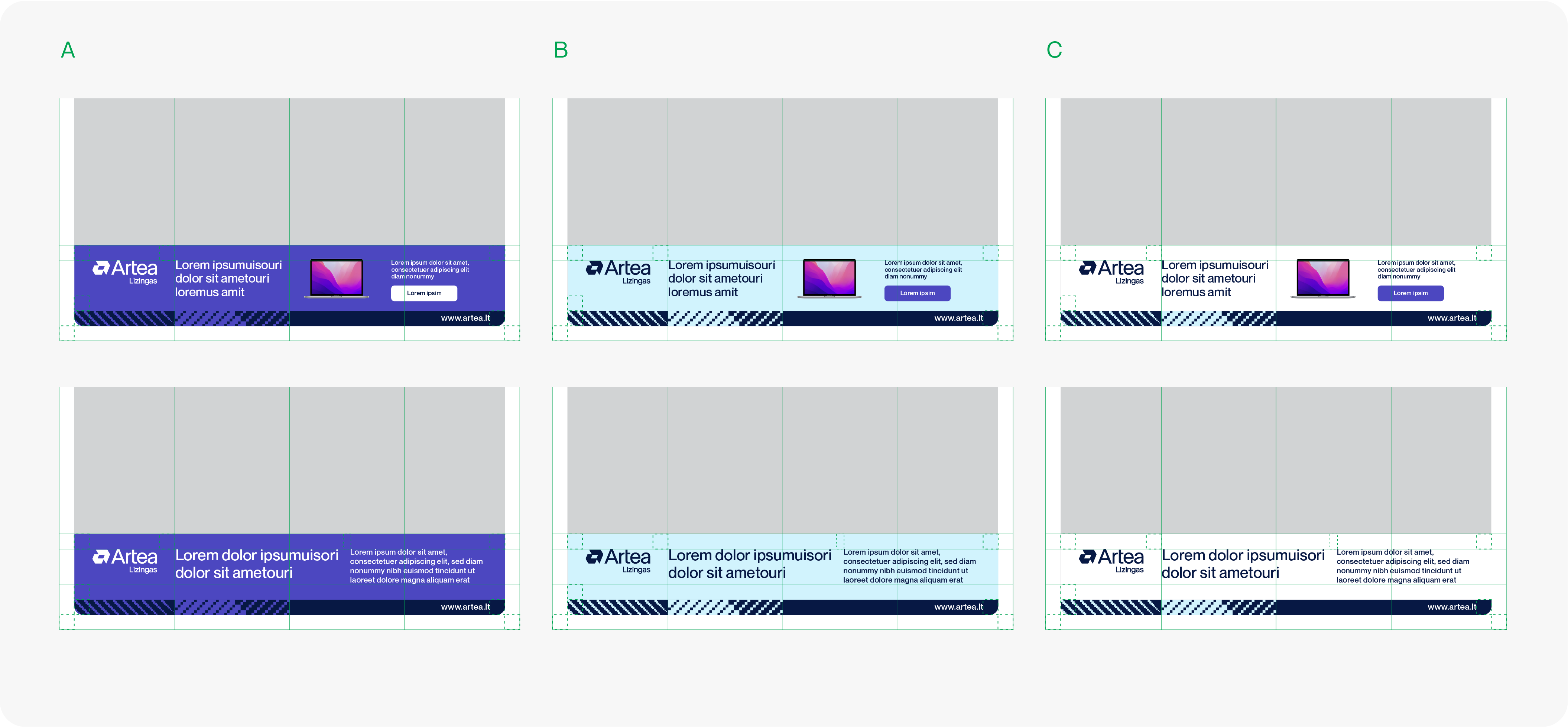
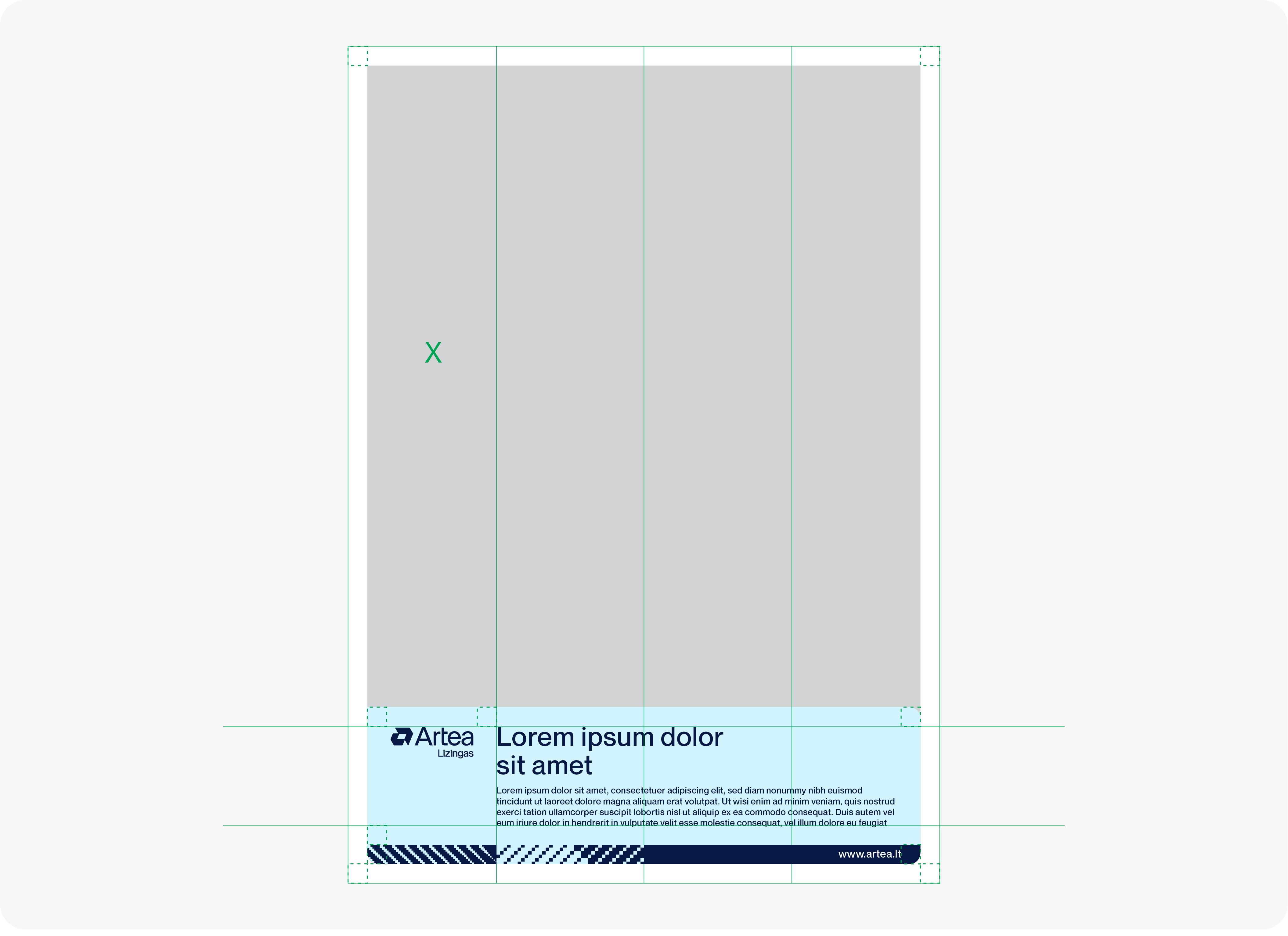
When creating advertising layouts with partners, use these guidelines to maintain the best brand visibility and recognition.
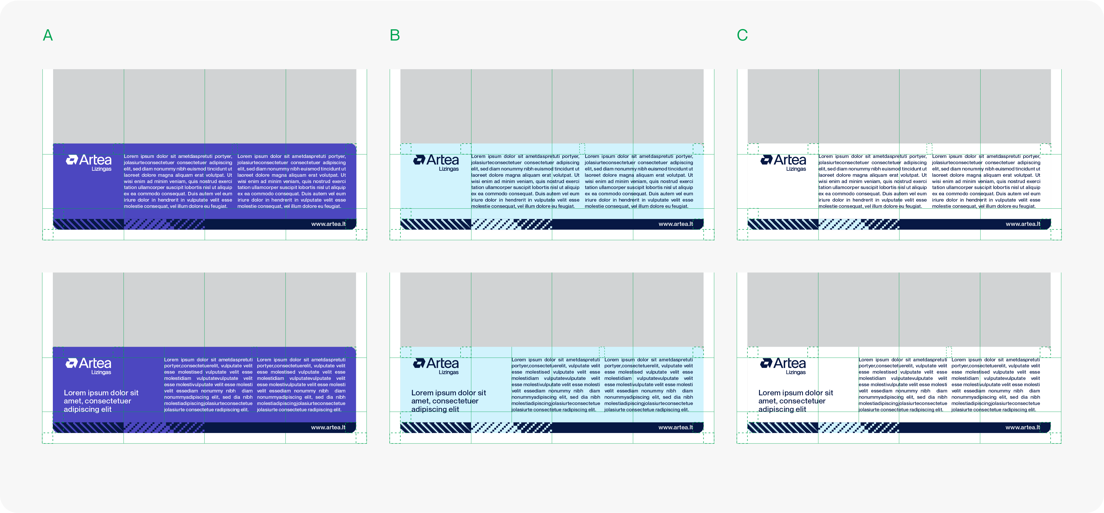
– Use 1/4 grid to maintain the best proportion and distances between all elements.
– Safety zone between the elements is the same size everywhere.
– Footer element height is the same as safety zone.
Versions with headline placement variation in different colours.
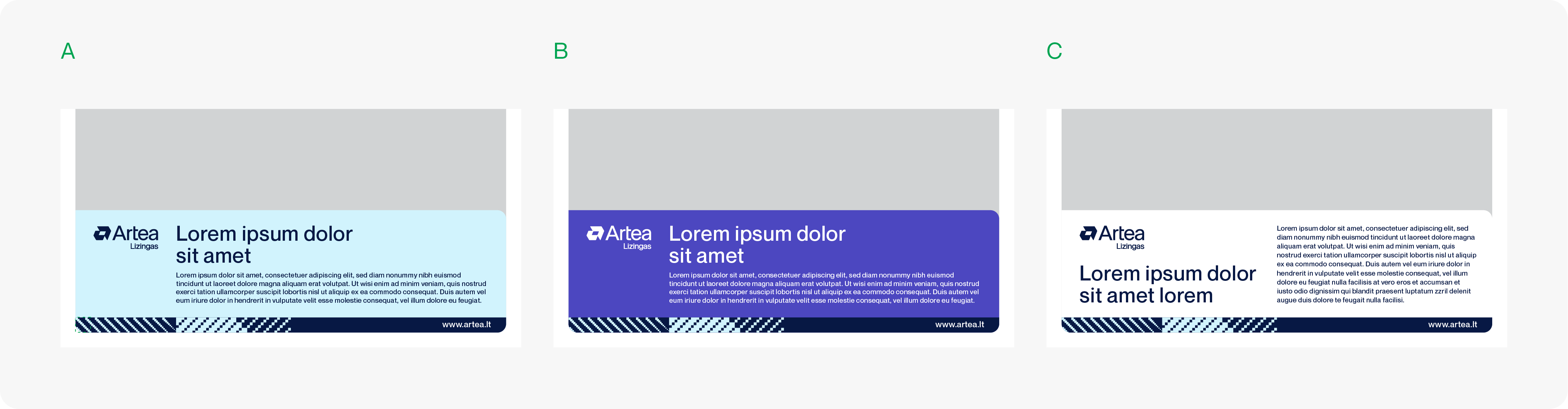
Versions with 2 collumns and a headline.
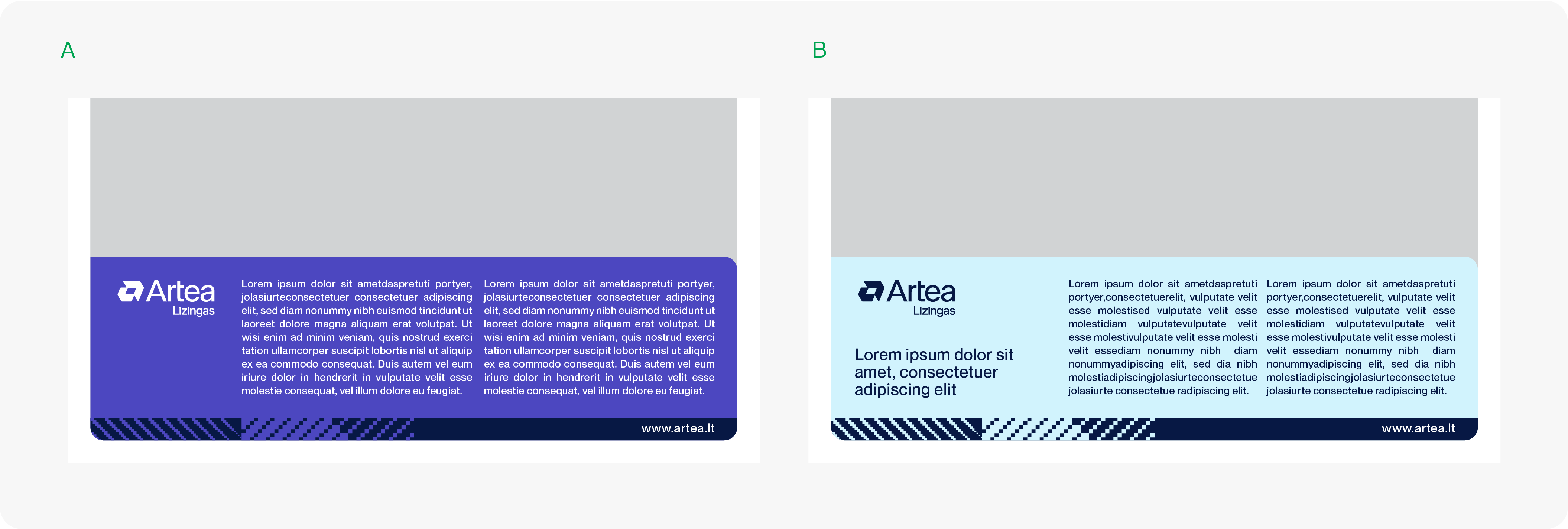
Using all 3 possible colour variations
Version with smaller advertising space and a product.
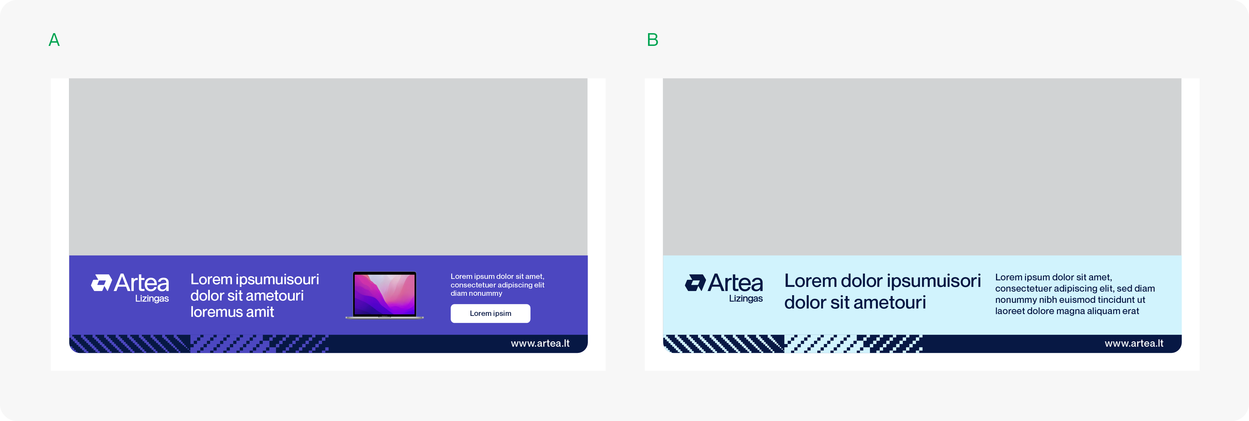
Using all 3 possible colour variations