BRAND ESSENCE
Lithuania. Co-create Experiences
POSITIONING STATEMENT
The best stories are the ones you experience.
A place that has been co-creating for centuries, Lithuania has a rich heritage hiding in plain sight. Yet while our picturesque architecture and hearty national cuisine tell stories of a co-created past, we keep finding new ways the world can experience:
– Multi-layered cultural heritage,
– Pristine nature,
– Rejuvenating wellness rituals,
– Dynamic business landscape.
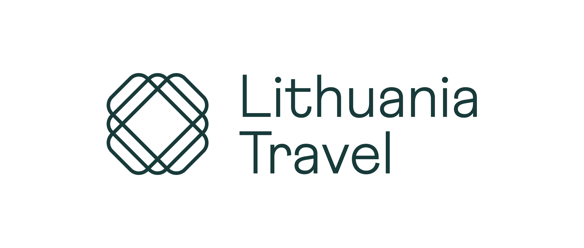
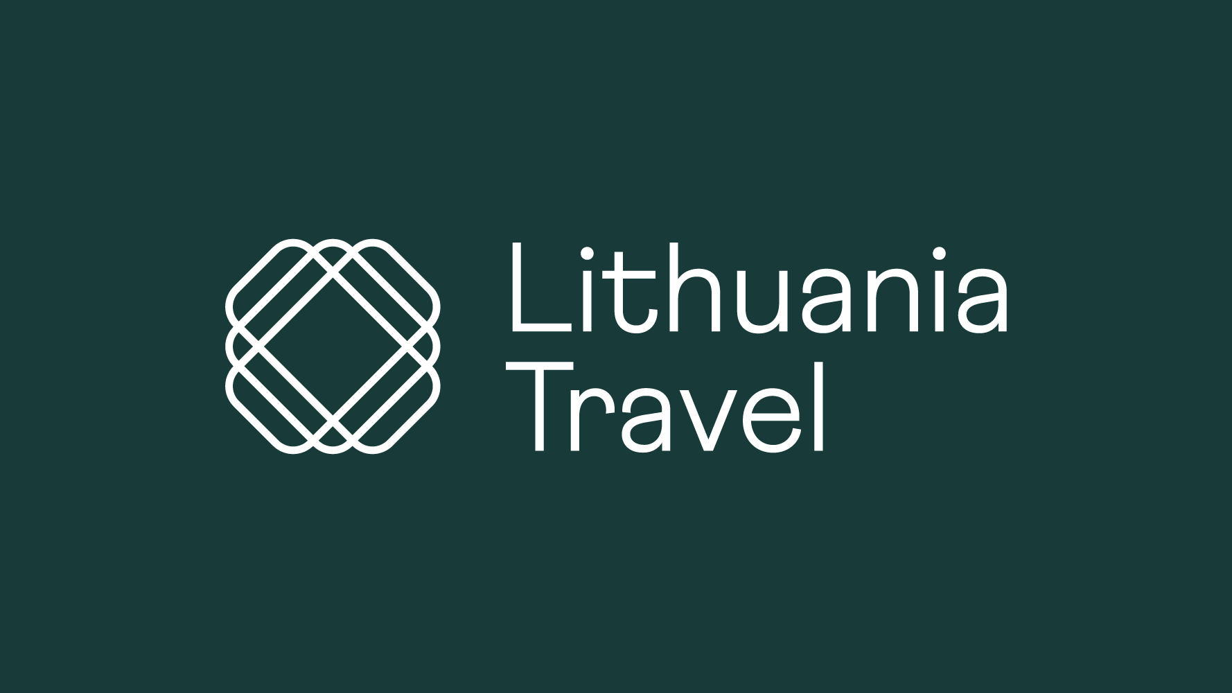
Although the logotype is only a small part of the overall identity, it’s also the most tangible and recognisable expression of the brand and should therefore be used properly at all times.
Our logo embodies the character of a modern and reliable brand. With a hint of heritage, our logo evokes a multi-layered place, Lithuania, that has a variety of different experiences to offer. The colourful and friendly typography communicates a forward-looking and accessible approach.
Download this and other logo versions by clicking the link below.
The preferred logo colours to use are white (#ffffff) and dark green (#003c3a). Colour is picked according to background, in order to retain the best readability and the integrity of the brand.
-
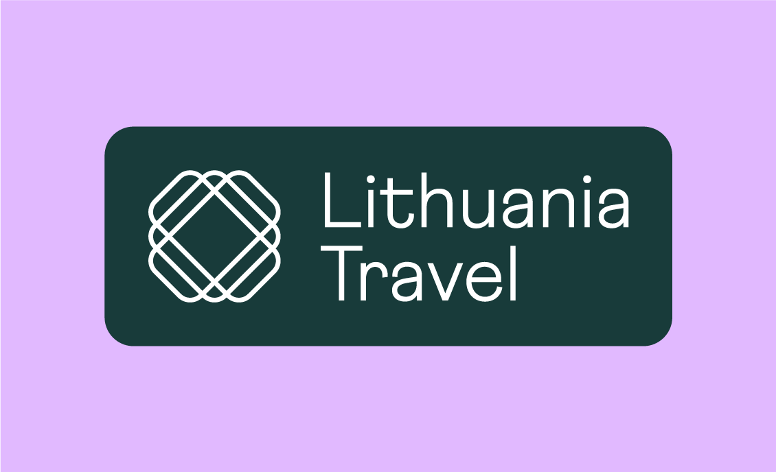
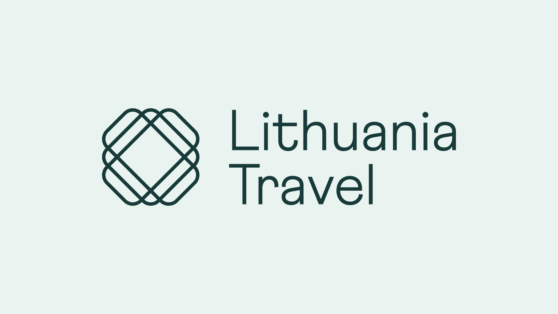 Dark green logo on a light background / Tamsiai žalias logotipas ant šviesaus fono
 -
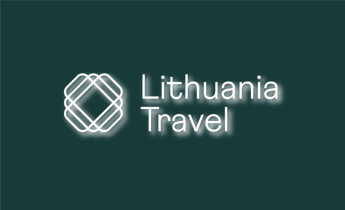
 White logo on a dark background / Baltas logotipas ant tamsaus fono
Here you can see all of our logo versions. Both the primary and secondary logotypes have English and Lithuanian versions. Choose the one most appropriate to the intended audience.
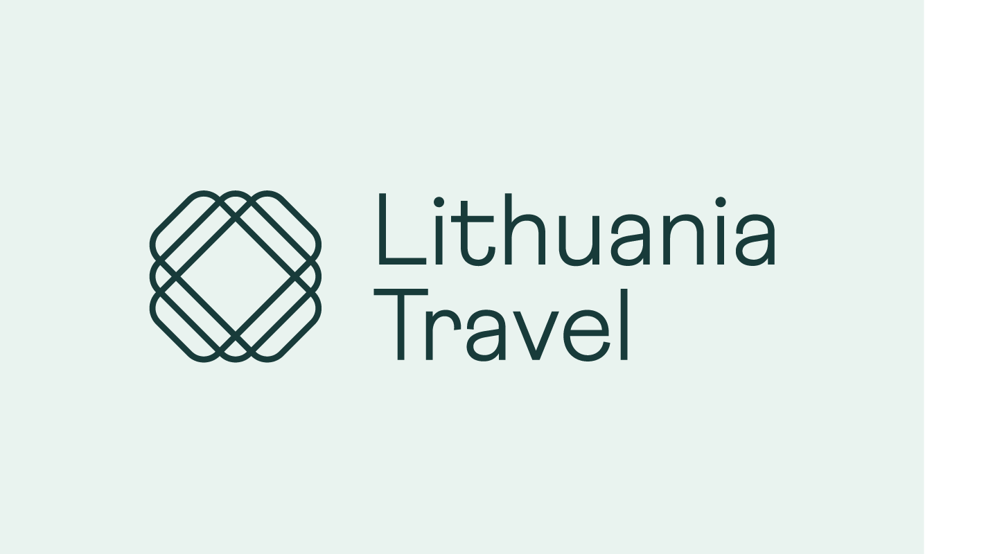
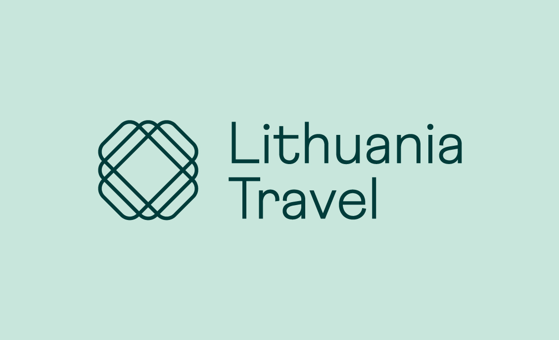
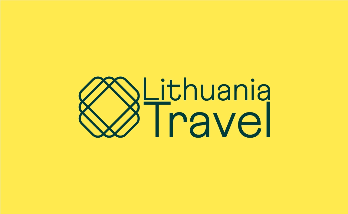
Primary logo in English
This is our primary logo in English that we use most often.
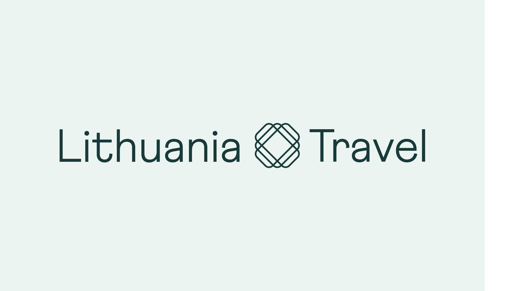
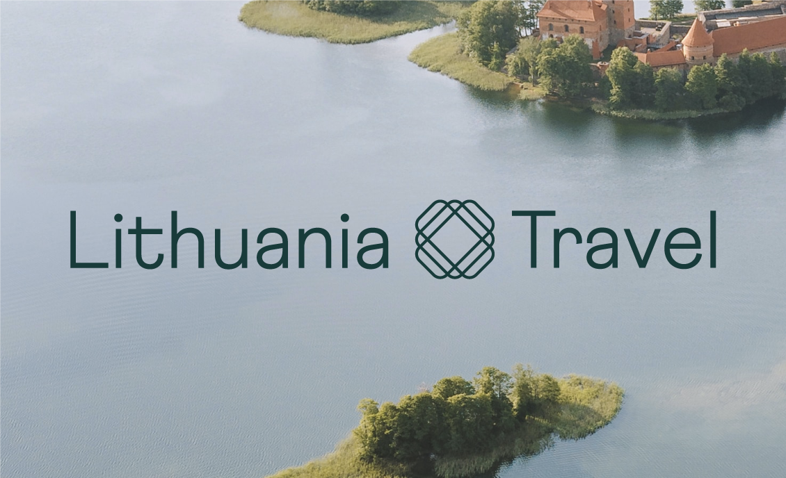
Secondary logo in English
This is our secondary logo in English that we use in situations where the use of the primary version is not possible because of layout size.
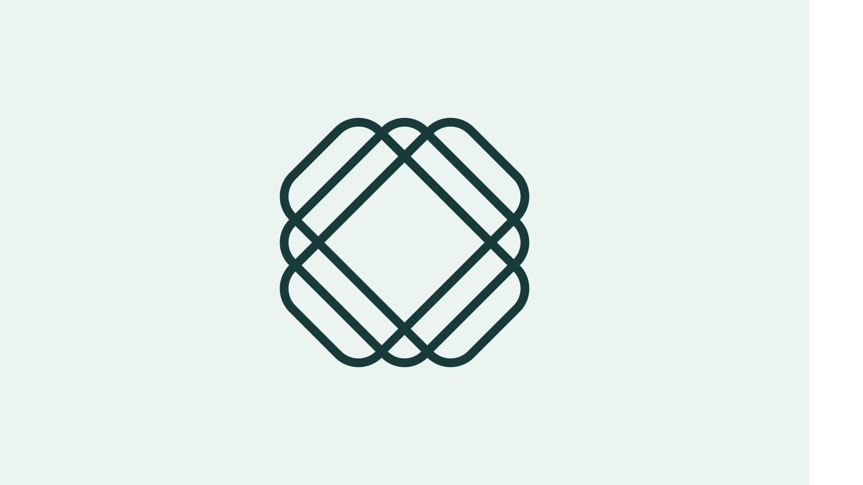
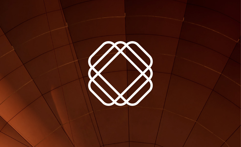
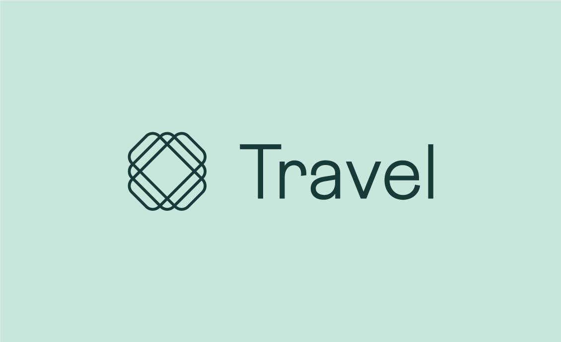
Symbol
We use the symbol without text only in cases where our brand name is already established and there is no need to use the full version.
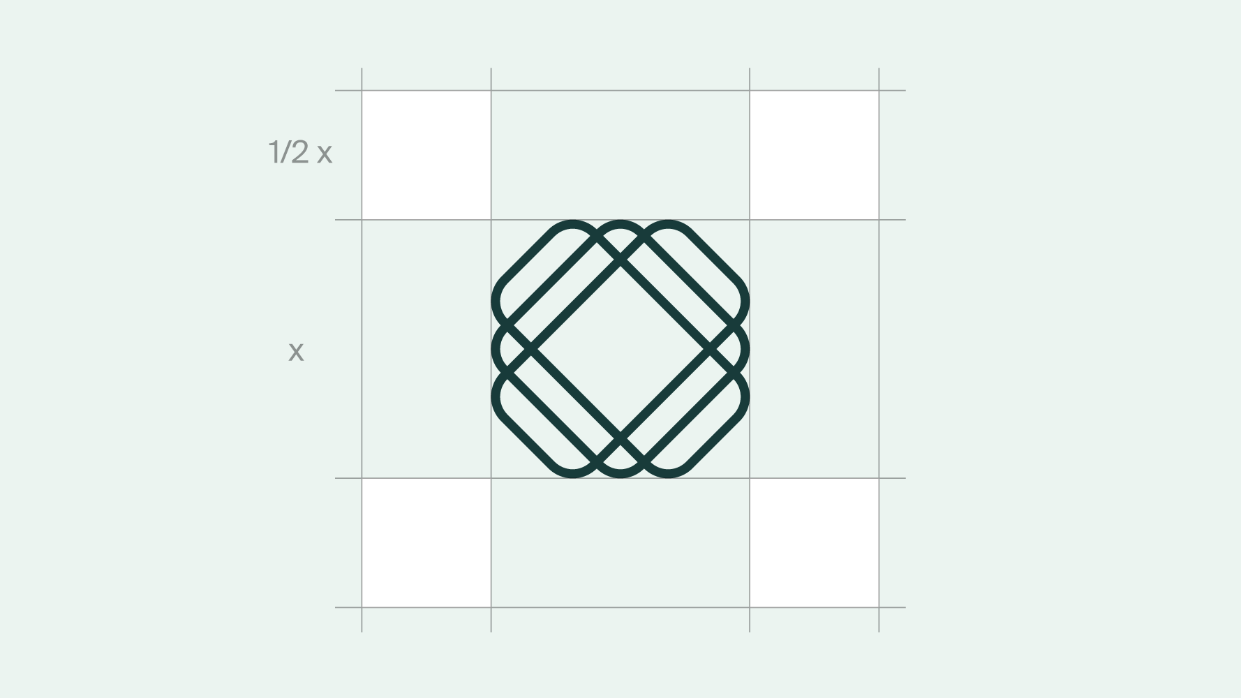
To protect the prominence and integrity of the logo, it should be padded with empty space free of competing visual elements. Similarly to ensure its legibility in print or digital formats, the logo shouldn’t be reduced beyond its smallest allowable size.
-
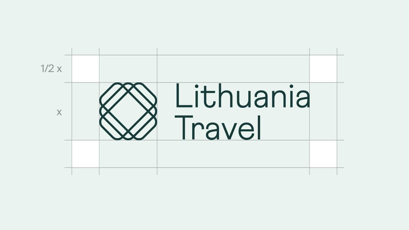 The size of the primary logo's safety zone should be half the height of the logo itself.
 -
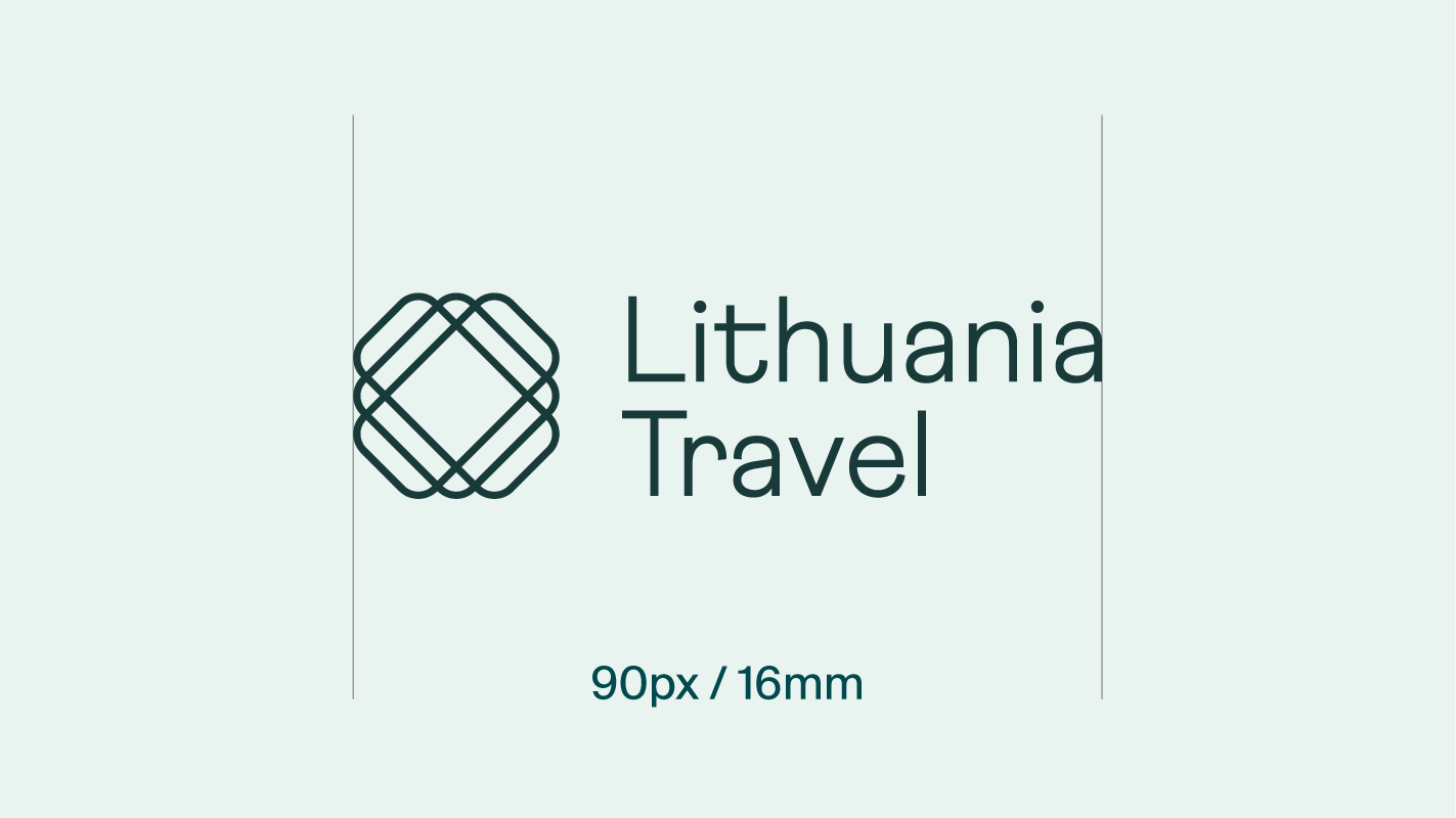 Primary logo's minimal width should be no less than 90 pixels in digital use cases and no less than 16 millimetres in print.
 -
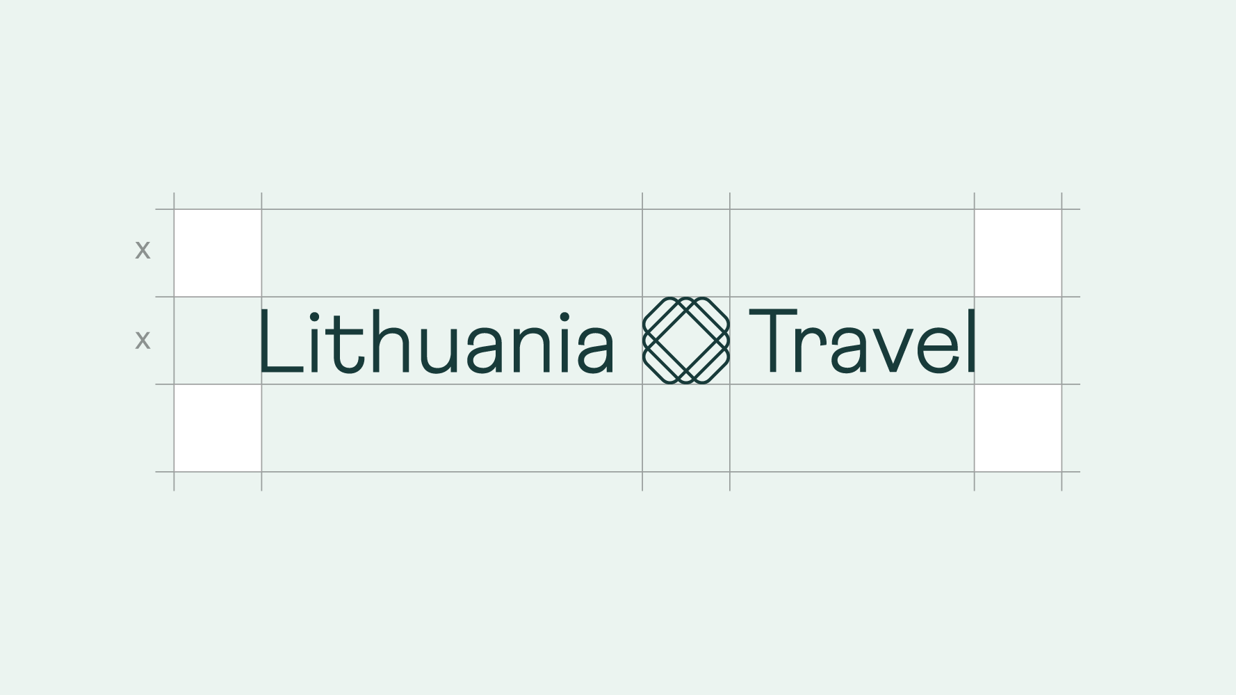 The size of the secondary logo's safety zone should be determined by the height of the logo itself.
 -
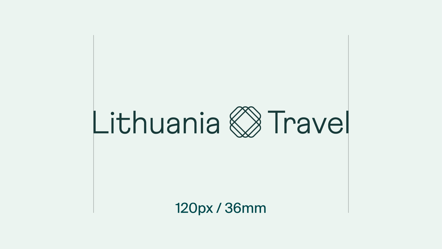 Secondary logo's minimal width should be no less than 120 pixels in digital use cases and no less than 36 millimetres in print.
 -
 The size of the symbol's safety zone should be determined by the size of the logo itself.
 -
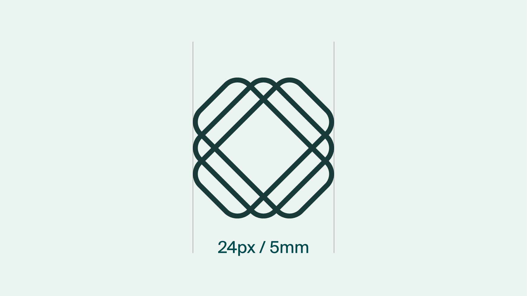 Symbol's minimal width should be no less than 24 pixels in digital use cases and no less than 5 millimetres in print.
Always use a 0 degree angle. / Always use correct proportions of the logo. / Always leave the logo some space to breathe. / Always use the correct logo version on white or dark backgrounds. / Always use the correct logo version on colourful backgrounds.
Do not stretch or alter the proportions of the logo in any way. / Do not rearrange the logo. / Do not change the logo’s colour. / Do not reduce the logo beyond its minimum allowable size. / Do not superimpose the logo on any image or background that makes it hard to see. / Do not use the logo in a separate box. / Do not apply any special effects to the logo.
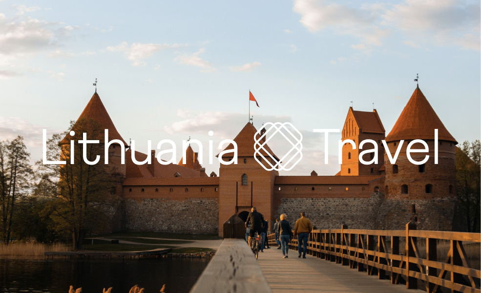
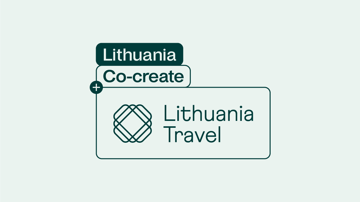
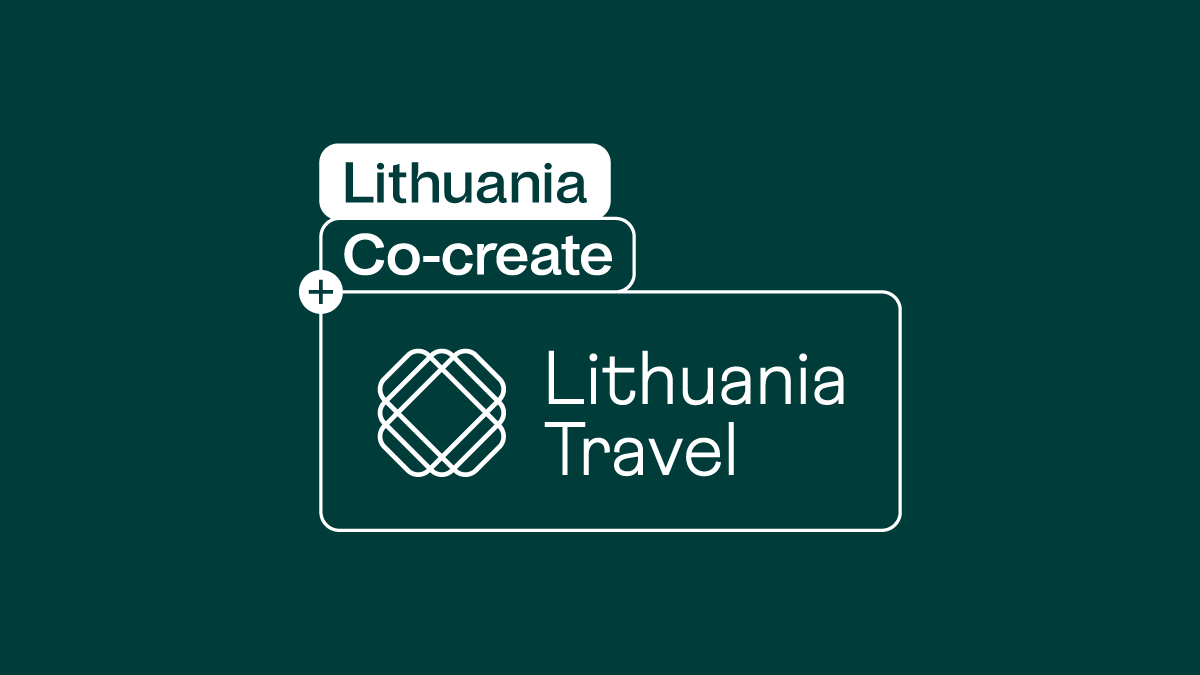
When we want to communicate together with Lithuania Co-create – we use such logotype compositions as shown below. For such conjunction we always use only the primary Lithuania Travel logotype version. Depending on the layout you are creating, you can choose both: vertical or horizontal composition of the logotypes.
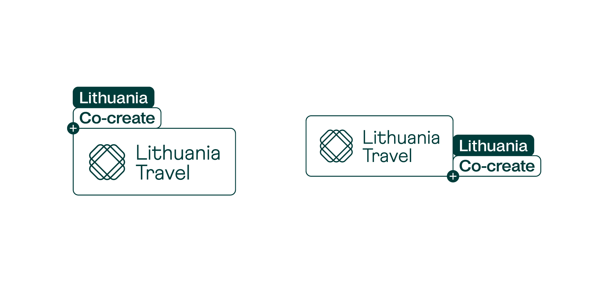
Logo compositions are created in accordance with the Lithuania Co-create identity guidelines, as indicated below.
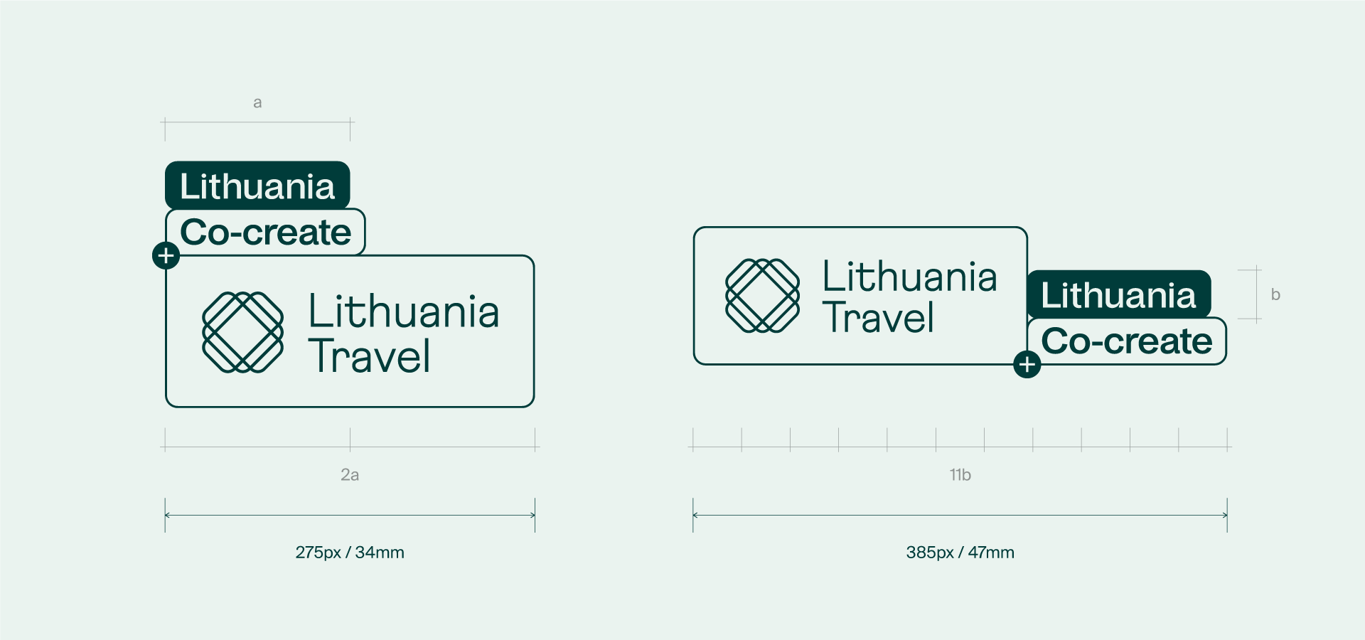
As for the vertical logo version, the size of the box field for the Lithuania Travel logo is determined by the width of the Lithuania box field – increasing it 2 times. The size of the box field for the horizontal logo version is determined by the height of the Lithuania box – increasing it 11 times.
To ensure the prominence and legibility of the logos we recommend not to use it smaller than indicated below. The smallest size of the vertical logotype in digital formats shouldn’t be smaller than 275px and 34mm in print. The smallest size of the horizontal logotype in digital formats shouldn’t be smaller than 385px and 47mm in print.
Just like the other Lithuania Travel logotype versions, these are always used in dark green (#003c3a) or white (#ffffff) colour – depending on the background that it is used for.
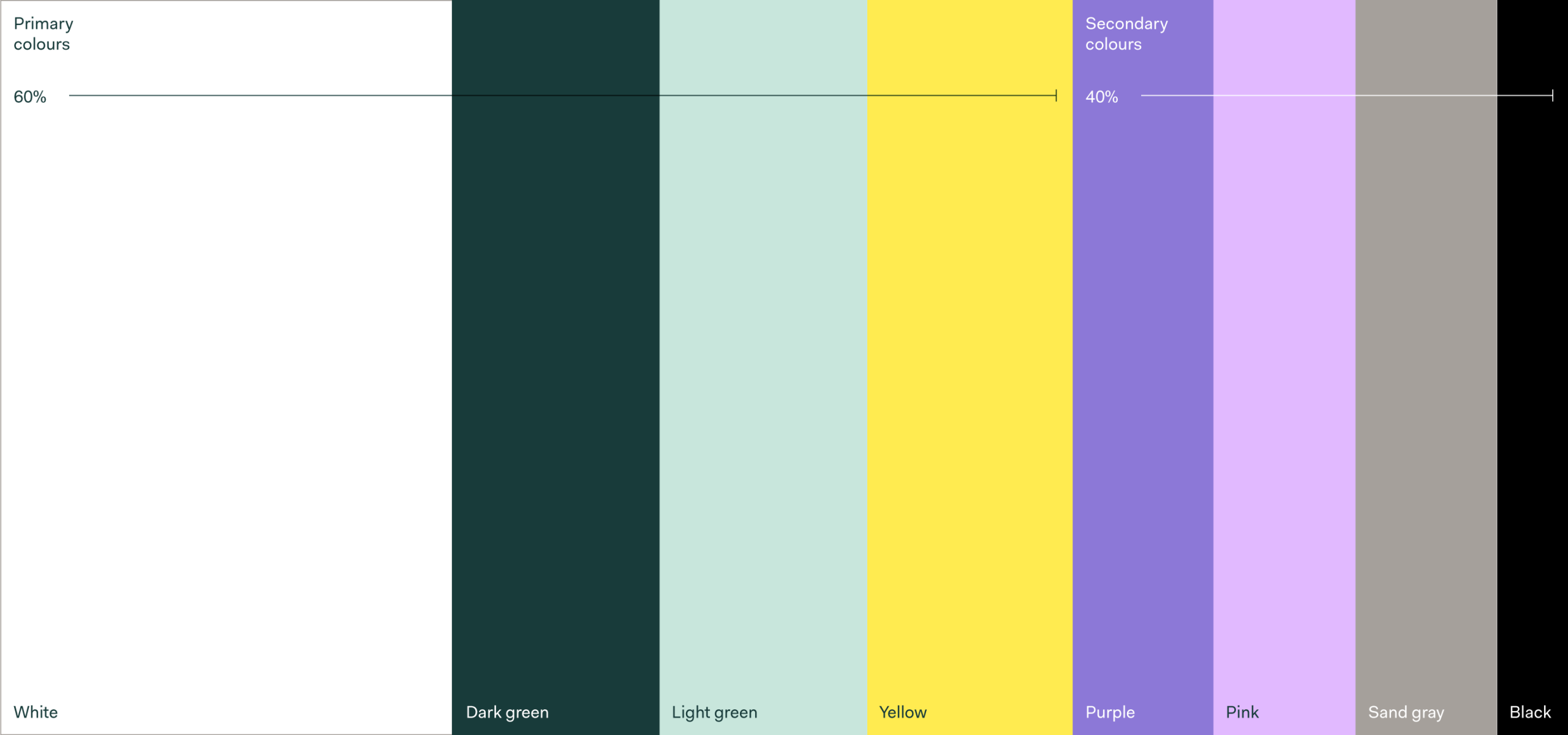
Our colour palette plays a key role in helping us to communicate our values and approach. Our colour combination helps us communicate our openness and approachability, while at the same time creating a lively and adventurous look.
Our colour palette consists of primary colours: white, dark green, light green and yellow. Our secondary colours are: purple, pink, sand gray and black.
This colour palette should be used in communications and both digital and print materials in order to maintain integrity of our visual identity. Additionally, in order to retain brand recognisability we recommend using colours in a proportion shown below.
-
#003c3aDark greenR:0 G:60 B:58C:93 M:53 Y:65 K:53Pantone: 330
-
#c7e6dcLight greenR:200 G:230 B:220C:20 M:0 Y:15 K:0Pantone: 573
-
#ffeb50YellowR:255 G:235 B:80C:0 M:5 Y:80 K:0Pantone: 106
-
#ffffffWhiteR:255 G:255 B:255C:0 M:0 Y:0 K:0Pantone: White
-
#8c78d7PurpleR:140 G:120 B:215C:60 M:60 Y:0 K:0Pantone: 2655
-
#e1b9ffPinkR:225 G:185 B:255C:20 M:35 Y:0 K:0Pantone: 2562
-
#a5a09bSand GrayR:165 G:160 B:155C:30 M:25 Y:30 K:10Pantone: 401
-
#000000BlackR:0 G:0 B:0C:0 M:0 Y:0 K:100Pantone: Black 6
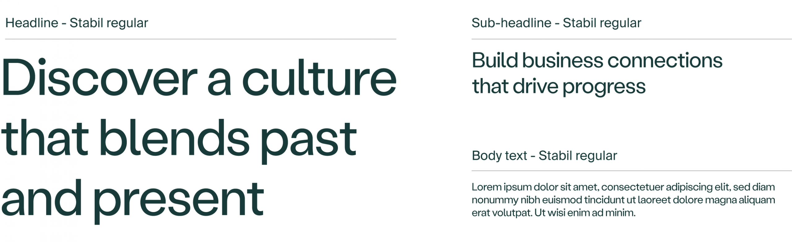
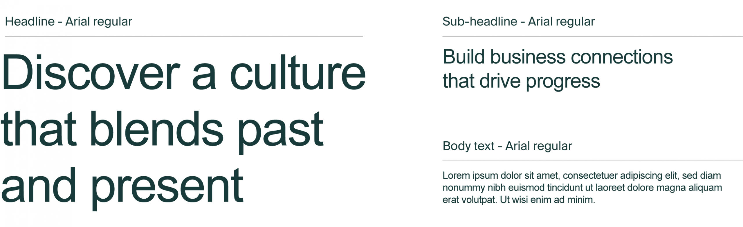
Our typeface defines our visual voice and, used consistently with other design elements, helps us create our brand personality. Our primary typeface is Stabil Grotesk.
Stabil Grotesk regular is used for headlines, sub-headlines and text blocks. It is a modern grotesk typeface with wide curves and playful letter details which set up an open and vivid tone that invites travellers to experience Lithuania.
We always use text in dark green (#003c3a) colour when applied on bright backgrounds and white (#ffffff) colour when applied on dark backgrounds.
Arial is the alternate typeface we use in exceptional cases only. It should be installed on all computers and used in Word and Excel documents, as well as in e-mail signatures and similar file formats. The alternate typeface should not be used in public-facing materials, such as posters, leaflets, websites, etc.
We always use text in dark green (#003c3a) colour when applied on bright backgrounds and white (#ffffff) colour when applied on dark backgrounds.
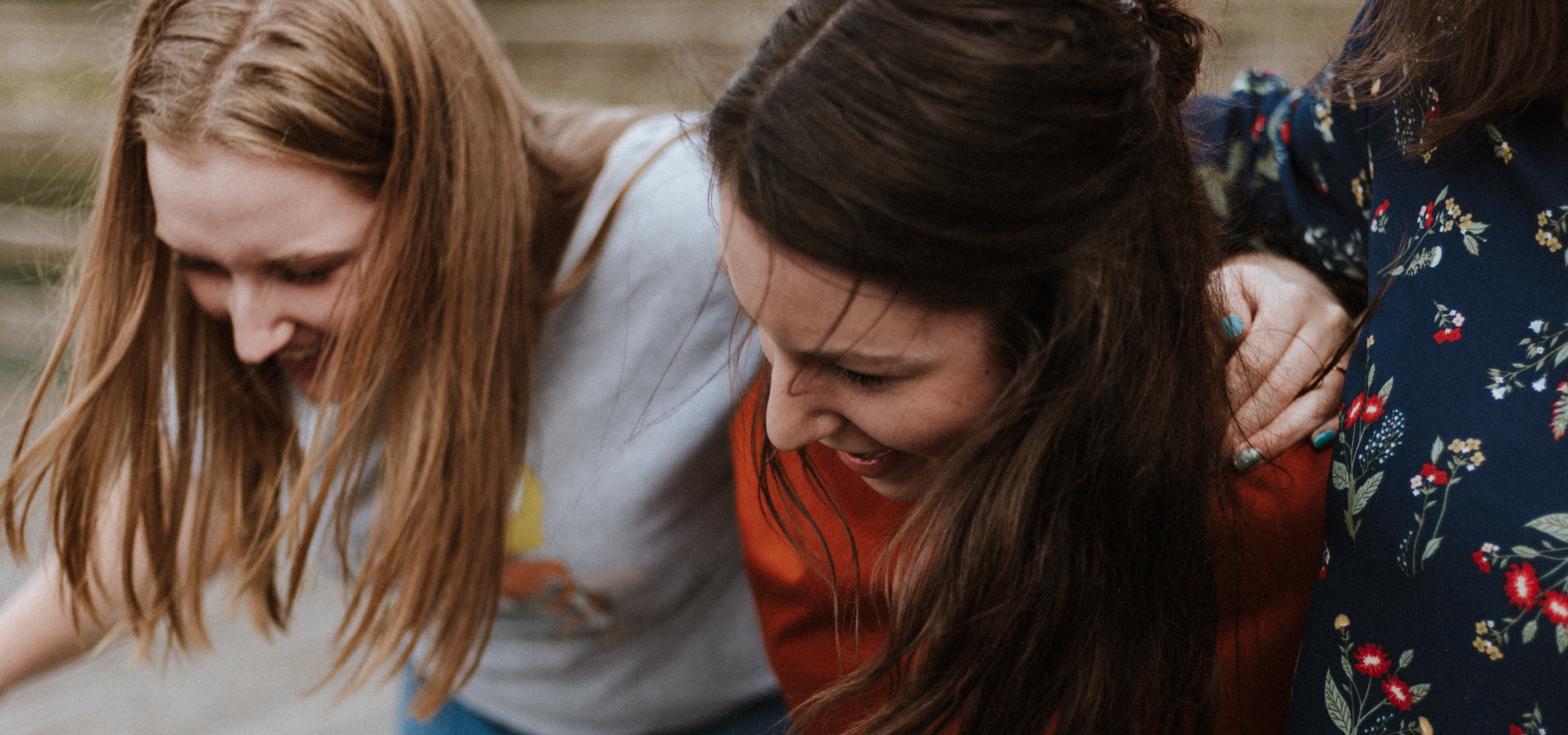
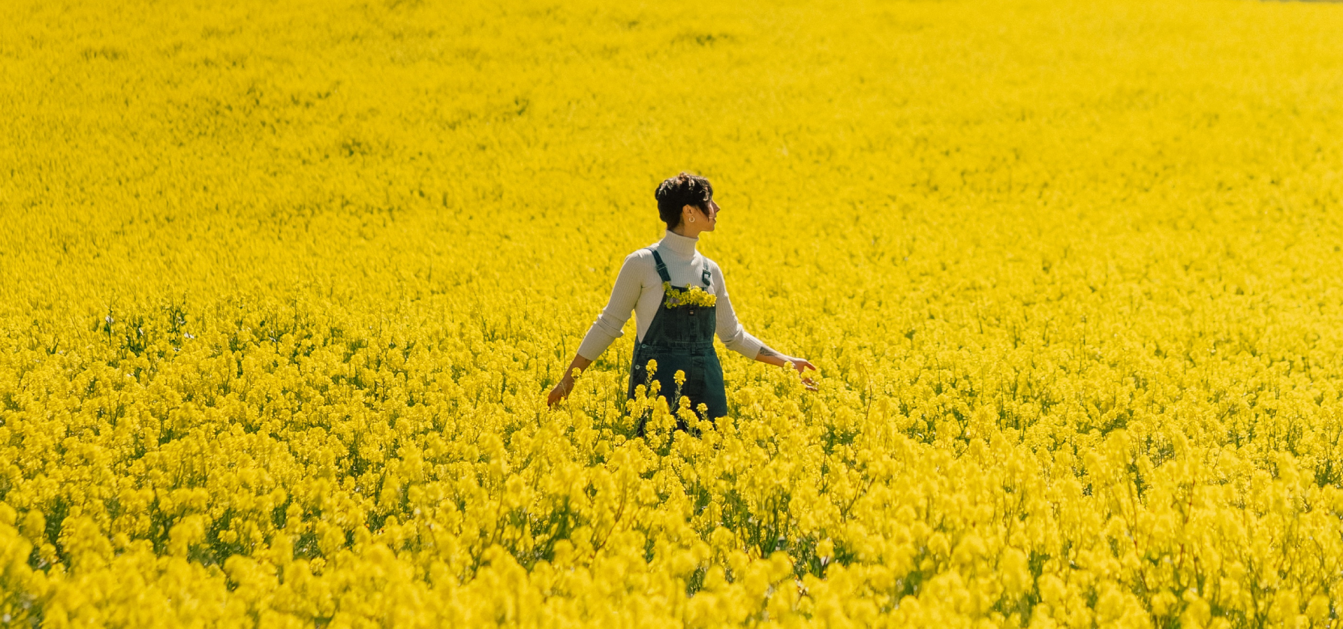
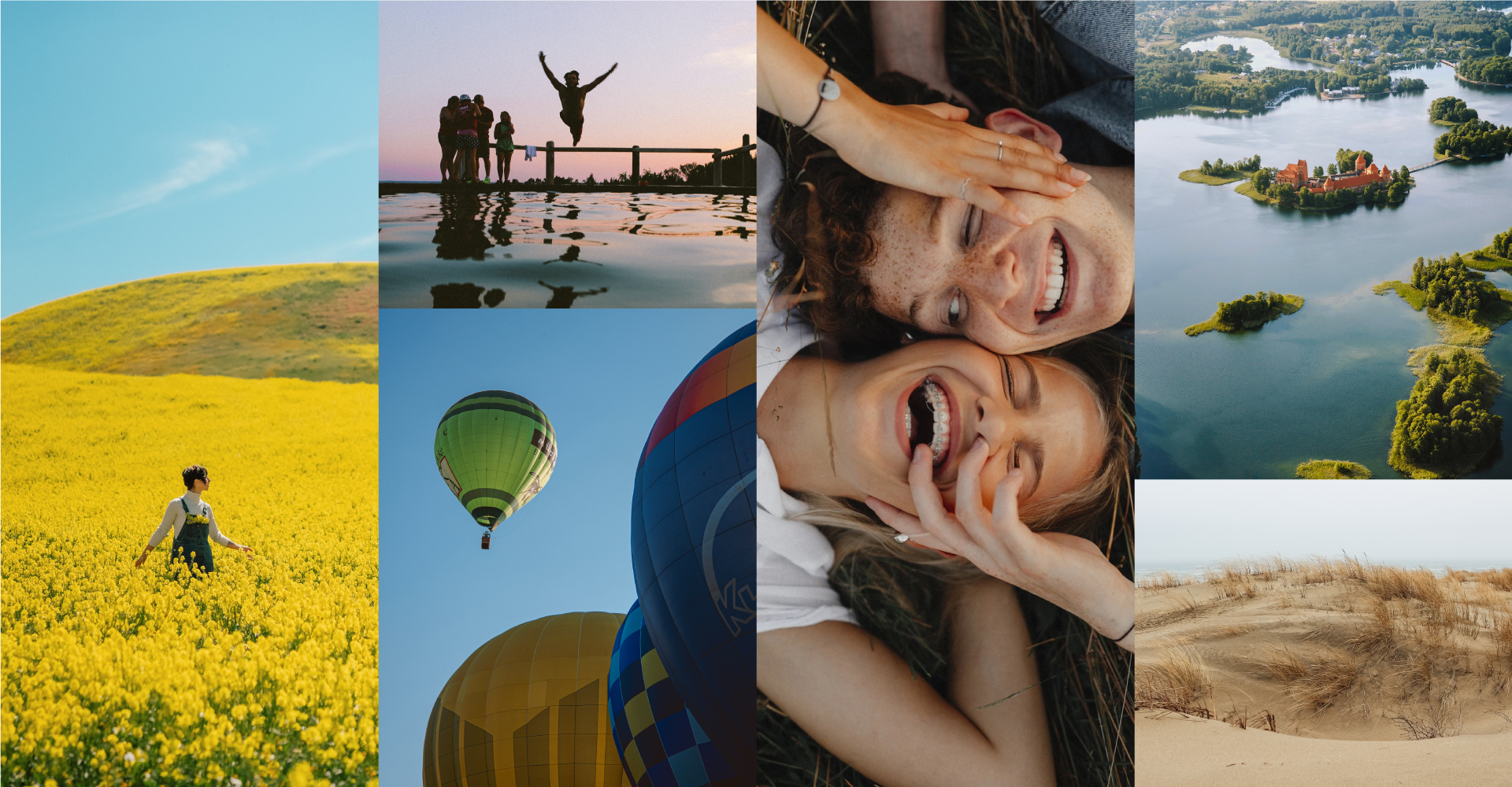
Given that photography is one of the key elements when representing Lithuania, it’s very important to use imagery properly and consistently as described here.
We use photography to express the truth and relatability of the Lithuanian landscape and the experiences people can have within it. Since we don’t want to excessively romanticise Lithuania with artificial visuals, we use the most natural-looking images possible. In addition, we aim to combine the mood and feel of an adventure with fascinating and inviting scenarios closely related to the country’s landscape. For this reason, we prioritise natural lighting, contrast, and colour balance, as well as natural poses and facial expressions for images depicting people.
Keywords describing the mood of our style of photography include the following: #true nature / #community / #freedom / #adventure / #cheerfulness / #calming / #open.
Examples of things to be avoided when choosing pictures:
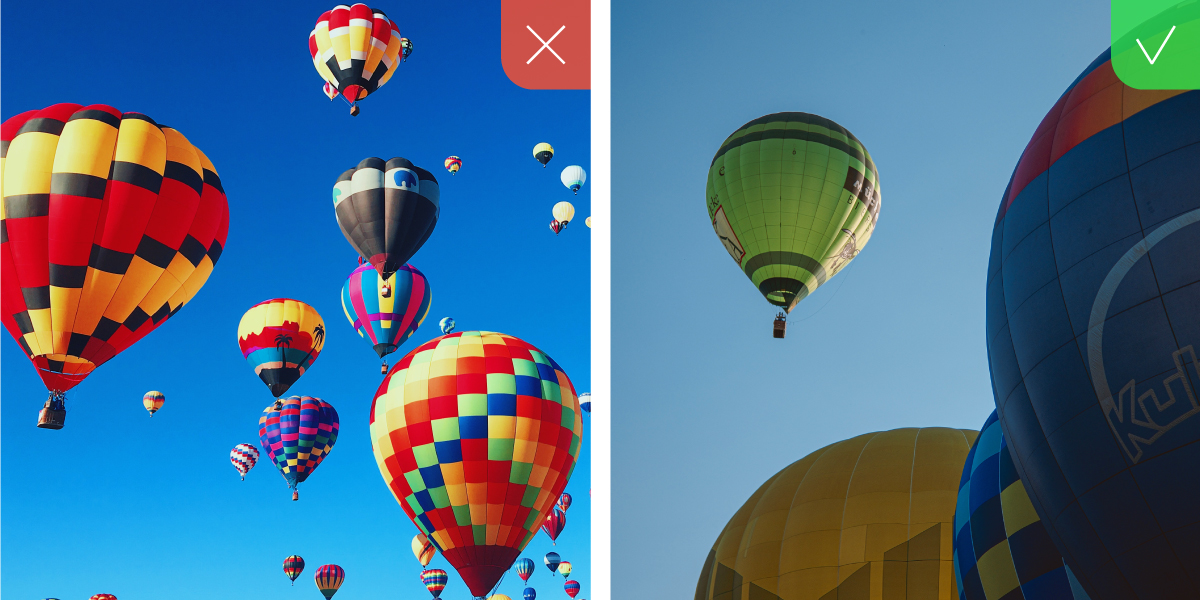
Hyper-saturated or unnatural colours. To make pictures look real and not photo-manipulated, avoid colour filters and high levels of saturation.
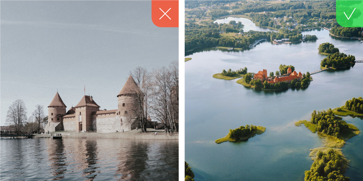
Desaturated or low-saturation colours. To make imagery look as natural as possible to the human eye, we use a natural colour balance.

Low lighting. Use bright and inviting, rather than dark images, unless they’re supposed to depict night time.
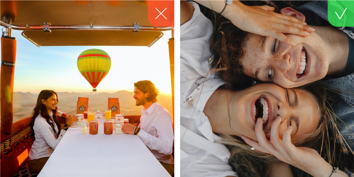
Staged scenarios. To convey relatable situations and emotions, avoid using pictures that contain unnatural posing or artificial facial expressions.
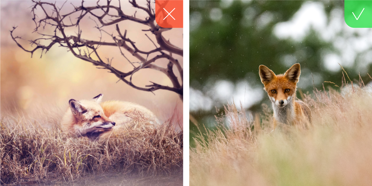
Manipulated images. To represent the beauty of Lithuanian nature authentically, avoid using fake, manipulated, or otherwise uncanny pictures.
Pattern of layers
To further broaden our visual identity, we use a pattern illustrating the concept of a multi-layered heritage. The pattern is a combination of rectangular shapes used in our logo that we call layers. By partially overlapping, these semi-transparent gradient elements make our visual language richer by adding liveliness and a sense of movement. However, this pattern should only be used in cases where the use of photography isn’t possible.
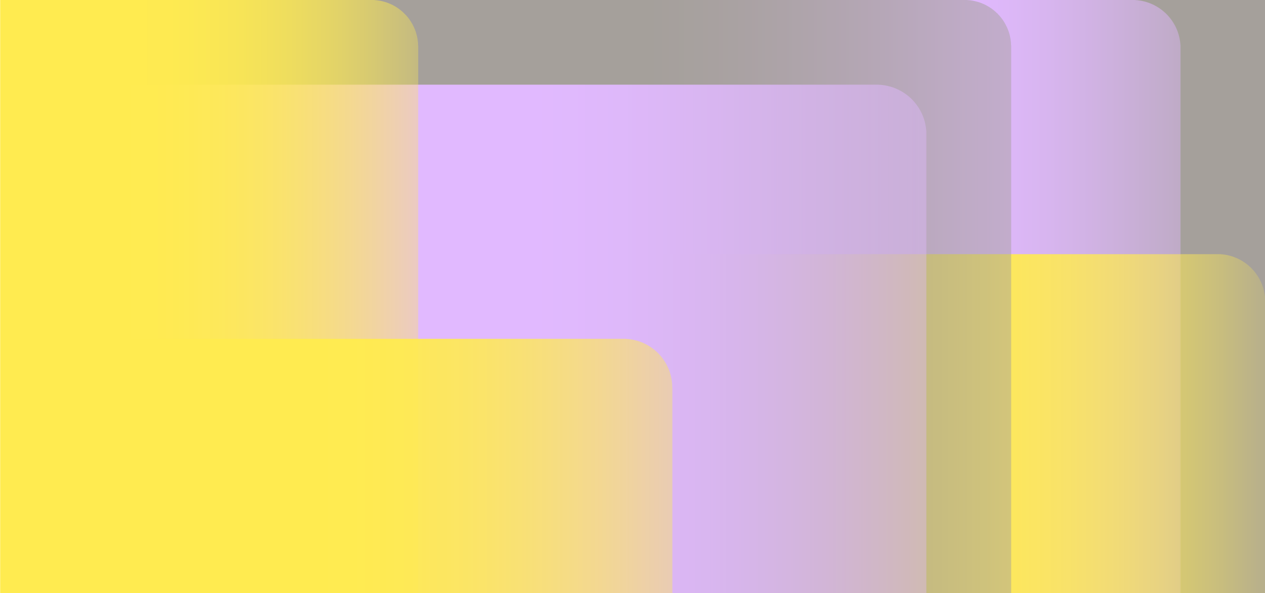
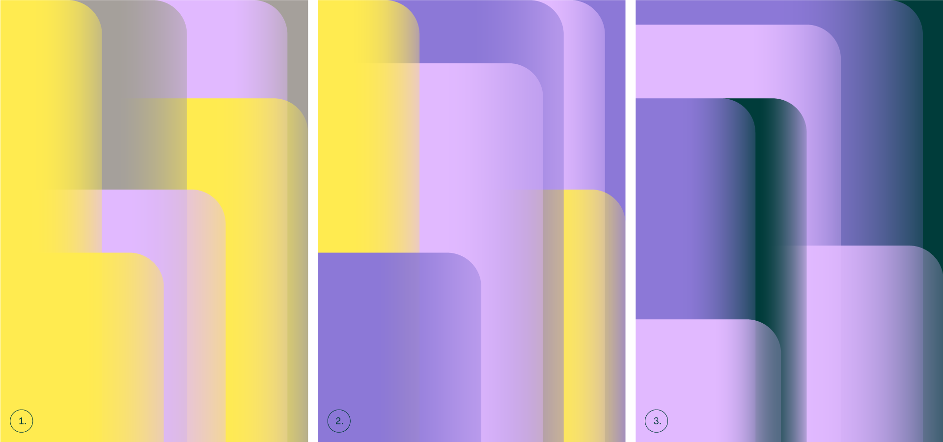
Pattern colour variations
Our pattern is flexible and can be expressed in 3 different colour versions. The first one is the brightest and we use it in cases where a softer tone of communication is required. The second is more vivid and lively, and should be used in cases that call for more vibrancy. The third is slightly darker, making it the most appropriate for more sophisticated, businesslike messaging.
Similar to our logo, our graphical system consists of the same partially overlapping rectangular layers with rounded corners. This allows us to create flexible and dynamic compositions suitable for any format or medium.
The system has 3 variants based on the type of usage:
-
01. Layouts featuring an image
-
02. Layouts featuring text only
-
03. Layouts featuring a pattern
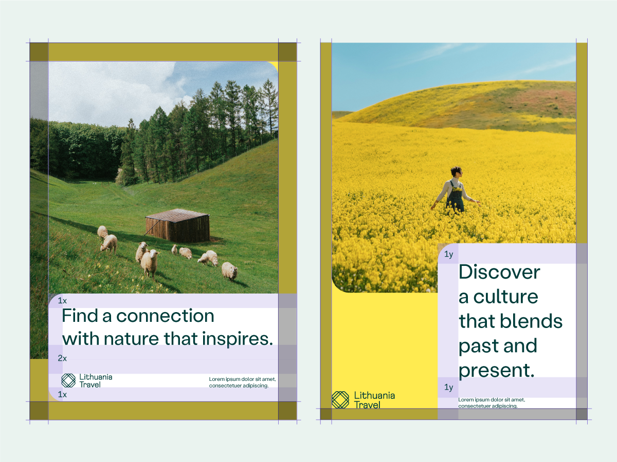
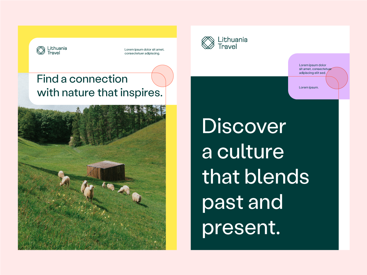
Our graphical system contains 6 key features. In order to maintain the integrity of our visual identity please follow the rules described below:
01.
Layers with rounded corners
The foundation of our layouts consists of rectangular layers with rounded corners. In order to maintain consistent identity, make sure that at least one rounded corner of each layer is visible.
02.
Corner roundness
For consistency, it’s also crucial to ensure that rounded corners are of uniform proportions by applying these 2 rules:
01. Maintain a uniform level of roundness for all shapes in the layout.
02. Choose the degree of roundness dependent on image size.
For instance, if image size is around 500x500px: set roundness to 25px / image size 1000x1000px: set roundess 50px and so on.
03.
Logo & text colour
On bright backgrounds we always use logo and text in dark green (#003c3a), while on dark backgrounds we use them in white (#ffffff).
04.
Logo placement
Depending on the situation, the logo can be placed either on the same layer as the text or separately on the background or image.
05.
Colouring
To make sure our brand identity is open and inviting, we include some white colour in every layout. It can be used:
01. In one of the layers containing text.
02. As background.
06.
Margins
To maintain a clear order among the elements, we use margins showed in the following examples.
01. The margin surrounding all the layers must be of uniform size (marked out in a dark colour).
02. Text elements contained in any of the layers must have the same margin as the layers themselves (marked with purple colour).
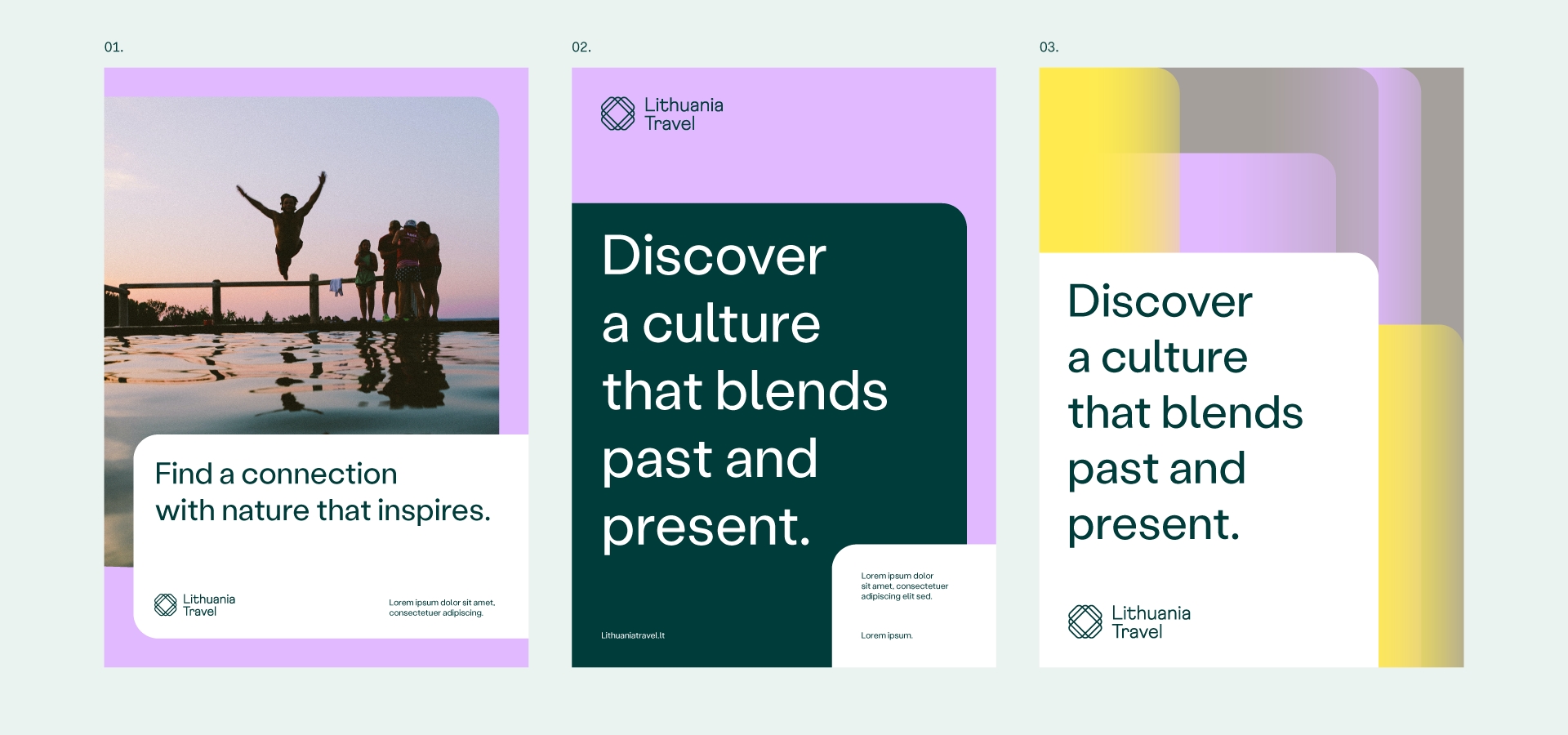
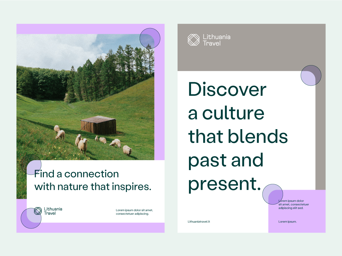
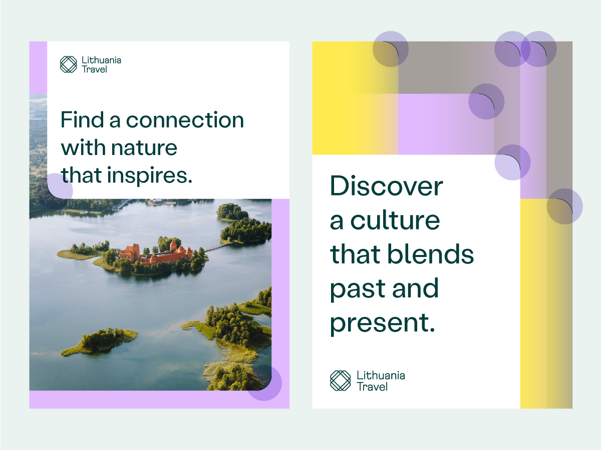
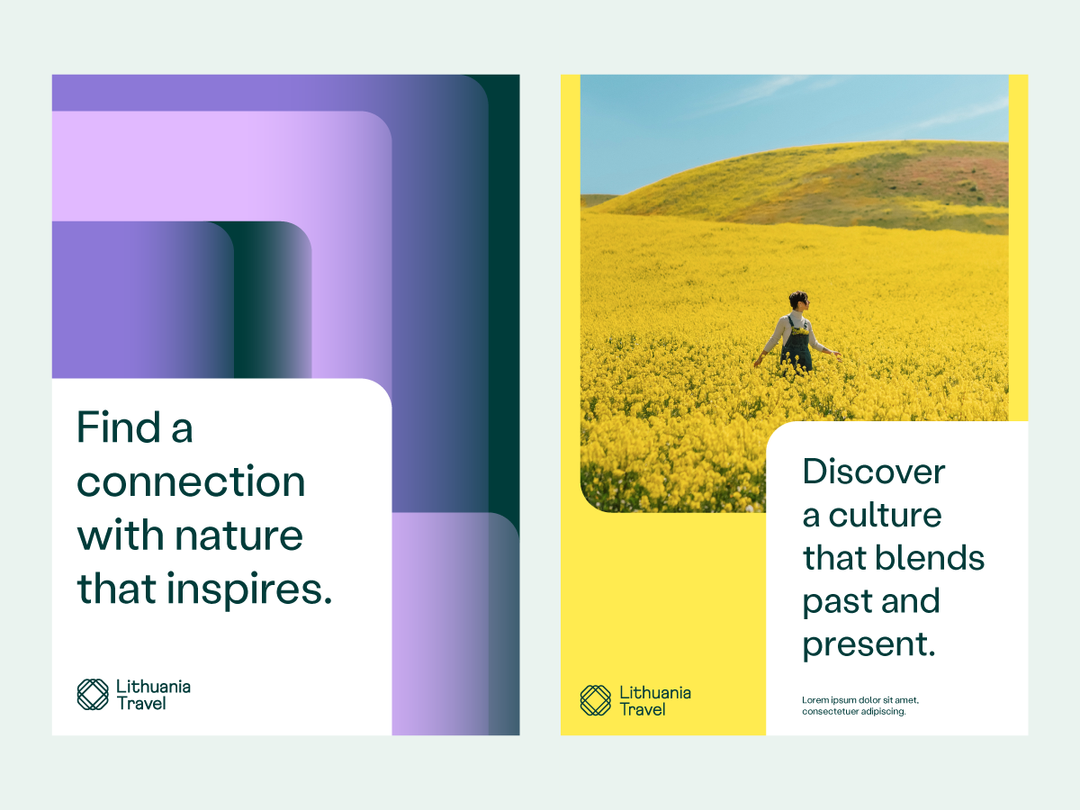
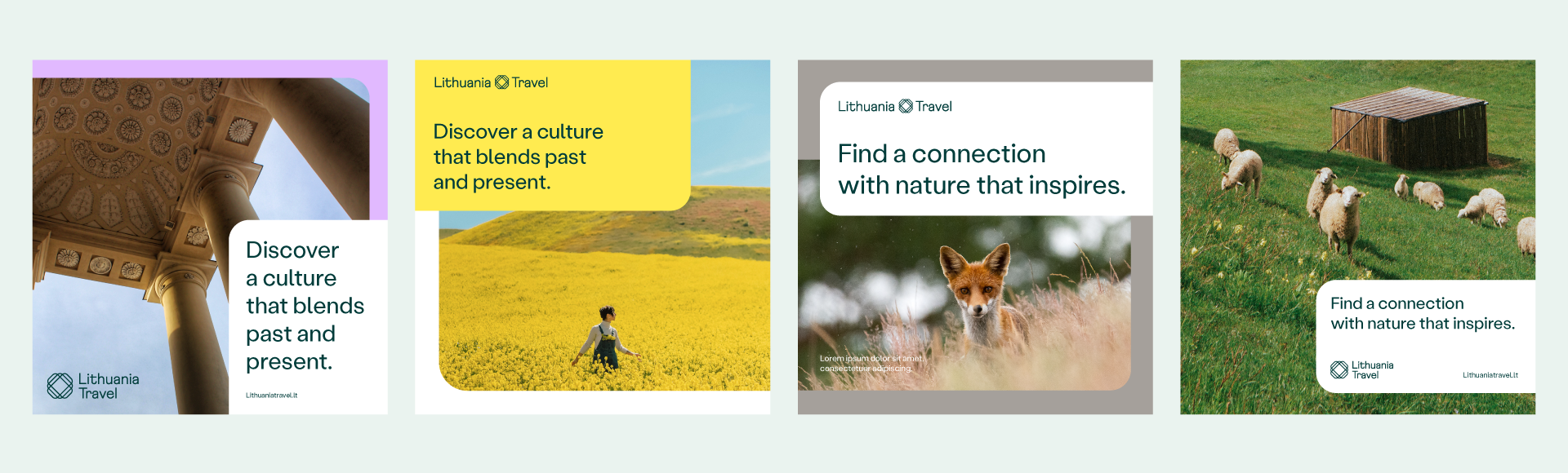
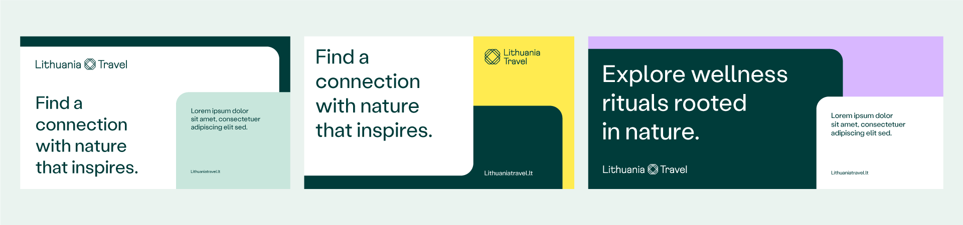
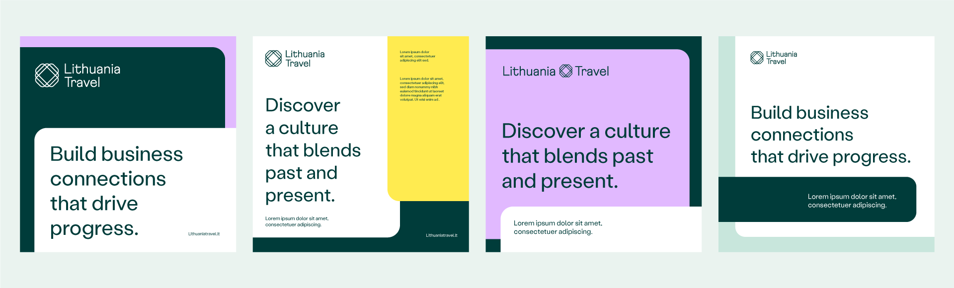
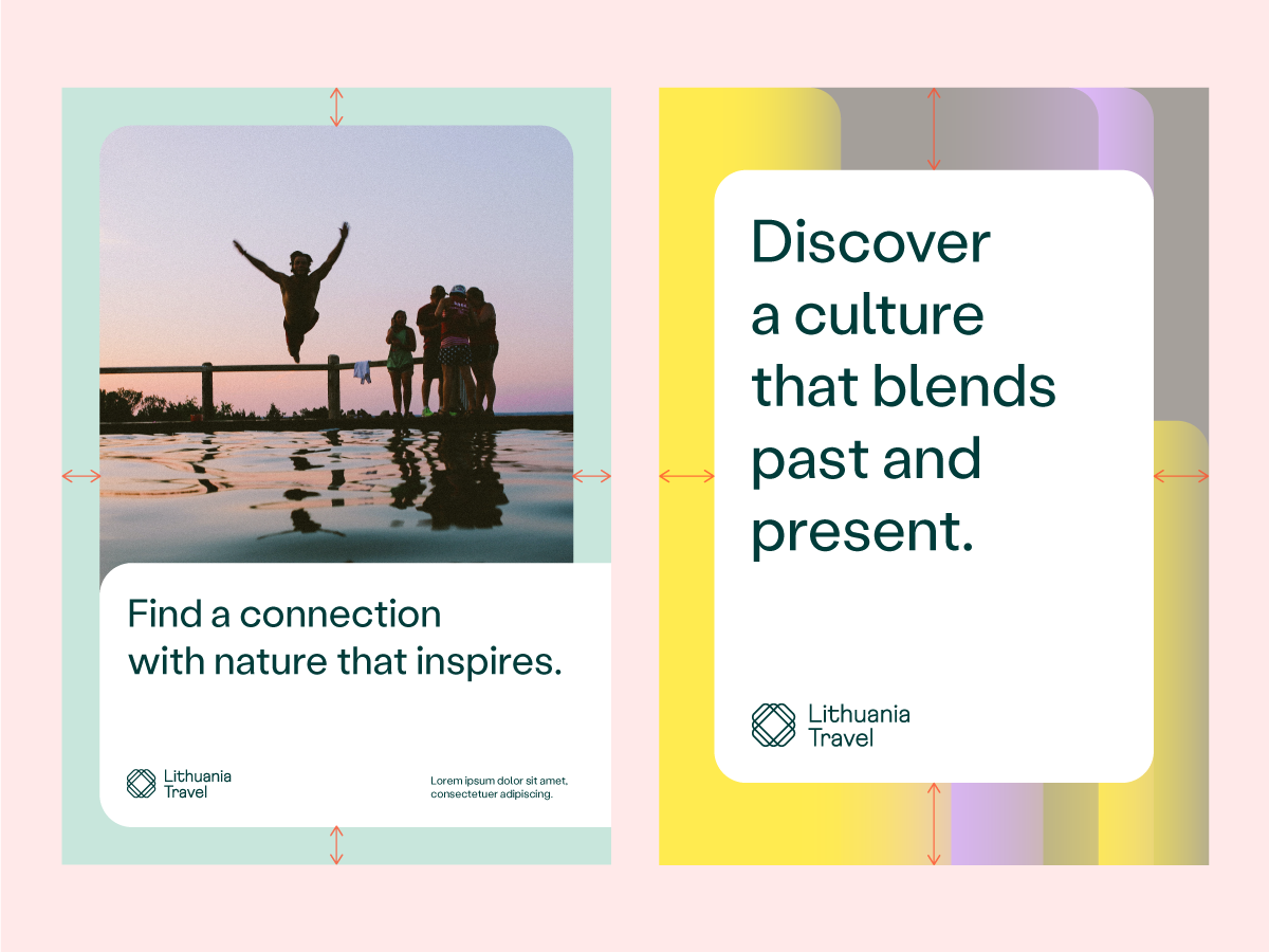
Layouts featuring an image
Given our conviction that Lithuanian culture and scenery are best conveyed through photography, we typically use layouts featuring an image. Examples below show and explain how we apply images to different sizes and formats.
Vertical layouts
Horizontal layouts
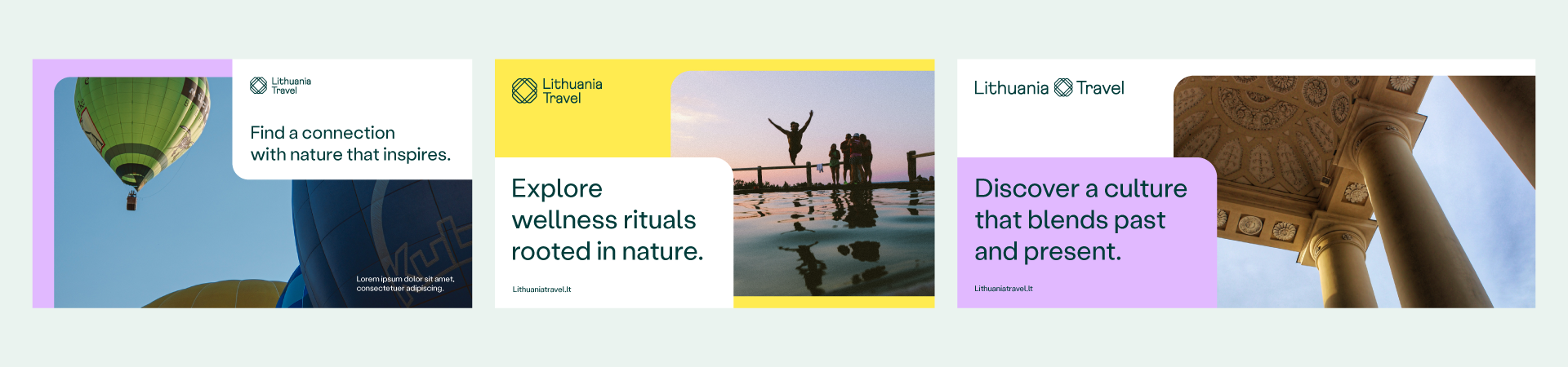
Square layouts
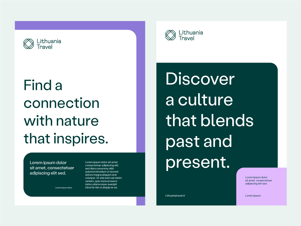
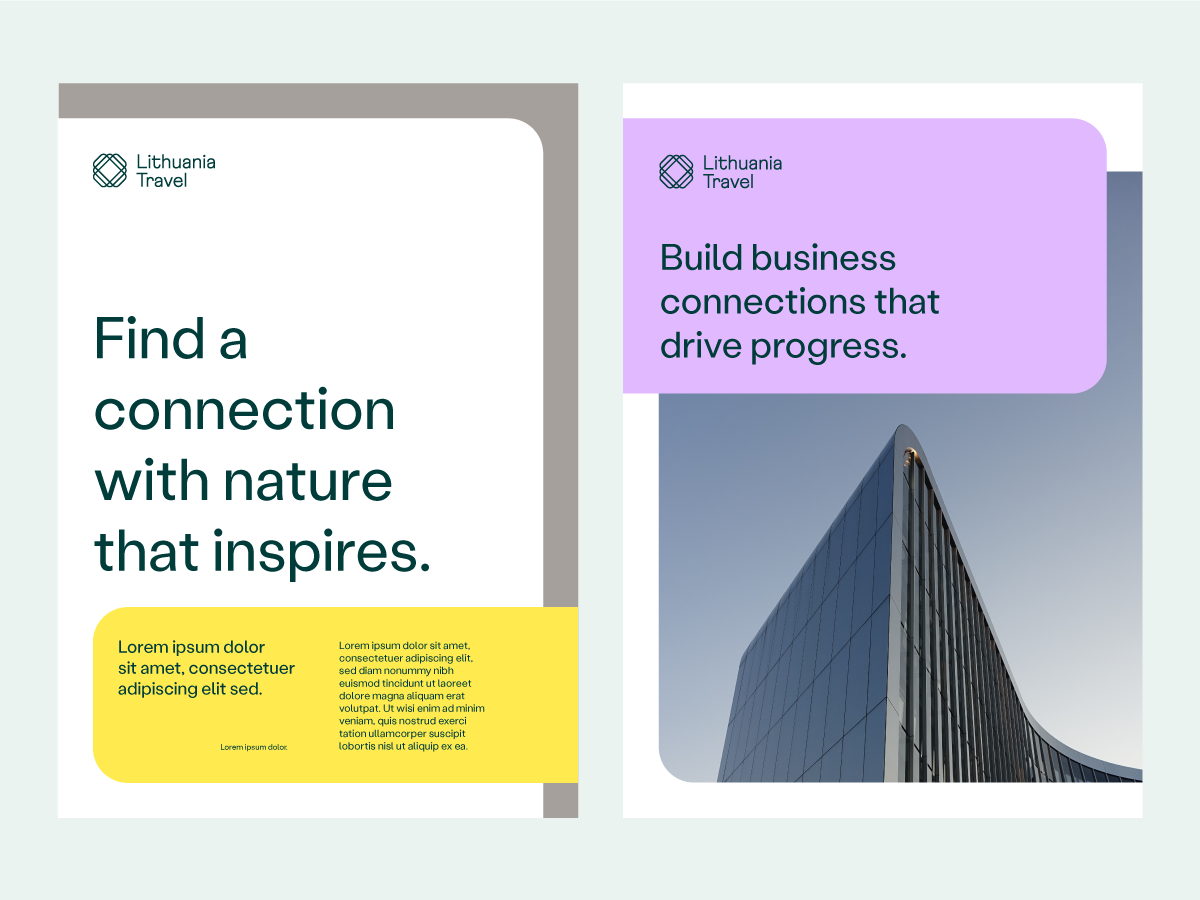
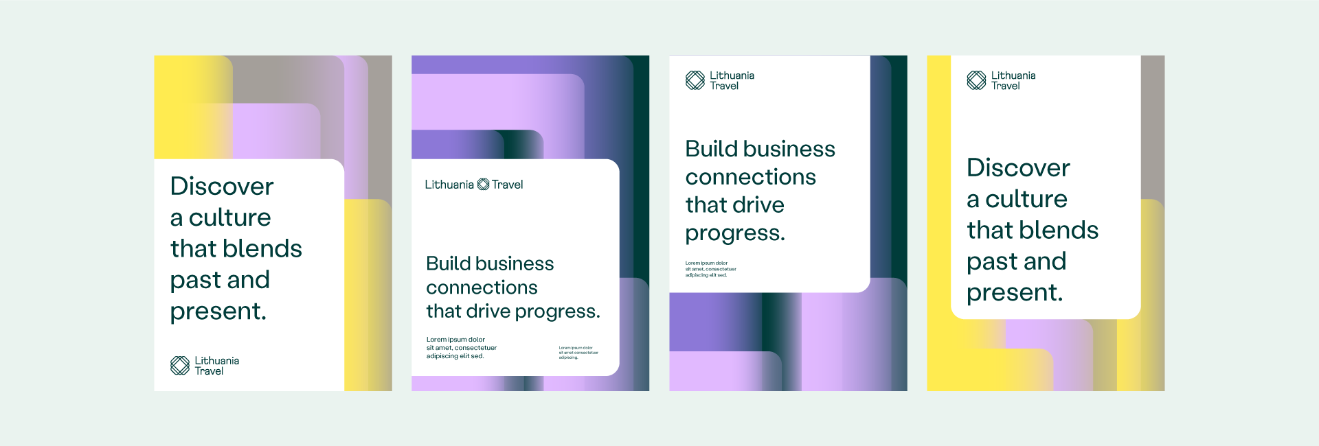
Layouts featuring text
In cases where pictures are unnecessary or not applicable we choose layouts with text only. To make them more dynamic, we prefer to distribute text blocks across 2 different layers.
Vertical layouts
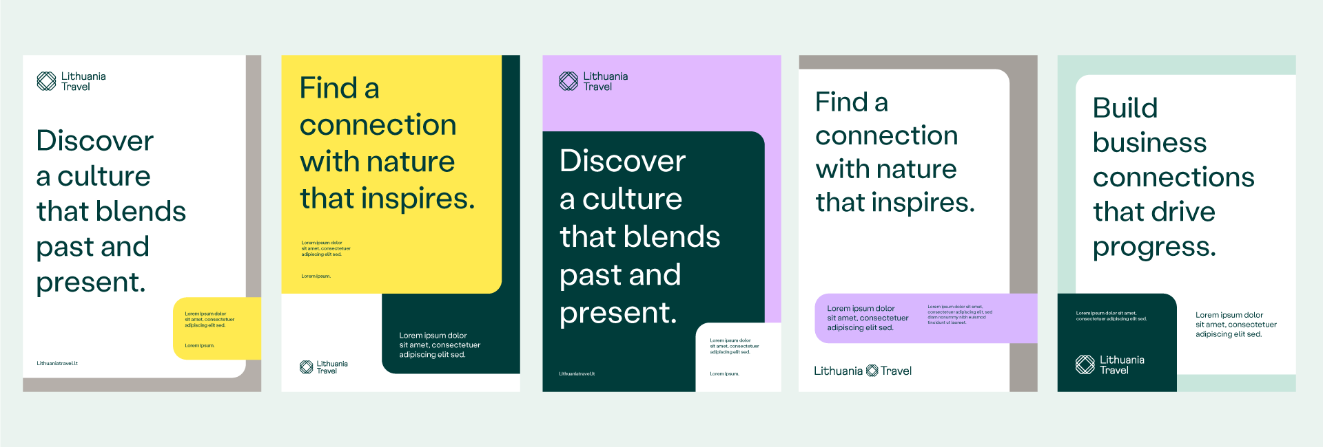
Horizontal layouts
Square layouts
Layouts featuring a pattern
In cases where pictures would be inappropriate, and a text-only layout – too simple, we use layouts featuring patterns. This allows us to enrich our visual language by giving it some extra liveliness and a sense of motion.
Vertical layouts
Horizontal layouts
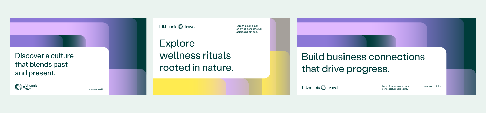
Square layouts

Examples of things to avoid when composing layouts:
-
 Do not hide corners of the layers under one another. Always keep at least one corner of the layer visible.
 -
 Do not withdraw layers away from the layout edges. To keep the integrity of visual identity it is important to always keep at least one edge of the layer sticked to the edge of the layout.
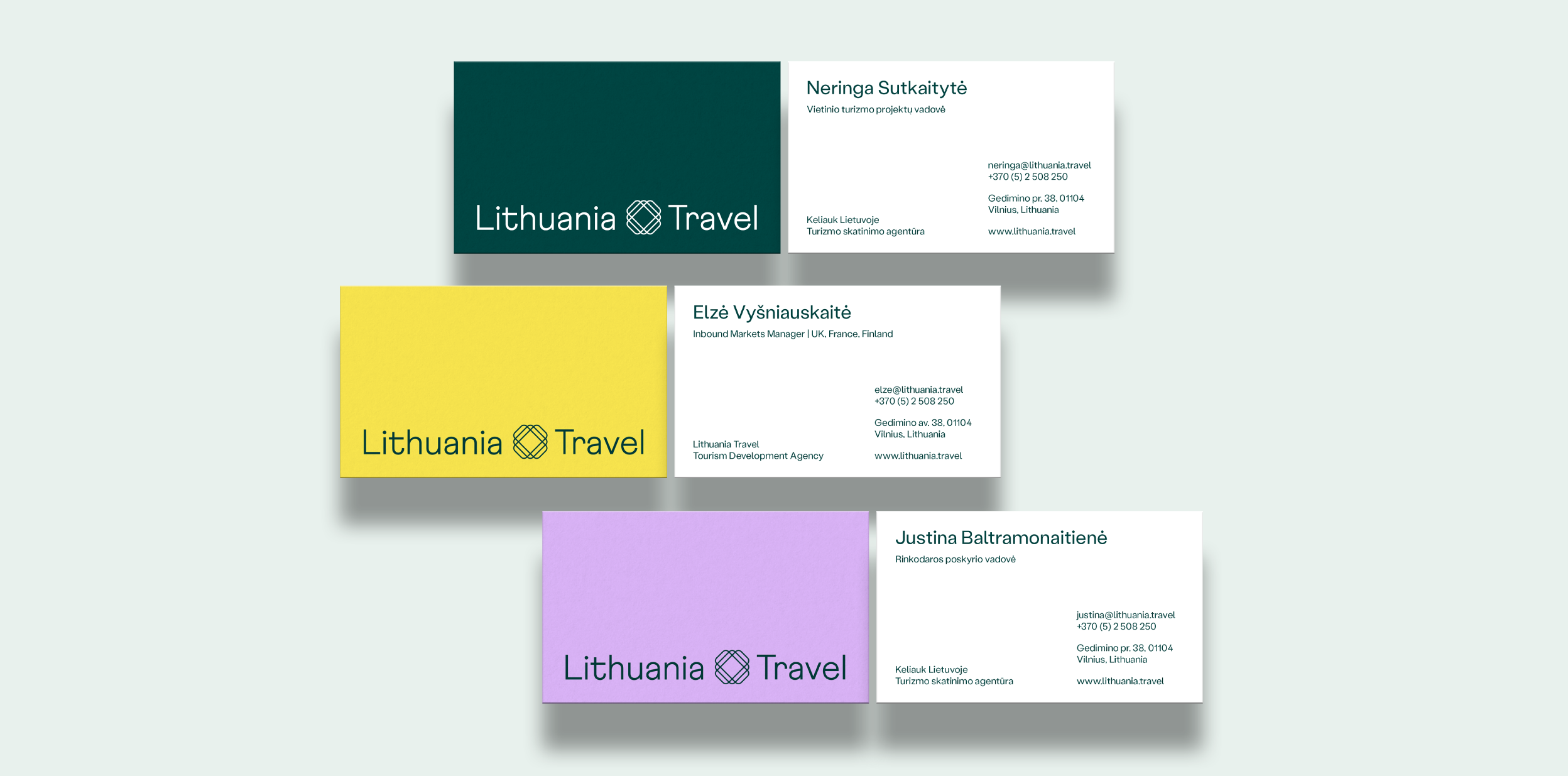
These are our business cards. One side contains the logo on coloured paper, while the other contains info always presented using the layout provided in the downloadable files.
Dimensions: 85 x 50 mm.
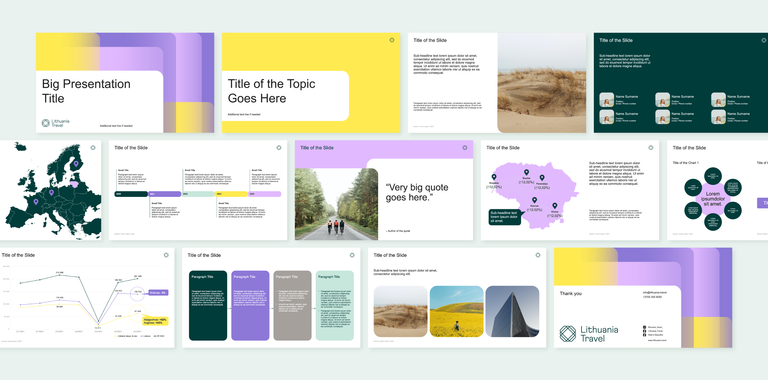
Below you’ll find a number of sample slides made using our presentation template. its design contains all of our visual identity elements put together. In the presentation template we use our secondary typeface Arial. Please download the template to view it in detail.
Download presentation template
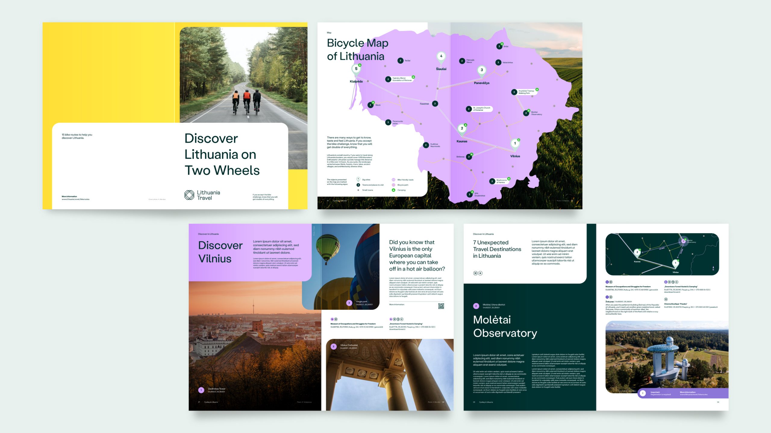
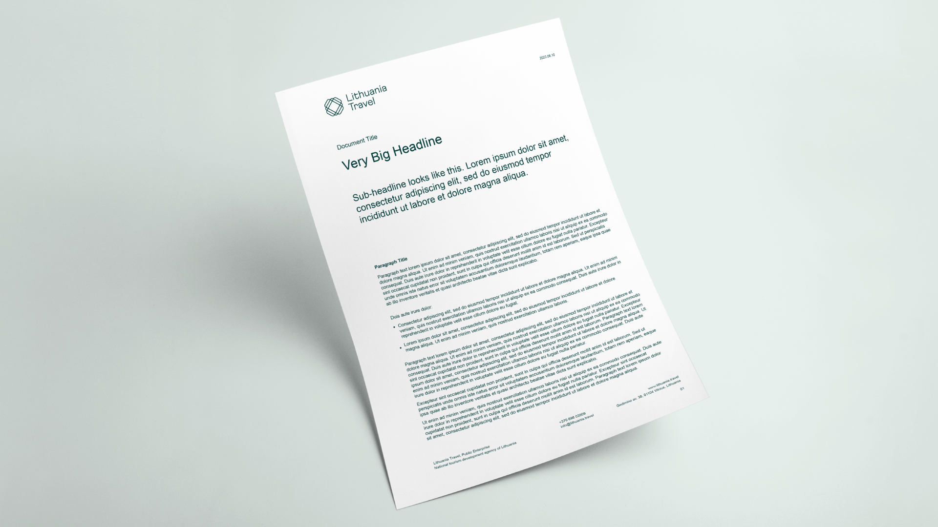
Below you’ll find several sample pages that use our publication design template for A4 layouts. The design contains all of our visual identity elements put together. Always use Stabil Grotesk typeface when designing publications.
Download publication design template
This is our Word document template. Always use Arial typeface as in the template file provided.
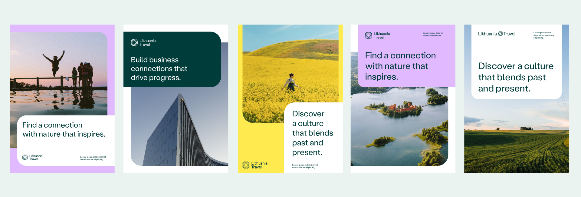
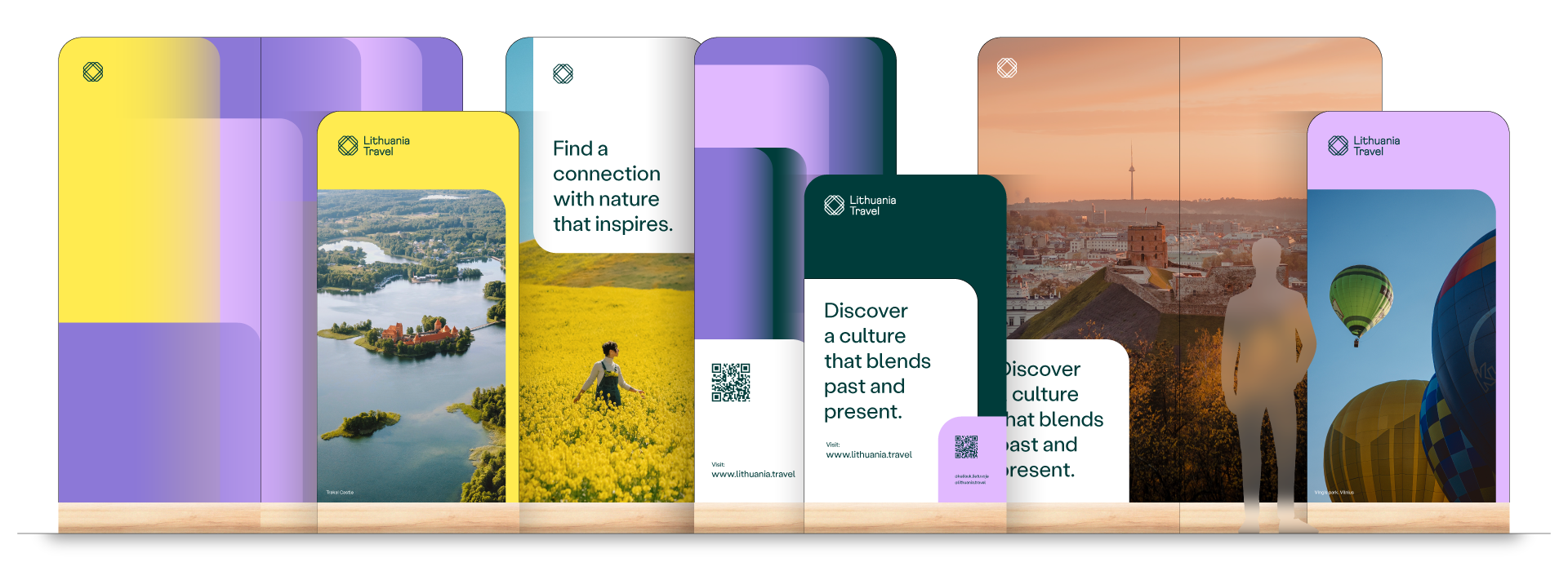
Despite the fact that most of our social media content is pure photography, we use templates with text and other visual identity elements from time to time as well. It might be campaign images, ads or other content that requires text or identity elements. For this reason, we use 3 types of template, as shown below.
Download social media templates
Post template categories
To see more samples, please download the template files.
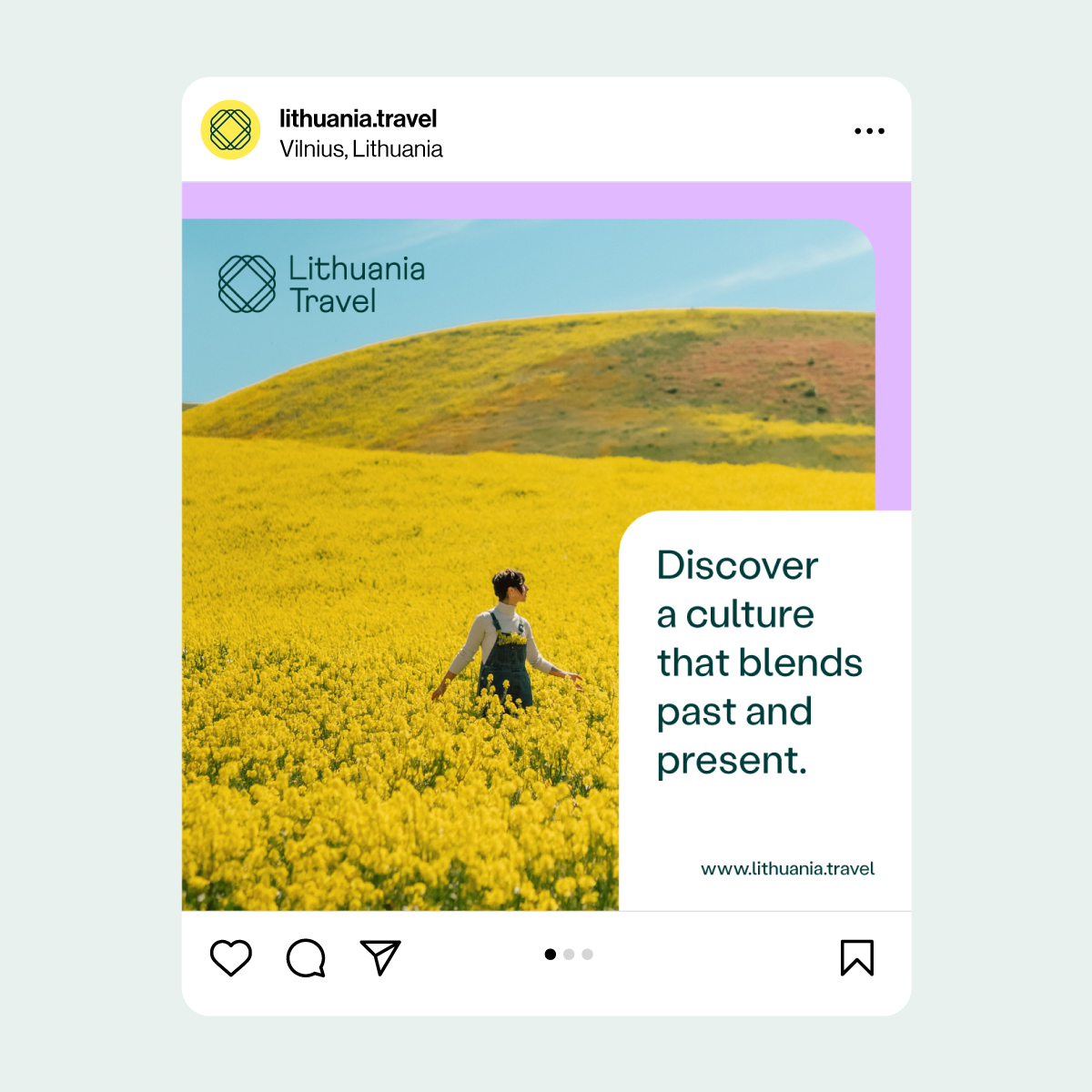
1. Layouts featuring an image and text.
We recommend using this template as the default because pictures best illustrate our culture.

2. Layouts featuring text.
We recommend using this template only in cases that call for a lot of text.
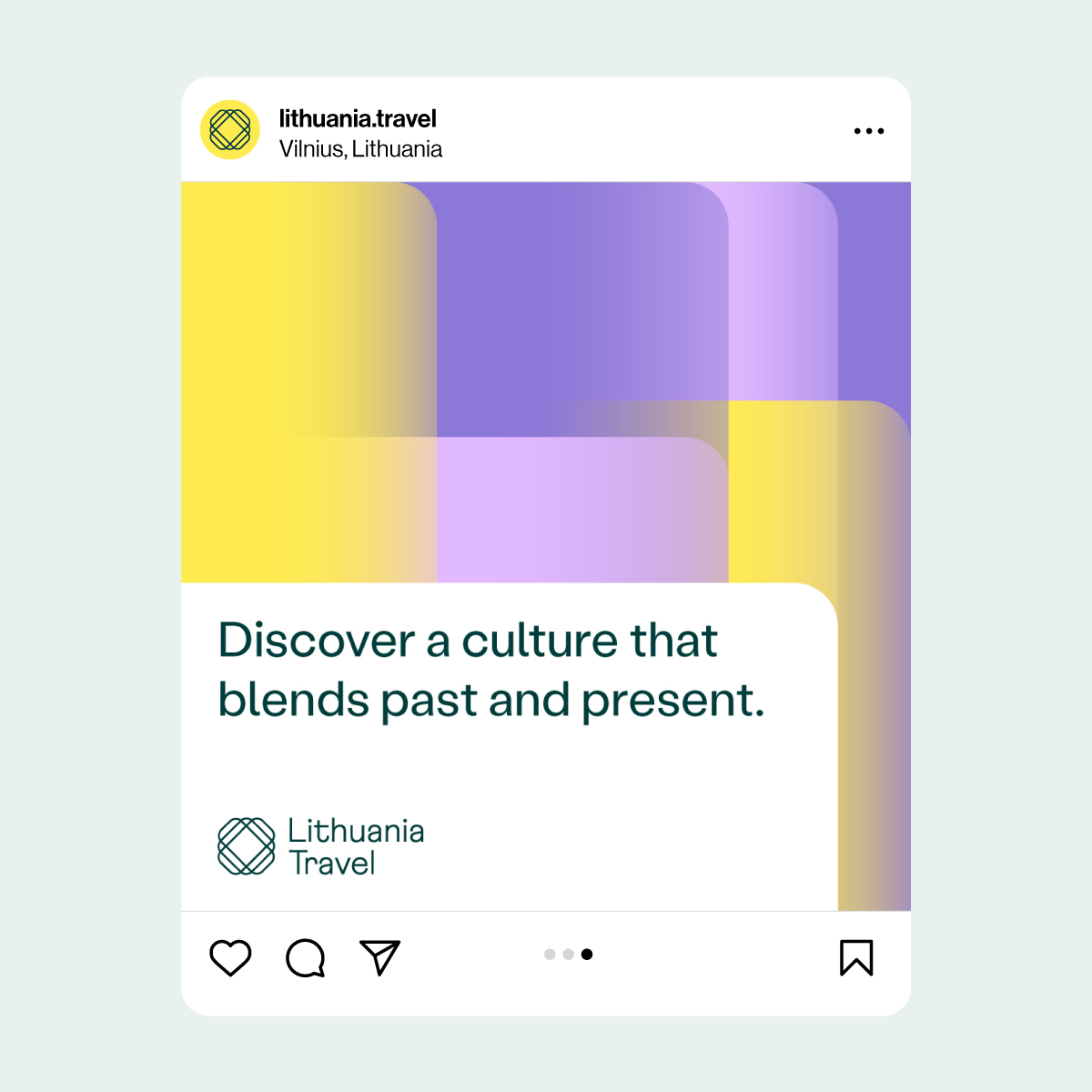
3. Layouts featuring a pattern and text.
We only use this template in cases where neither of the previous two templates are viable.
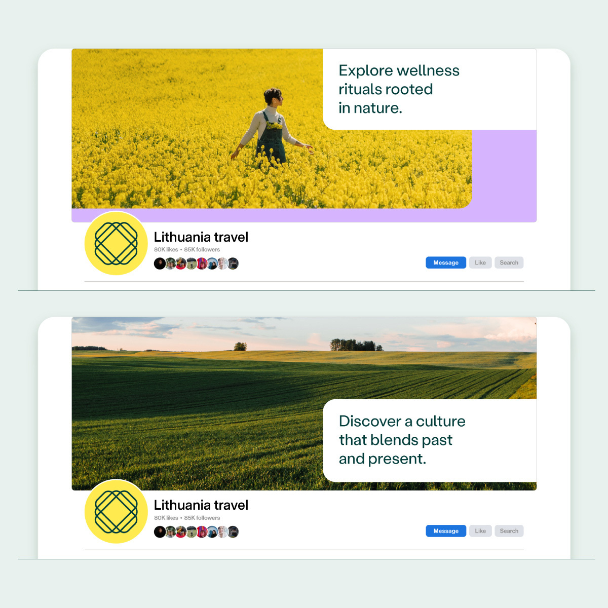
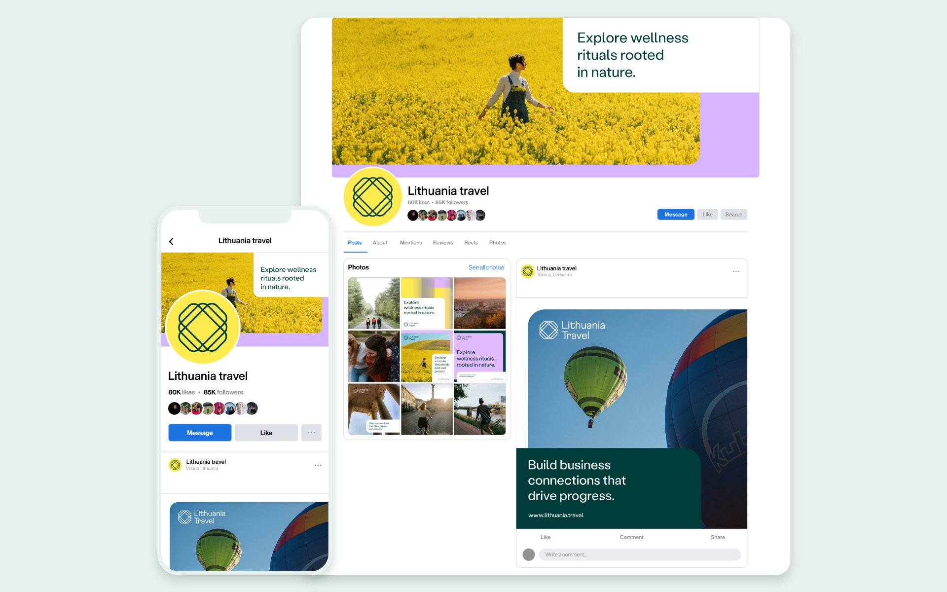
Profile covers
We recommend to always use photography on our profile covers. For that we have 2 different templates: with or without a colour layer.
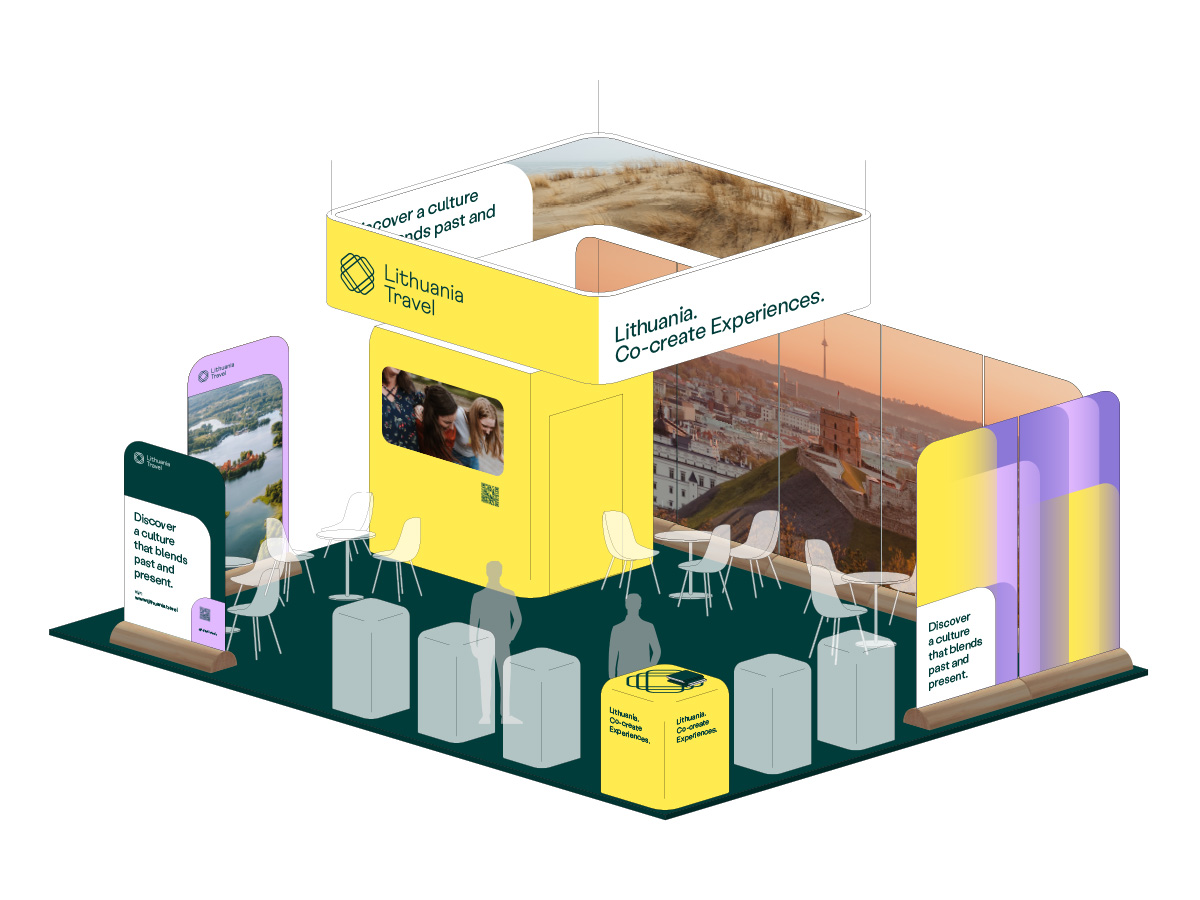
With the design of the exhibition booth we want to emphasise and reveal the whole idea and the concept of the identity of Lithuania Travel – a destination that offers versatile and diverse experiences.
For this reason, the key element of our booth is differently sized walls that, placed next to each other, create the impression of a partially overlapping pattern. This makes for a unique aesthetic and gives visitors an interesting experience.
To see the detailed description of the booth design or edit its elements download the files provided.
Download exhibition booth files
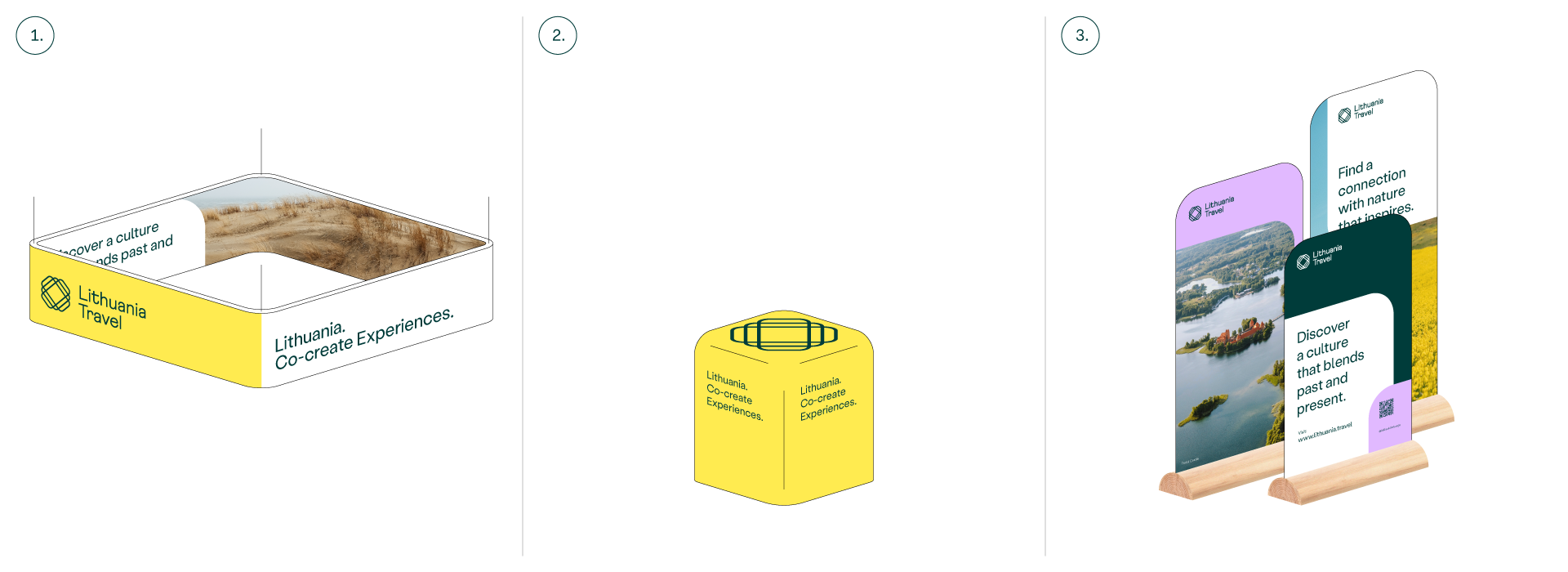
Booth elements
Our exhibition booth design is created using 3 main elements:
-
1. Hanging banner
-
2. Modular standing walls
-
3. Cubic table
Building scheme
Our modular system that consists of differently sized walls enables us to adapt to any situation in any exhibition. Below you’ll find several examples of how the booth elements can be put together to match booth size and other requirements.
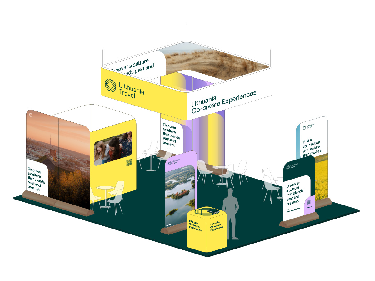
#1
Stand with a small room, tables for meetings and an info bar.
#2
Stand with a small room, tables for meetings, 1 main info bar and 5 additional info bars.
Since our video content is very broad, we’ve created intro and outro animations to make it coherent. We have 3 different options for each category.
Intro animations
Intro #1
This is our primary intro animation. It combines a logo animation displayed on a white colour layer.
Intro #2
This is our secondary intro animation. It displays a logo animation in a dark-coloured video. We use it for higher quality video content in cases where visual identity elements aren’t necessary.
Intro #3
This is our trietary intro animation. It displays a logo animation on a white colour layer that has a coloured layer underneath it. We use it in cases that call for using more visual identity elements.
Outro animations
Outro #1
We use this animation in cases that call for more text at the end of the video, and in cases where we want to use more visual identity elements.
Outro #2
We use this animation in cases that don’t call for any text, yet we want to use more visual identity elements.
Outro #3
We use this animation in cases that call for more text at the end of the video, but there’s no need to use any visual identity elements.