This idea is a part of our business philosophy: never stop at what’s already been achieved, always look for ways to offer even more efficient solutions to our freight transportation customers.
LTG Cargo aims to make good transportation solutions better.
Our audience
Constructive, practical business people who value their time. LTG Cargo customers are active, engaged in their business affairs and they do not want to waste time deciding on the freight transportation solutions that suit them best. They expect us to be reliable, efficient and creative.
Benefits we bring
We constantly discover new ways to solve logistic puzzles efficiently.
Personality
LTG Cargo is a self-confident and liberal brand. We are not bound by prejudice, we always take a creative approach to every customer order, task, project or problem. We are specific and constructive when communicating with our customers, and attentive to their needs.
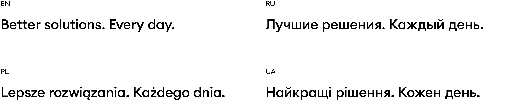
Better solutions. Every day.
LTG Cargo’s motto is a creative way of expressing the essential aspects of the company’s business philosophy and promise to its customers – continuous progress, self-confidence and high quality of services. The motto is divided into two components in order to highlight two key aspects: ability to offer freight transportation solutions that are above market standards and ensure continuous improvement and search for new ideas. LTG Cargo sees opportunities even where there seems to be nothing to improve and is discovering new ways to provide even more useful and better-performing services to its customers. Nevertheless, even with the implementation of a better solution, LTG Cargo continues to look for new ways to make freight transportation even more efficient. The motto expresses all this in a matter-of-fact way, just as LTG Cargo likes to work.
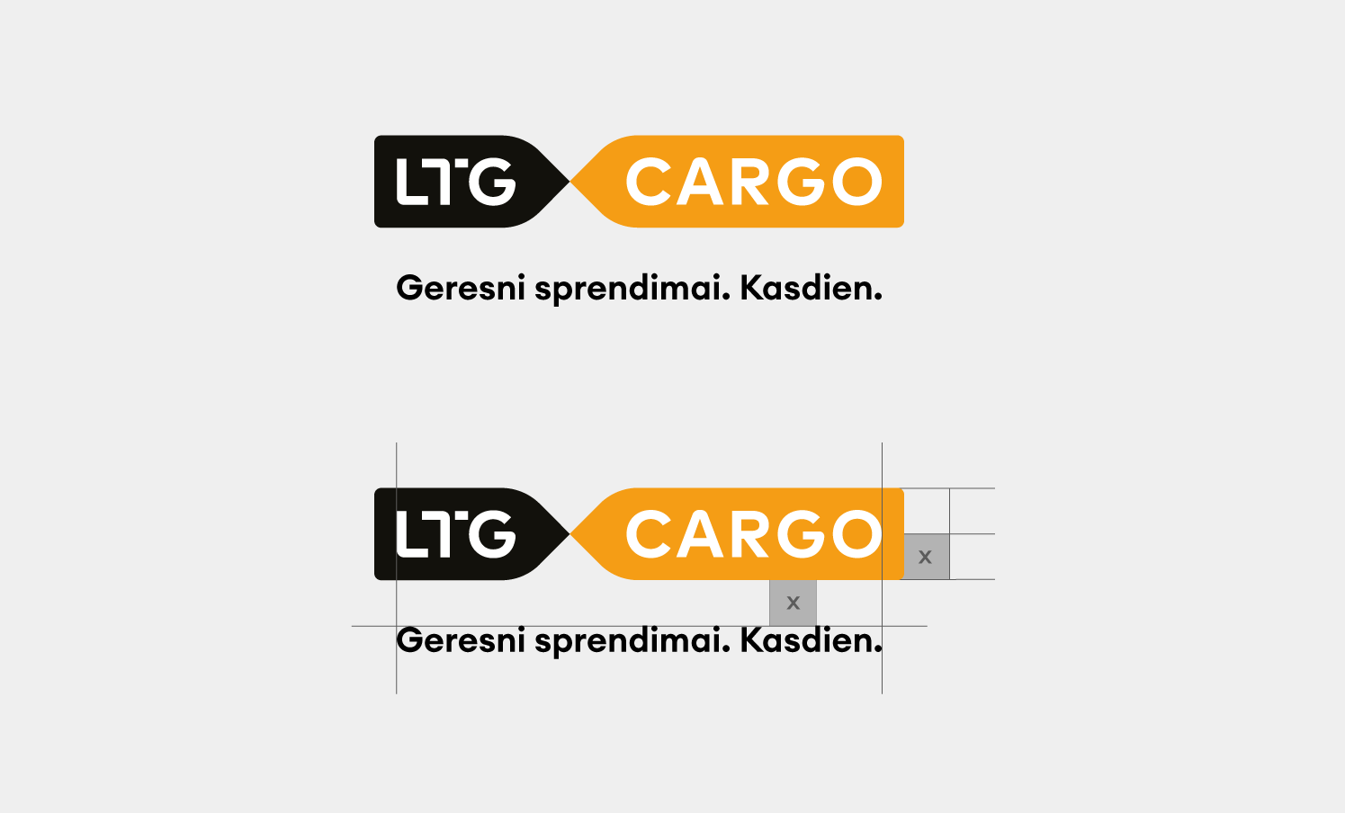
It is an additional logo version with an enclosed motto of the Company. Irrespective of the motto’s length, it is critical to maintain the width of the motto and safety zones. The enclosed guidelines will help you use the logo and the motto appropriately.
-
 LT
LT -
 EN
EN -
 RU
RU -
 PL
PL -
 UA
UA
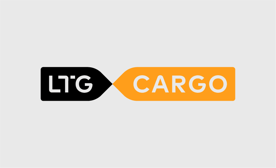
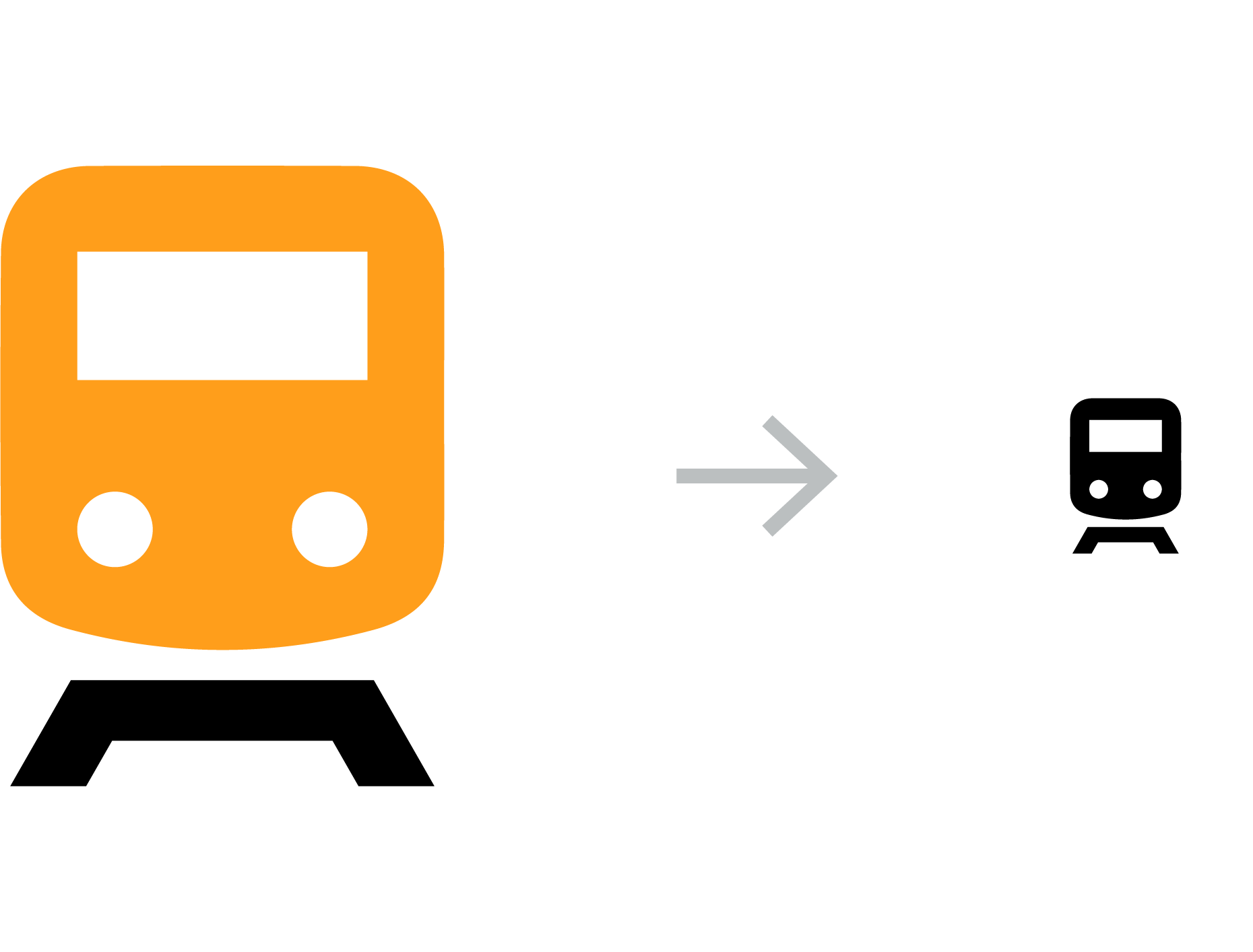
The LTG Cargo logo is the main and most recognizable means of representing our name. The guidelines provided here will help you use the logo consistently, without errors.
It is the main logo version.
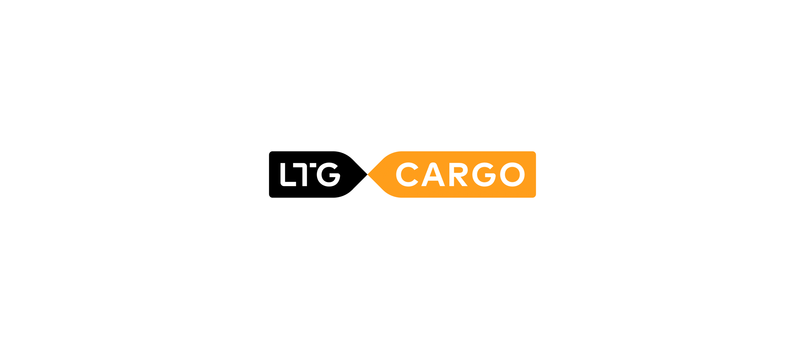

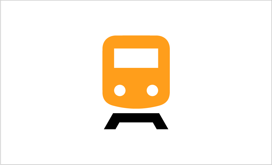
Logo positive version
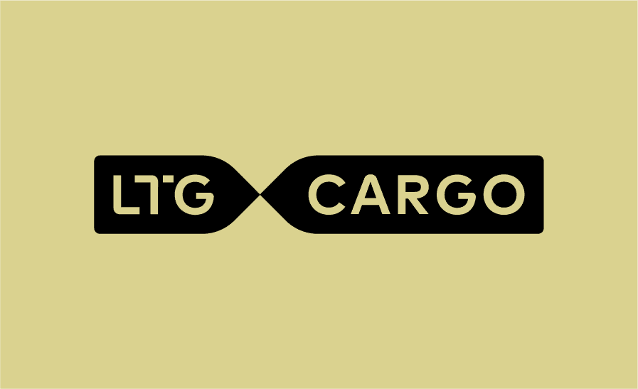
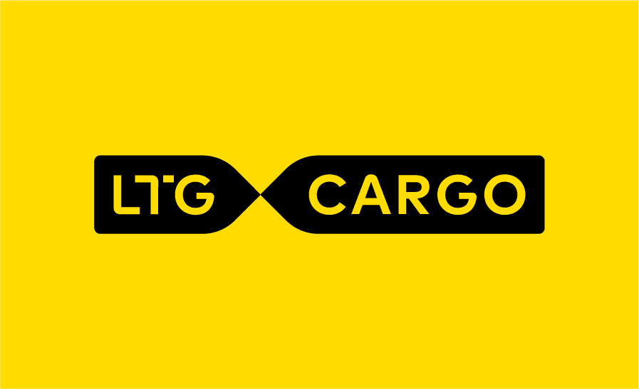
This is a positive version of our logo. This version of the logo is used on white or other light-coloured backgrounds.
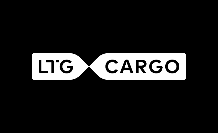
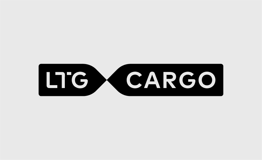
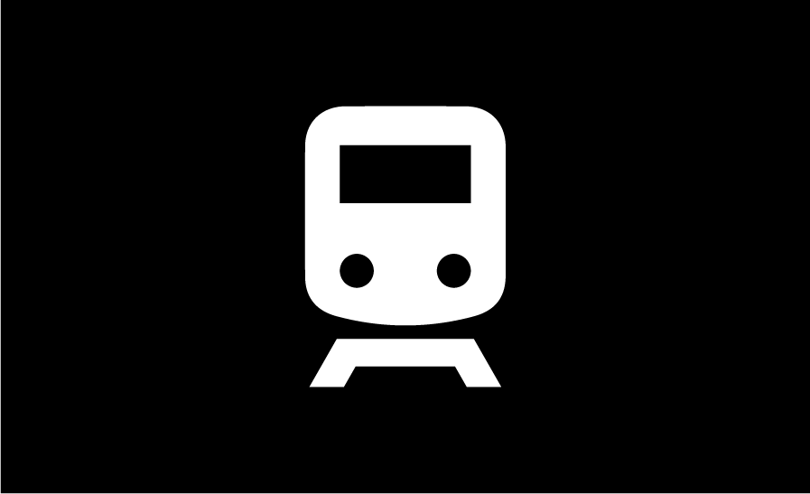
Logo negative version
This is a negative version of our logo. This version of the logo is used on black or other dark-coloured backgrounds.
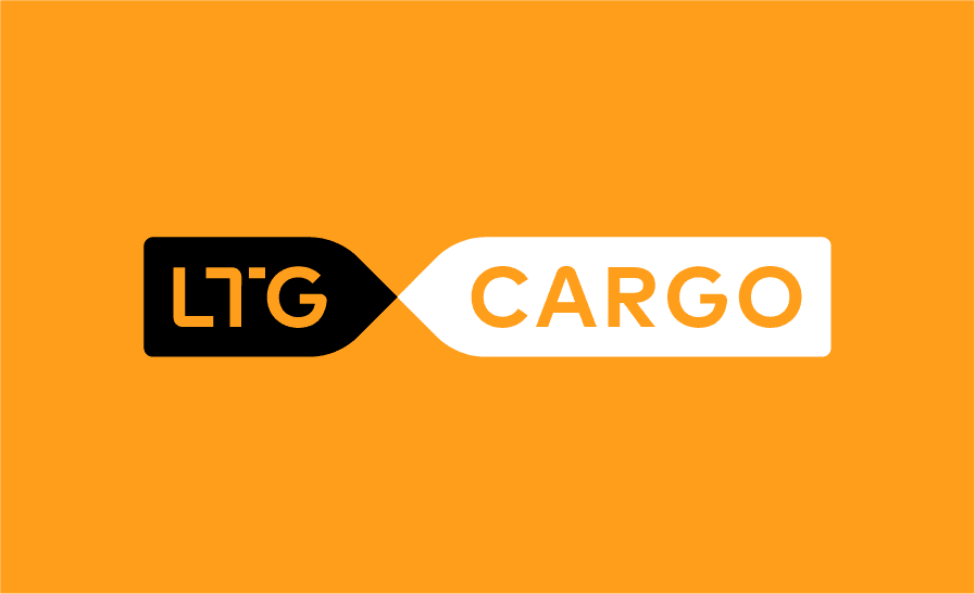
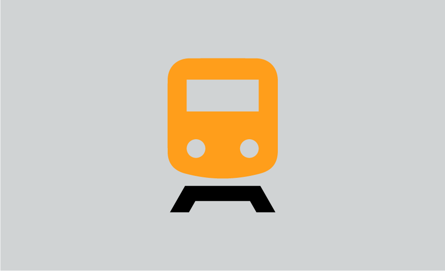
Logo negative version
This is a negative version of our logo. This version of the logo is used on backgrounds in other colours.
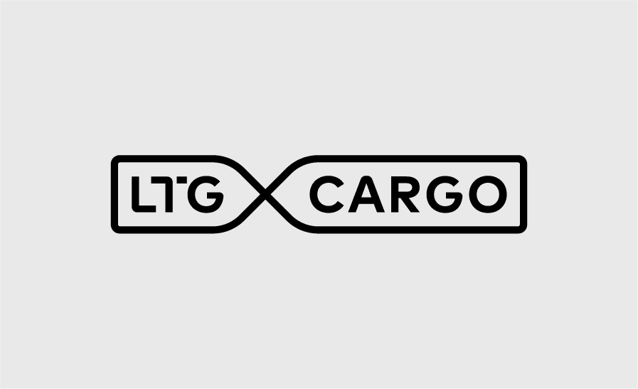
The LTG Cargo logo has several different versions. We always use the main, colour version of the logo. On a coloured background we use the main black and white or black version of the logo. Where the printing limitations or other reasons prevent from selection of these versions, we can use a linear version or a solid colour fill-letter version of the logo.
-
 Main logo version
 -
 Main logo version, black
 -
 Secondary logo version
 -
 Third logo version
-
 LTG Cargo Polska
 -
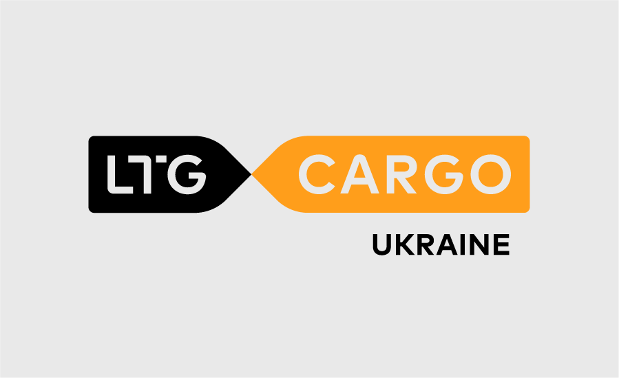 LTG Cargo Ukraine
 -
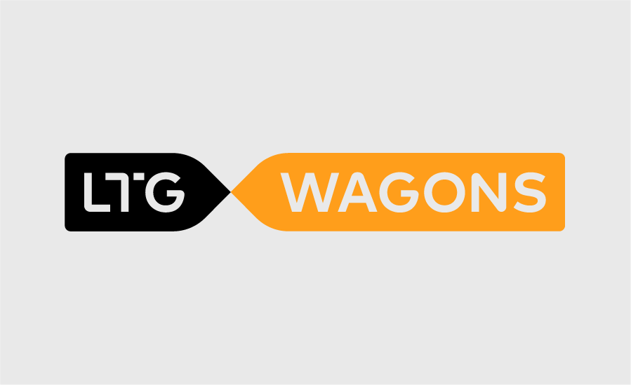 LTG Wagons
To ensure the readability and proper visibility of the symbol, we recommend leaving more space around it and not placing any graphic elements nearby.
-
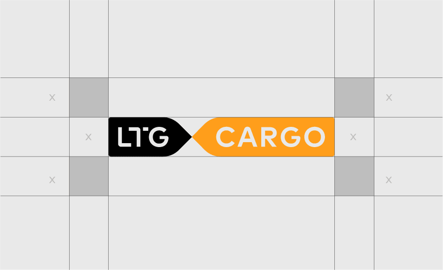 Logo safety zone
The logo used should not be of less than 3 mm height. Using smaller logos risks losing readability.
-
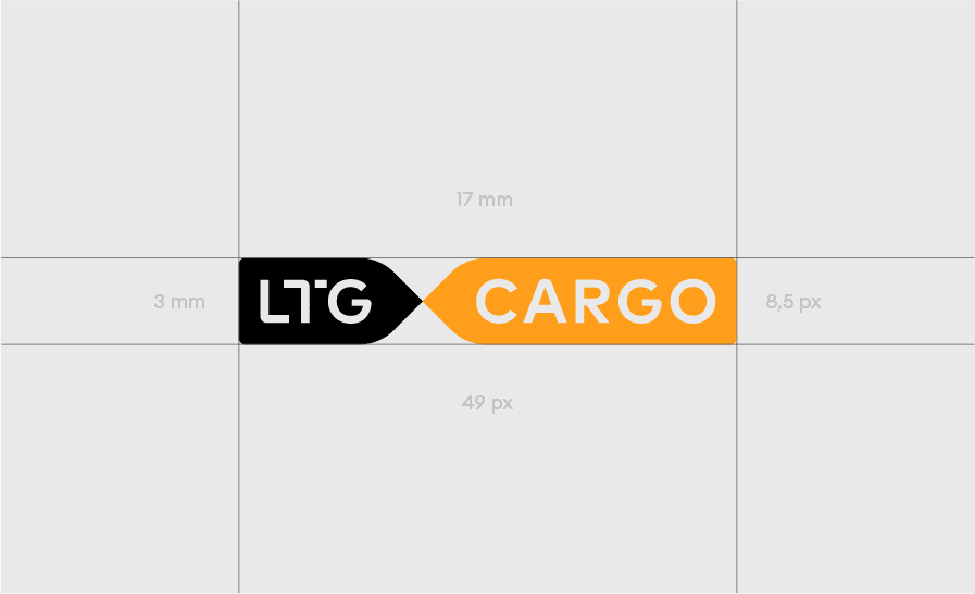 Minimum logo size
Maintain logo proportions. / Ensure easy reading. / Use with identity colours only. / Mind the logo safety zone
Change of logo proportions. / Failure to ensure easy reading. / Use of unofficial logo colours. / Logo is too small. / Failure to mind the logo safety zone.
In the process of developing a visual LTG Cargo identity we use these colours in accordance with the set proportions. The main colour is dark yellow. There are seven secondary colours: dark green, bright yellow, red, light pistachio, black, grey and white. The main colours should be reflected in external means of communication (posters, leaflets, social media pictures, etc.), i.e. used in at least 85% means of communication to build visual reputation.
-
#ff9e1bDark yellowR:255 G:158 B:27C:0 M:45 Y:94 K:0Pantone 1375 CRAL 1007
-
#ffffffWhiteR:255 G:255 B: 255C:0 M:0 Y:0 K:0Pantone White CRAL 9003
-
#d0d3d4GreyR:208 G:211 B:212C:7 M:3 Y:5 K:8Pantone 427 CRAL 7047
-
#000000BlackR:0 G:0 B:0C:75 M:68 Y:67 K:90Pantone Black 6CRAL 9017
-
#373a36Dark greyR:55 G:58 B:54C:69 M:57 Y:65 K:52Pantone 447 CRAL 7022
-
#ffdf00Bright yellowR:255 G:209 B:0C:0 M:9 Y:100 K:0Pantone 109 CRAL 1023
-
#ff671fBright orangeR:255 G:103 B:31C:0 M:70 Y:100 K:0Pantone 165 CRAL 2008
-
#dcd59aLight pistachioR:220 G:213 B:154C:6 M:2 Y:32 K:1Pantone 614 CRAL 1015
Example of using colour proportions:
Our main font is “Euclid Circular A”. It is used in our communication, press and other identity development tools. We always use the Medium version for headings’ text. Small headings use the Bold version. Text boxes and paragraphs use Regular version, Bold and Italic are used to make text bold or highlight it.

Official documents and templates (official document templates, presentations) use a systemic font “Arial”.

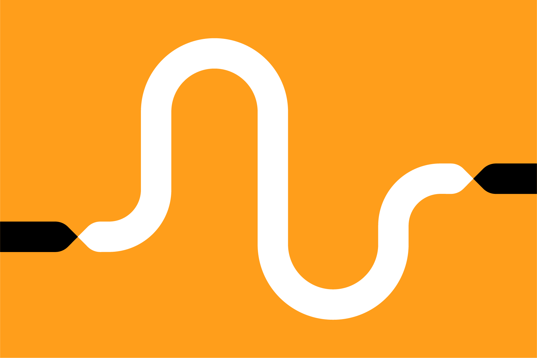
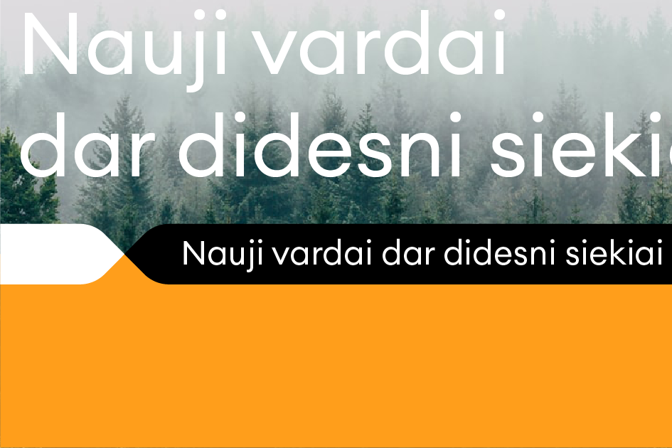
The graphic element is an integral part of our identity. It is a key tool in creating our visual expression and coherent identity. The line in all cases consists of two coloured parts: yellow and black or white and black.
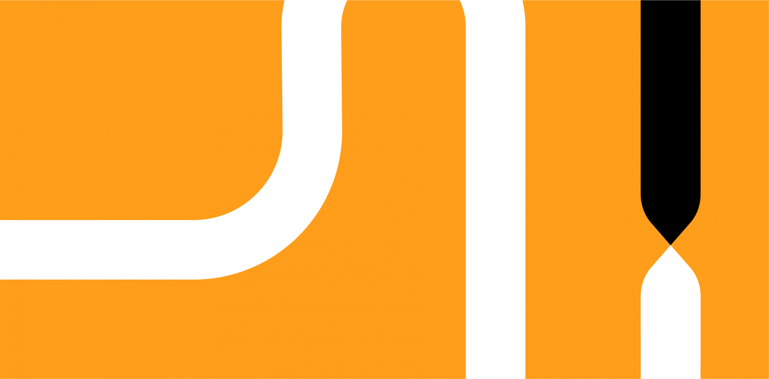
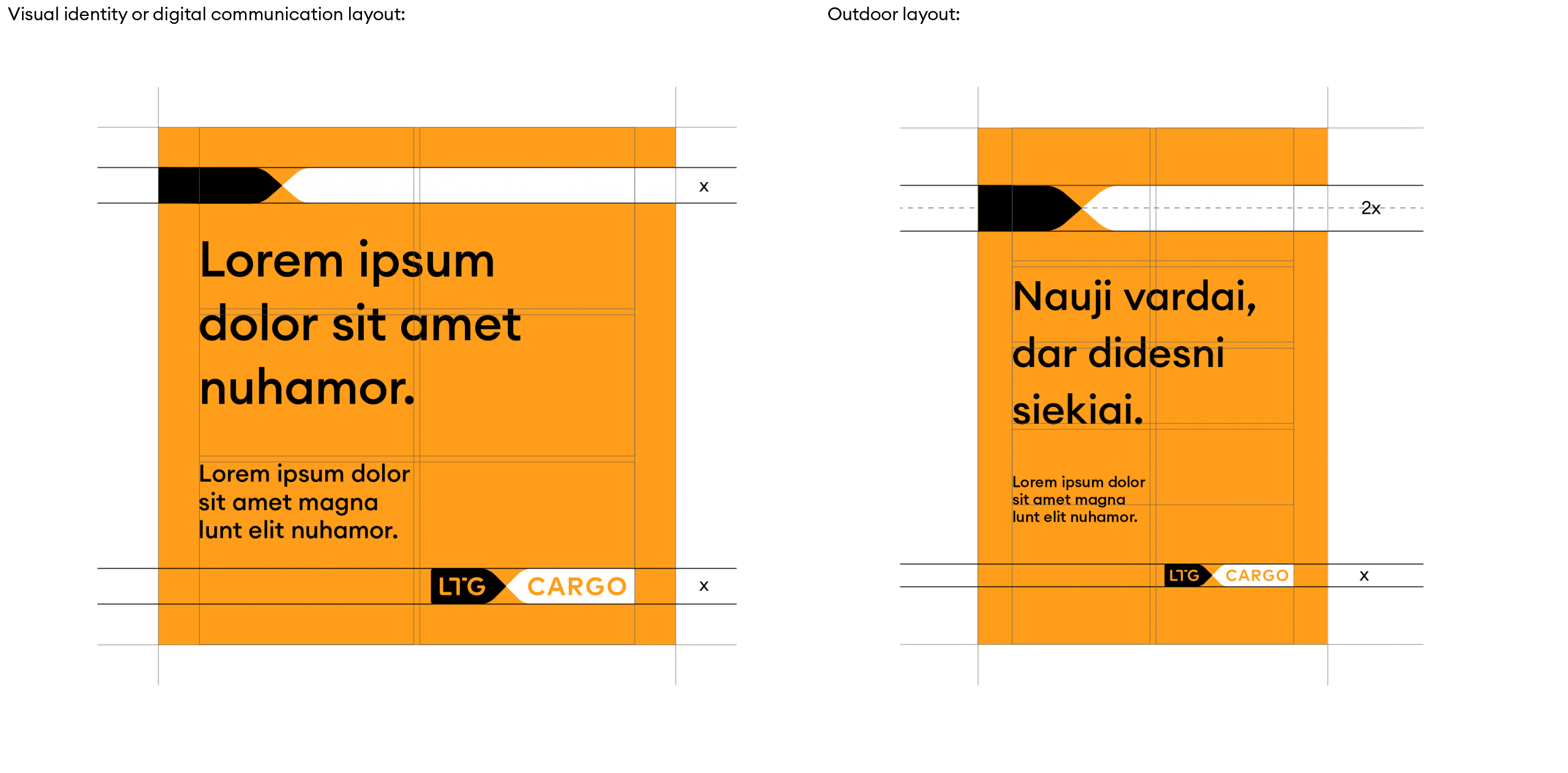
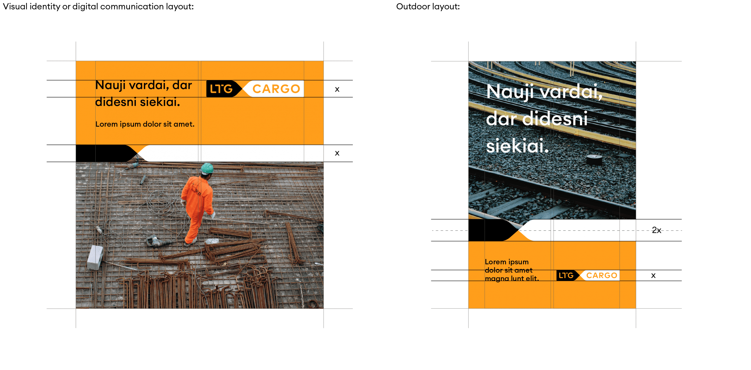
To create a unified graphic language, we apply the line rule: the thickness of the graphic line in visual identity tools or digital communication layouts is equal to the height of the logo. An exception applies to larger format (outdoor advertising) layouts where the line thickness must be twice the height of the logo.
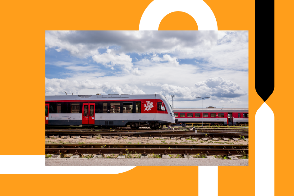
An example with no photo:
An example with a photo:
The shape of a line is one of the expressions of graphic language. Although our line is used quite extensively, we can still single out a few ways of usage.
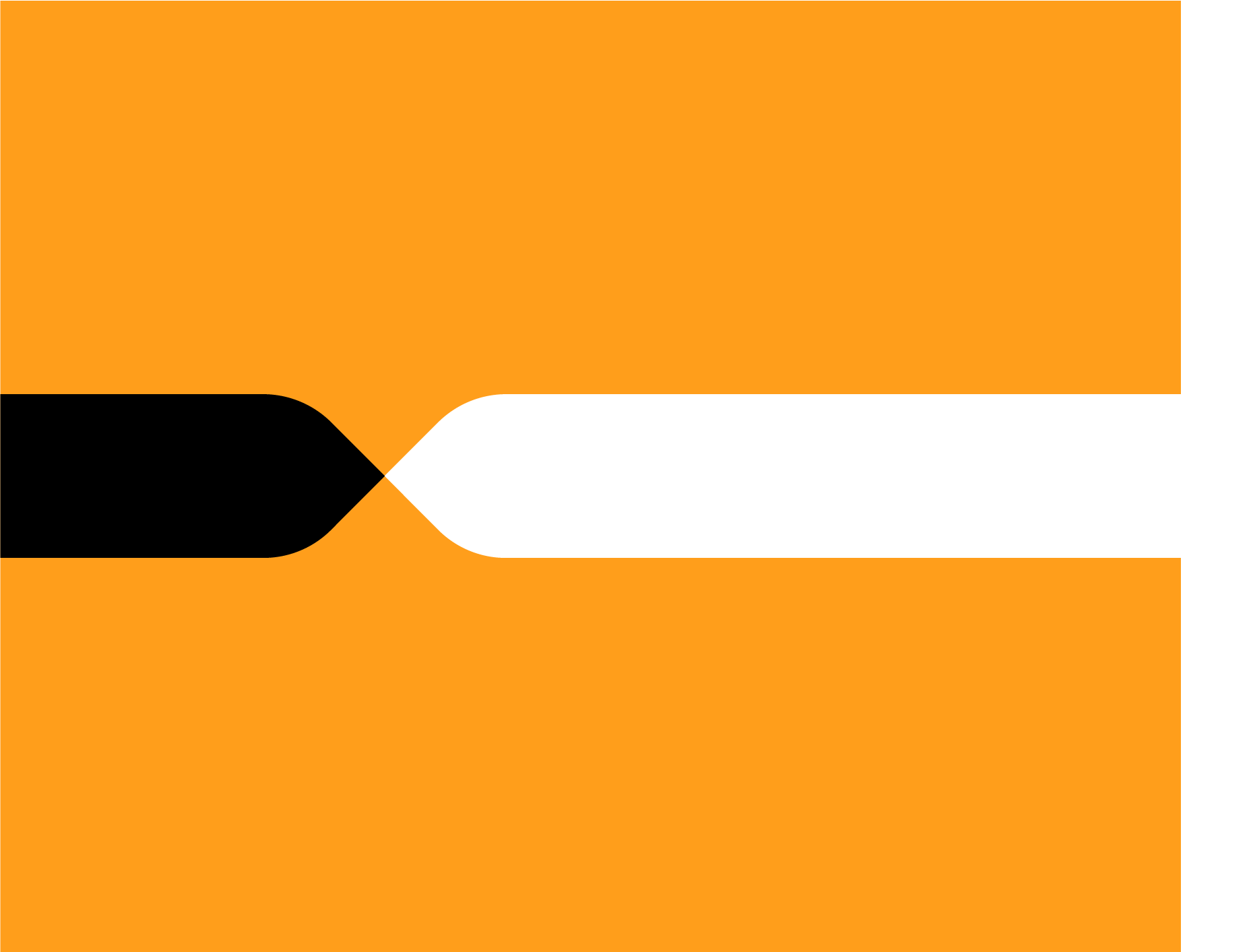
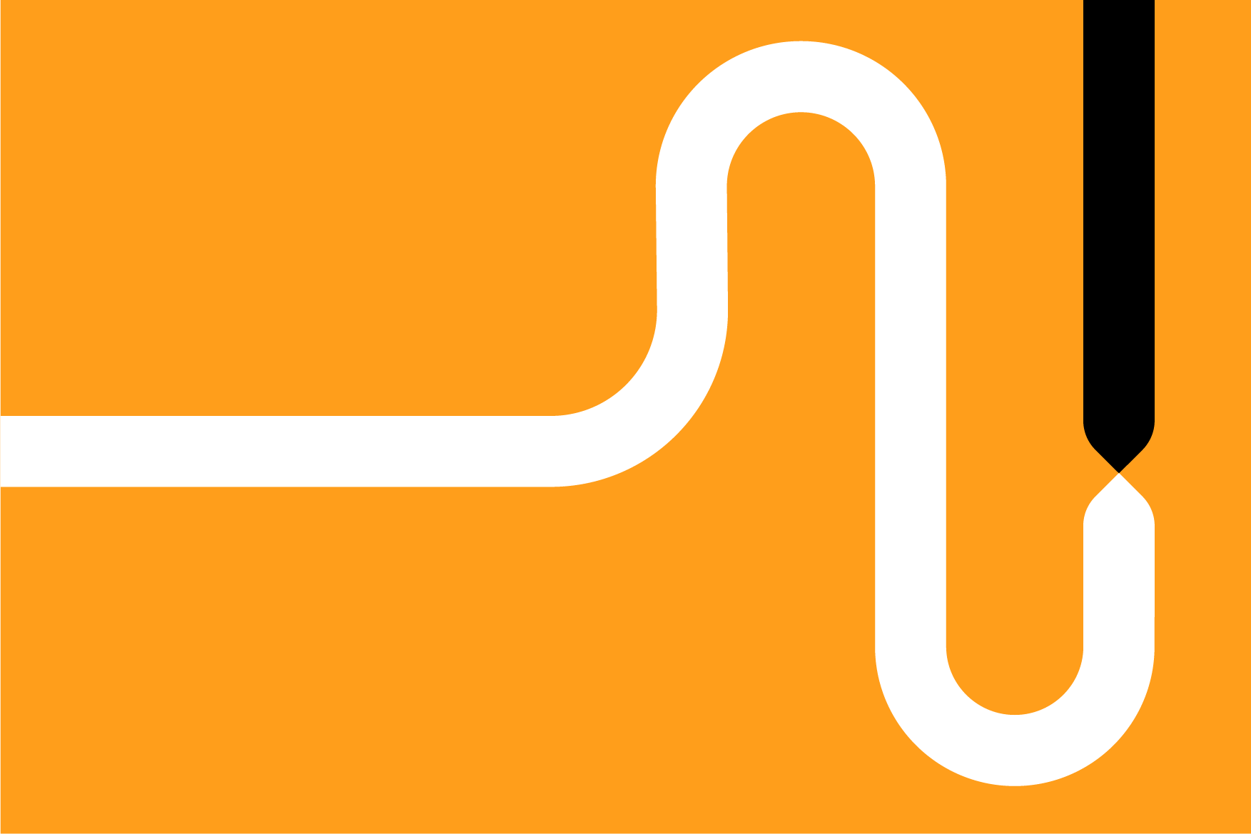
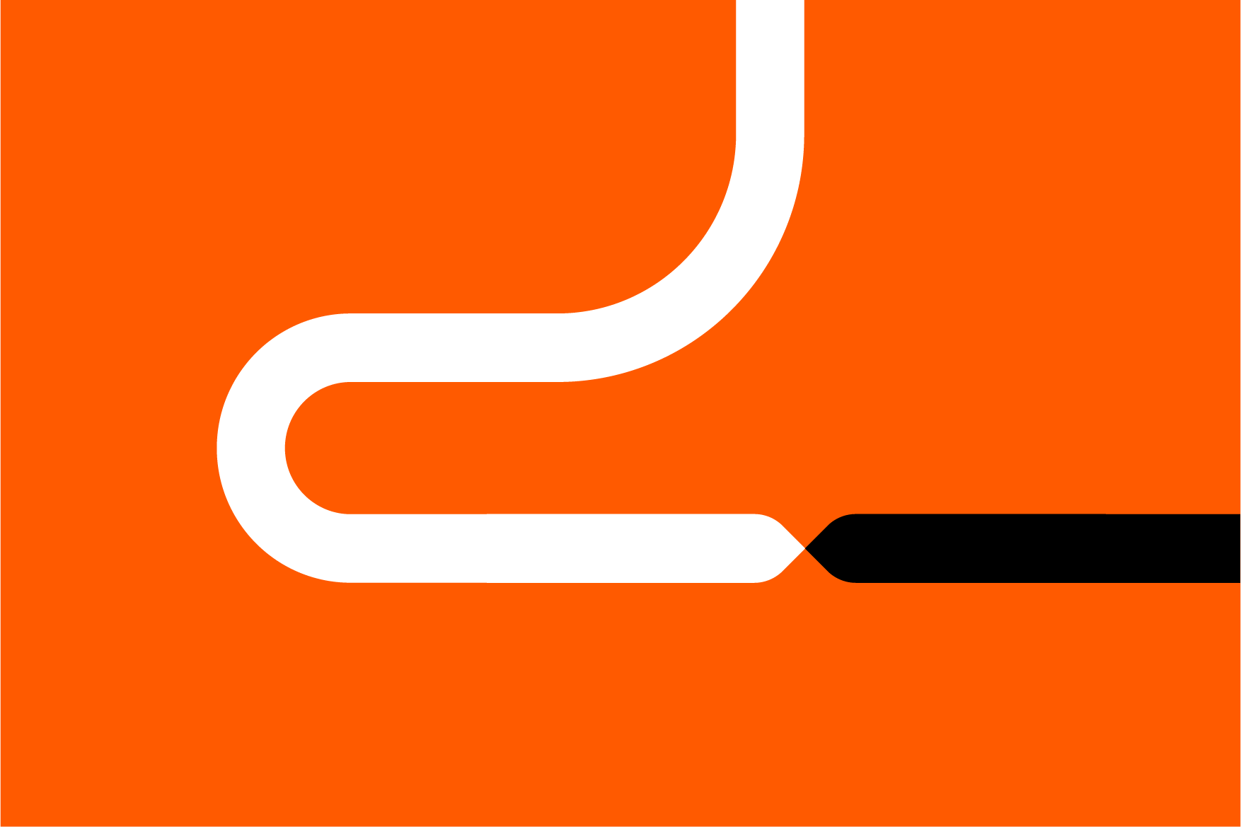
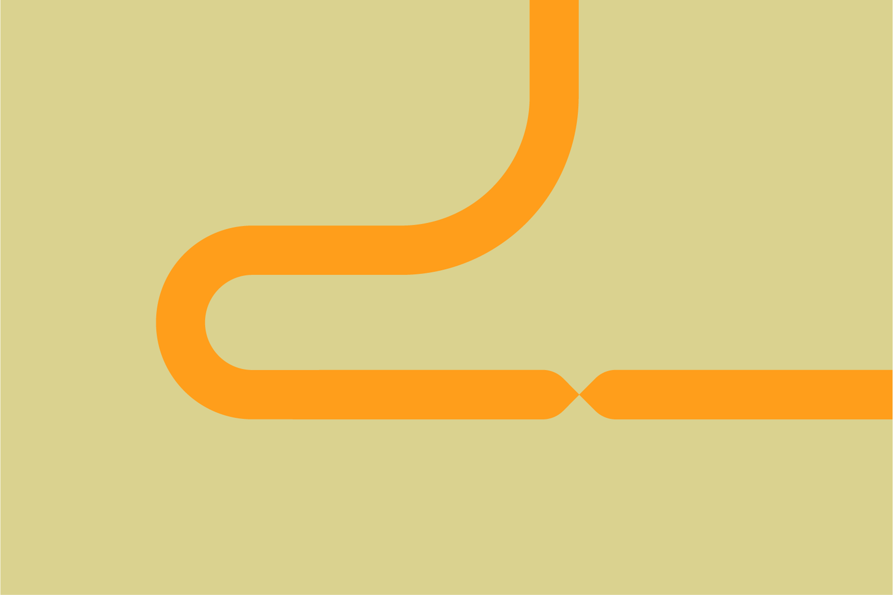
1. Straight line of two colours. We use this graphic expression in layouts where our aim is to create a calm and solid image.
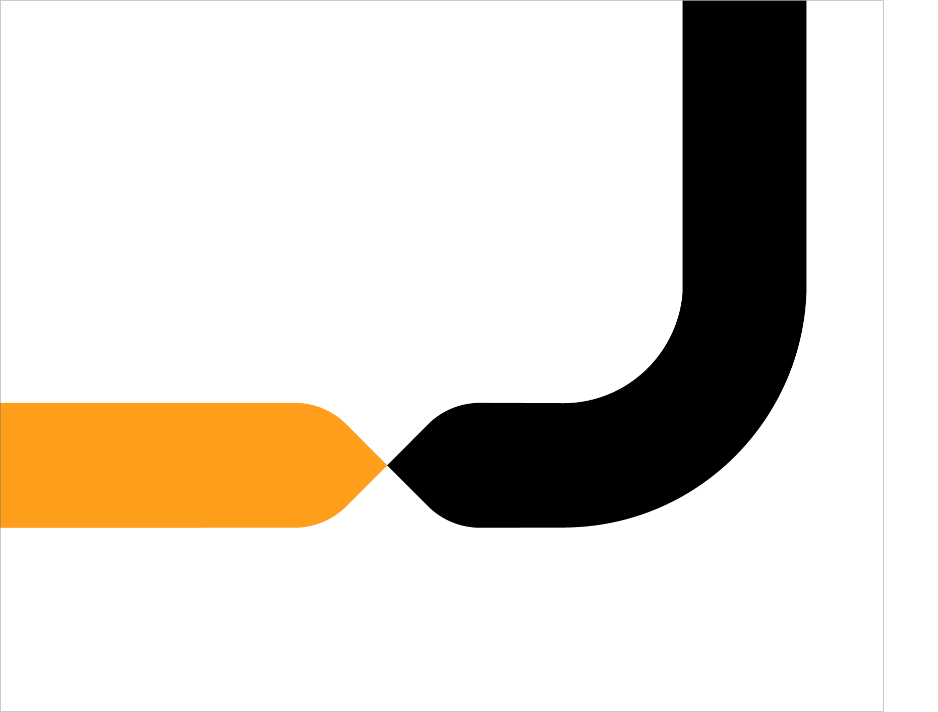
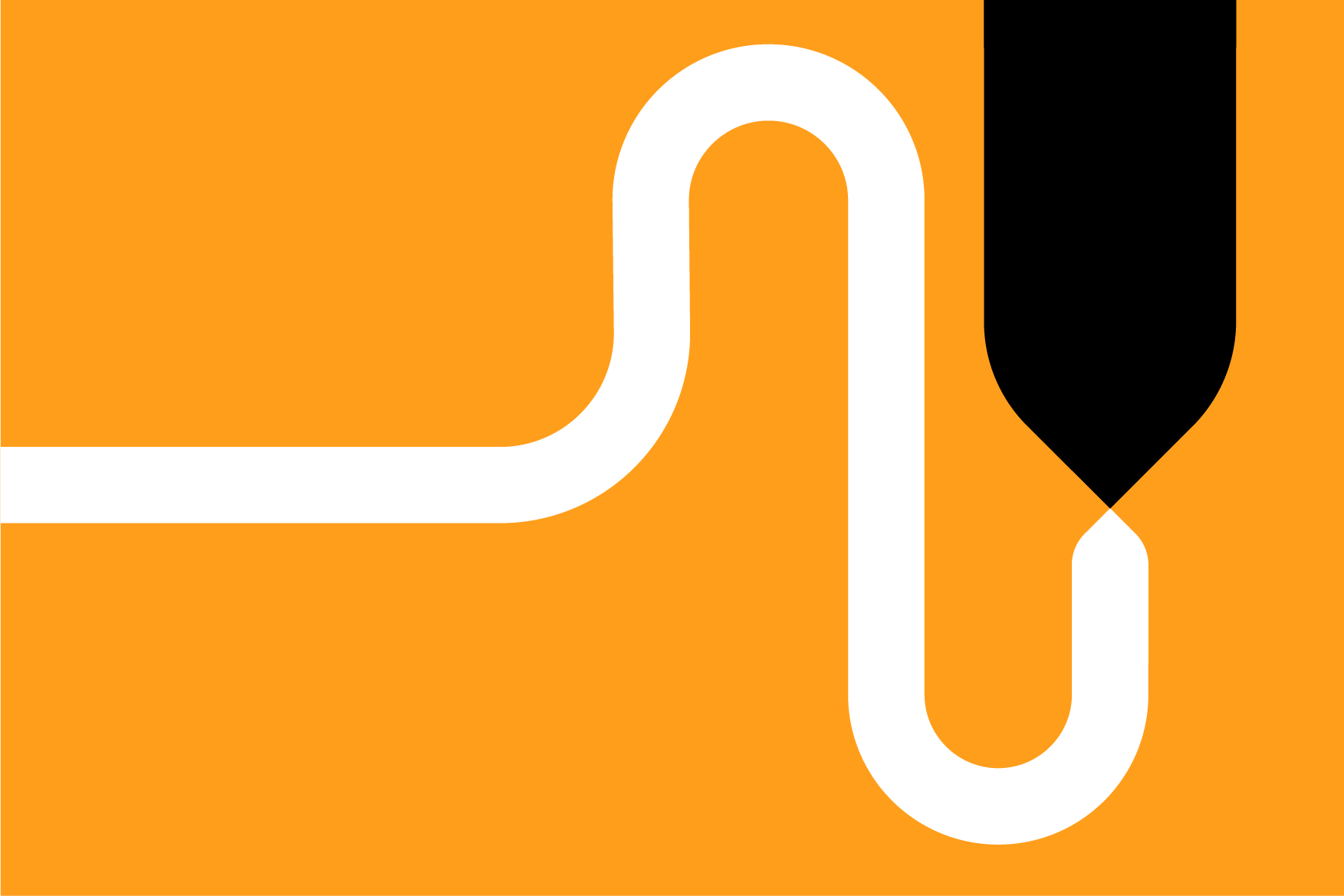
2. Slightly curved two-colour line. We use this graphic expression in layouts where our aim is to create a calm image, but make it more lively and fill in the available format.
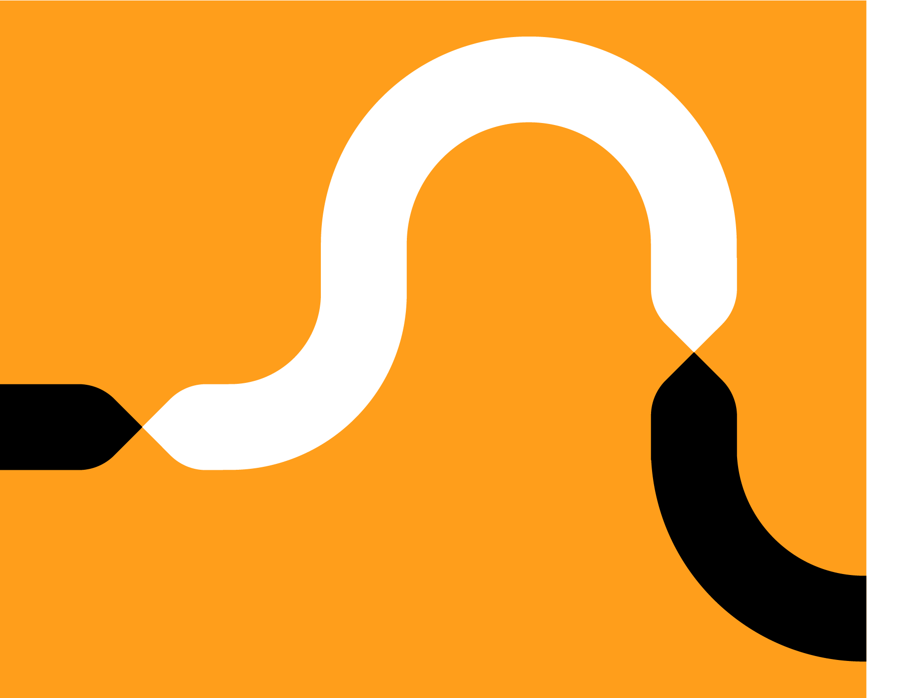
3. Heavily curved two-colour line. We use this graphic expression in layouts where our aim is to create a dynamic and energetic image.
-
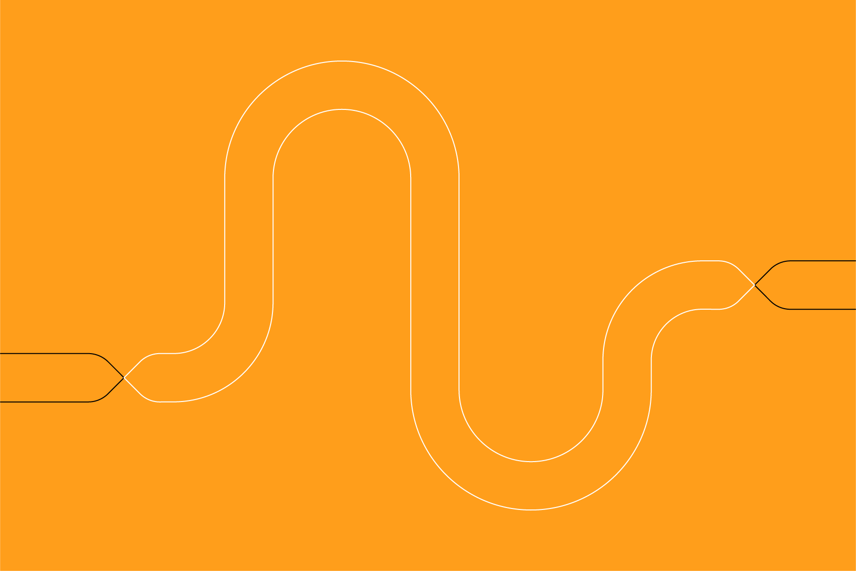
 The line is used in the colour setting of the brand.
 -
 The line sections are proportional and of the same thickness.
 -
 The line in all cases consists of two coloured parts: dark yellow and black or white and black.
 -
 The line has no start and no end.
 -
 The motif of the line is calm, uncomplicated.
 -
 The line is used with filler.
In exceptional cases, the graphic element of the line may use typography that does not distort the shape of the line and its visual fulfilment is of high quality. We never use typography on social media or other print layouts for which usage guidelines and work templates have been developed.
-
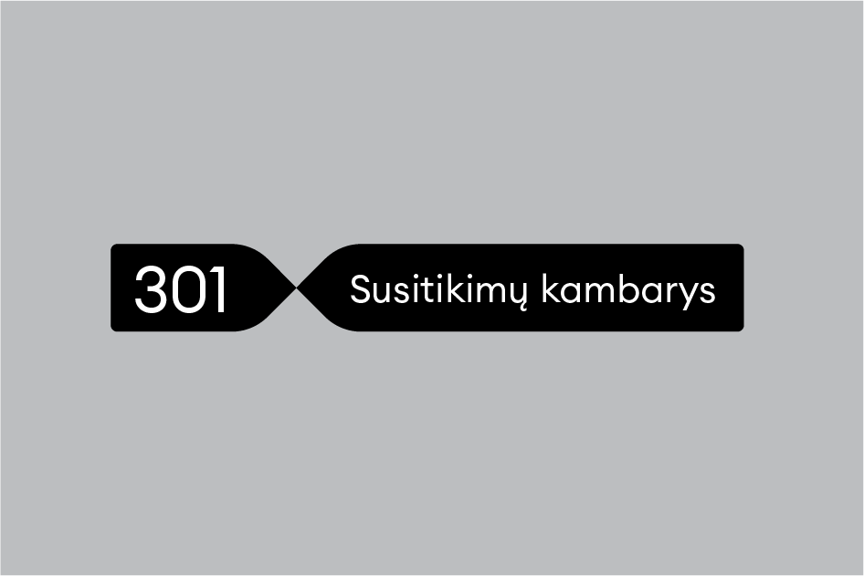 Correct useage in office labelling
 -
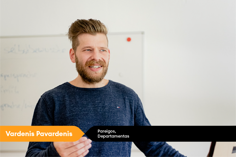 Correct useage in video communication
-
 Disproportionate use of line sections, unequal line thickness.
 -
 Monochrome lines, use of incorrect colour combinations.
 -
 Broken line.
 -
 Chaotic, angled line.
 -
 Empty line.
 -
 Photograph on top of a graphic element.
We never use a logo or other elements in the graphic element of the line that would violate or otherwise distort the overall identity and visual rules of the LTG Group.
We never use typography on social media or other print layouts for which usage guidelines and work templates have been developed.
-
 Incorrect useage of graphic element and logo
 -
 Incorrect useage of graphic element and text
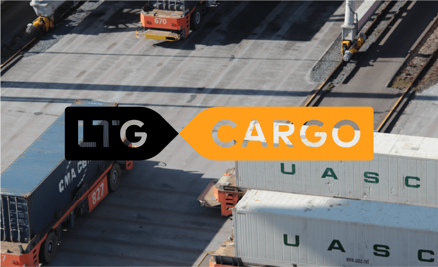
Photo style guidelines will explain how to represent different objects or spaces, help you find the right photos in your photo bank archives, and provide tips for photographers.
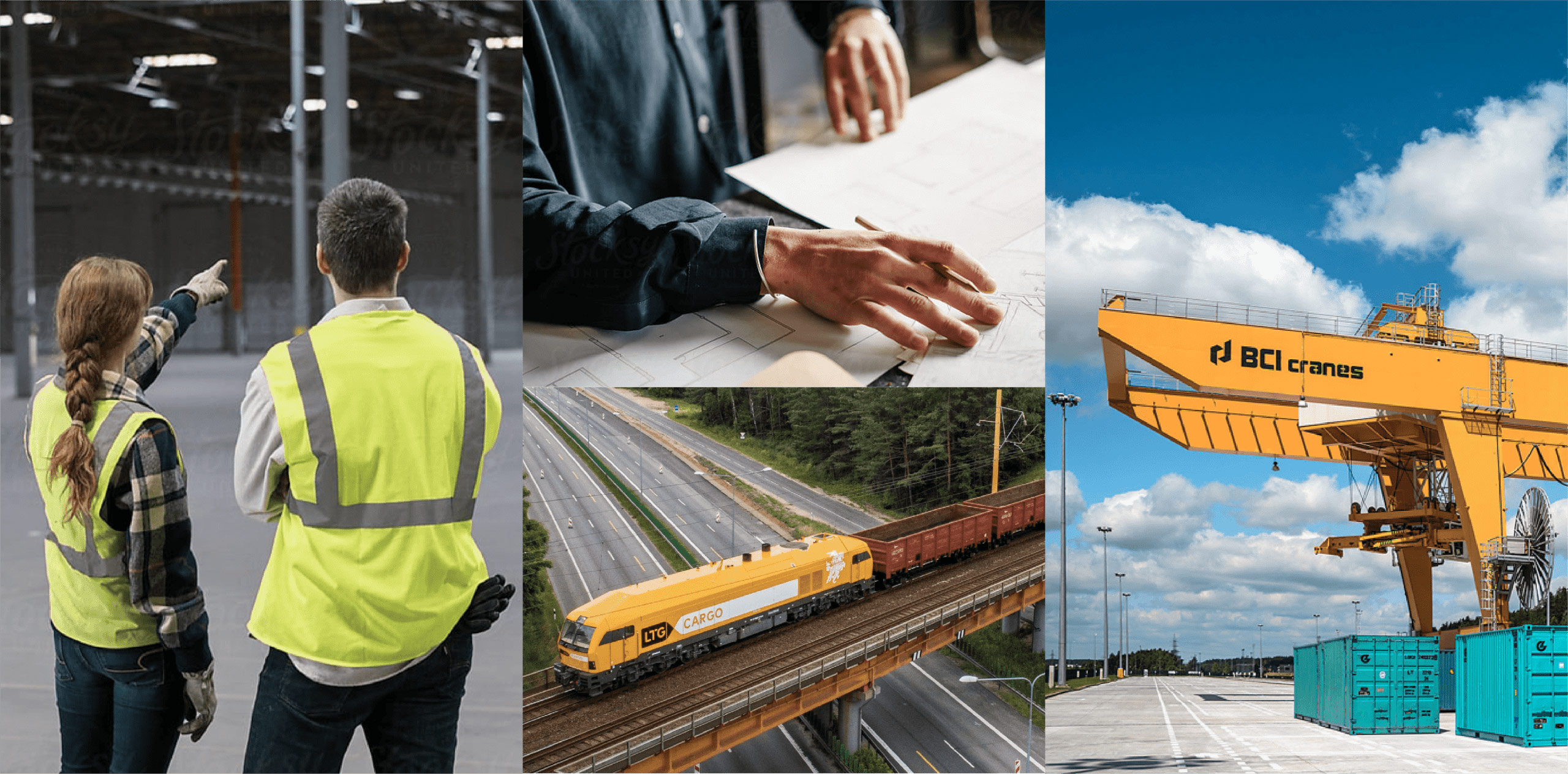
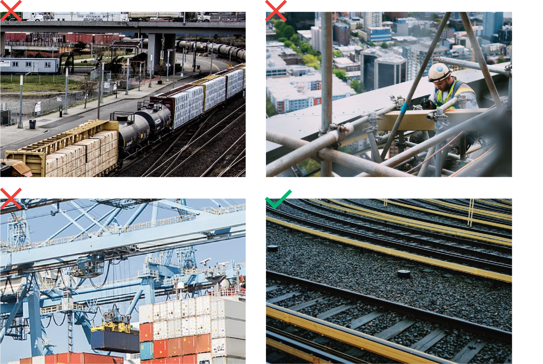
In order to properly communicate brand values, we select photos that meet the following criteria:
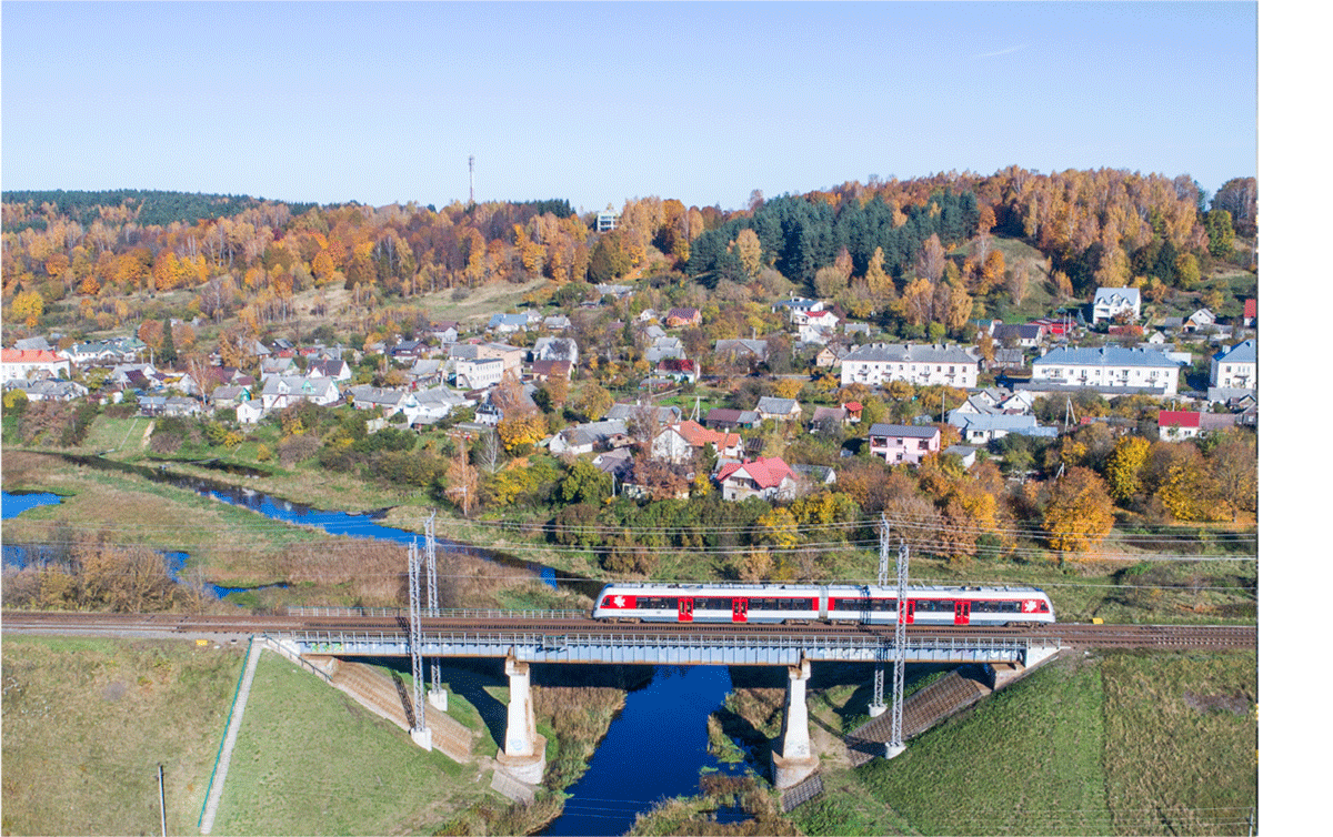
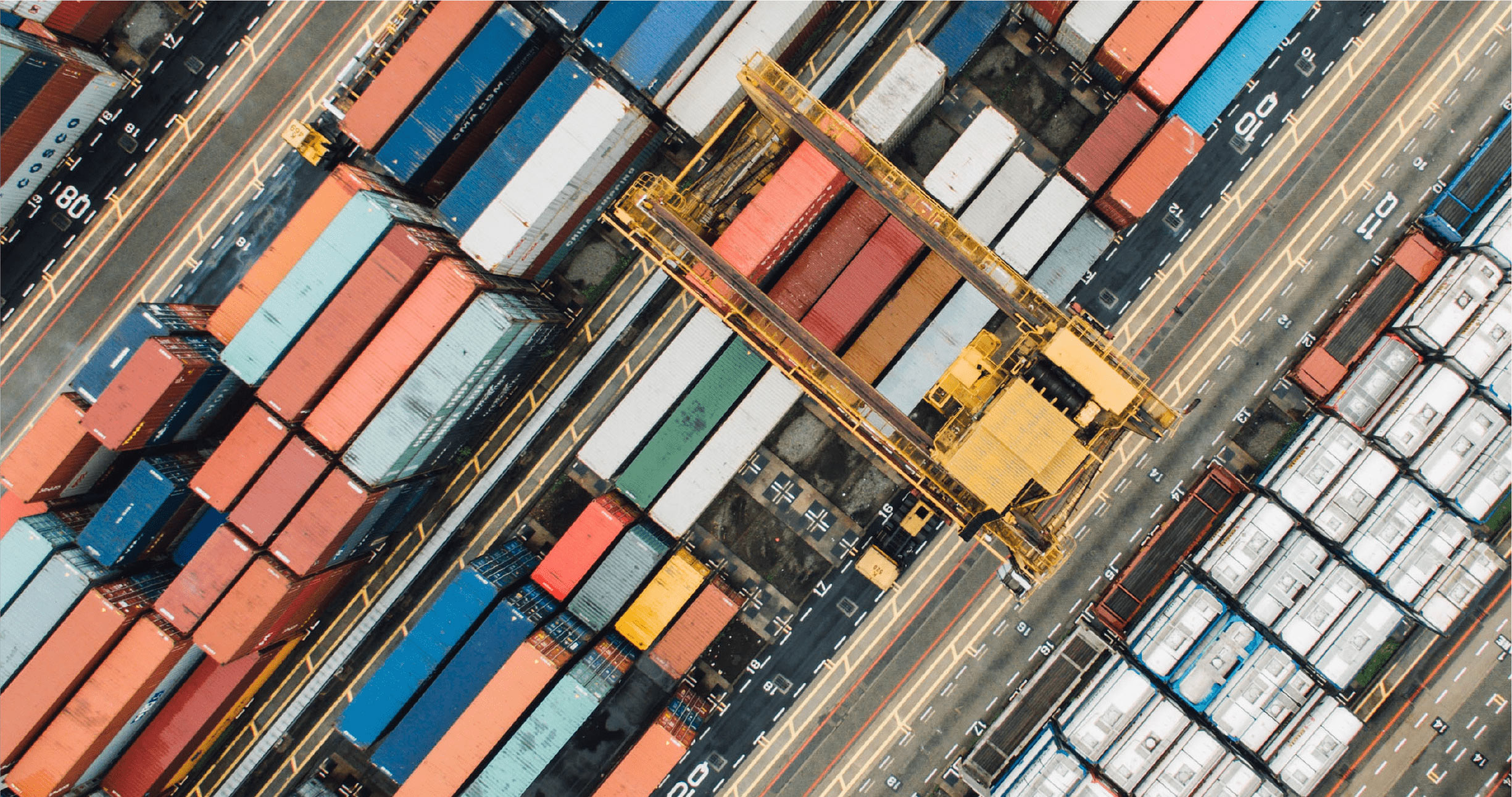
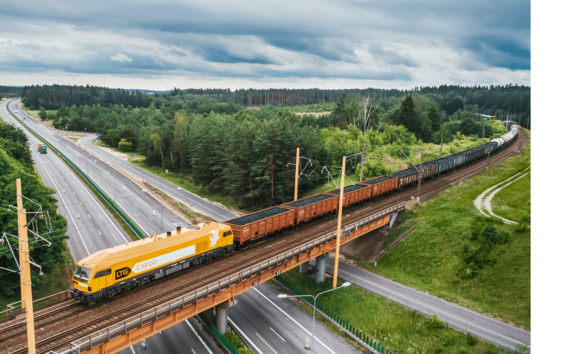
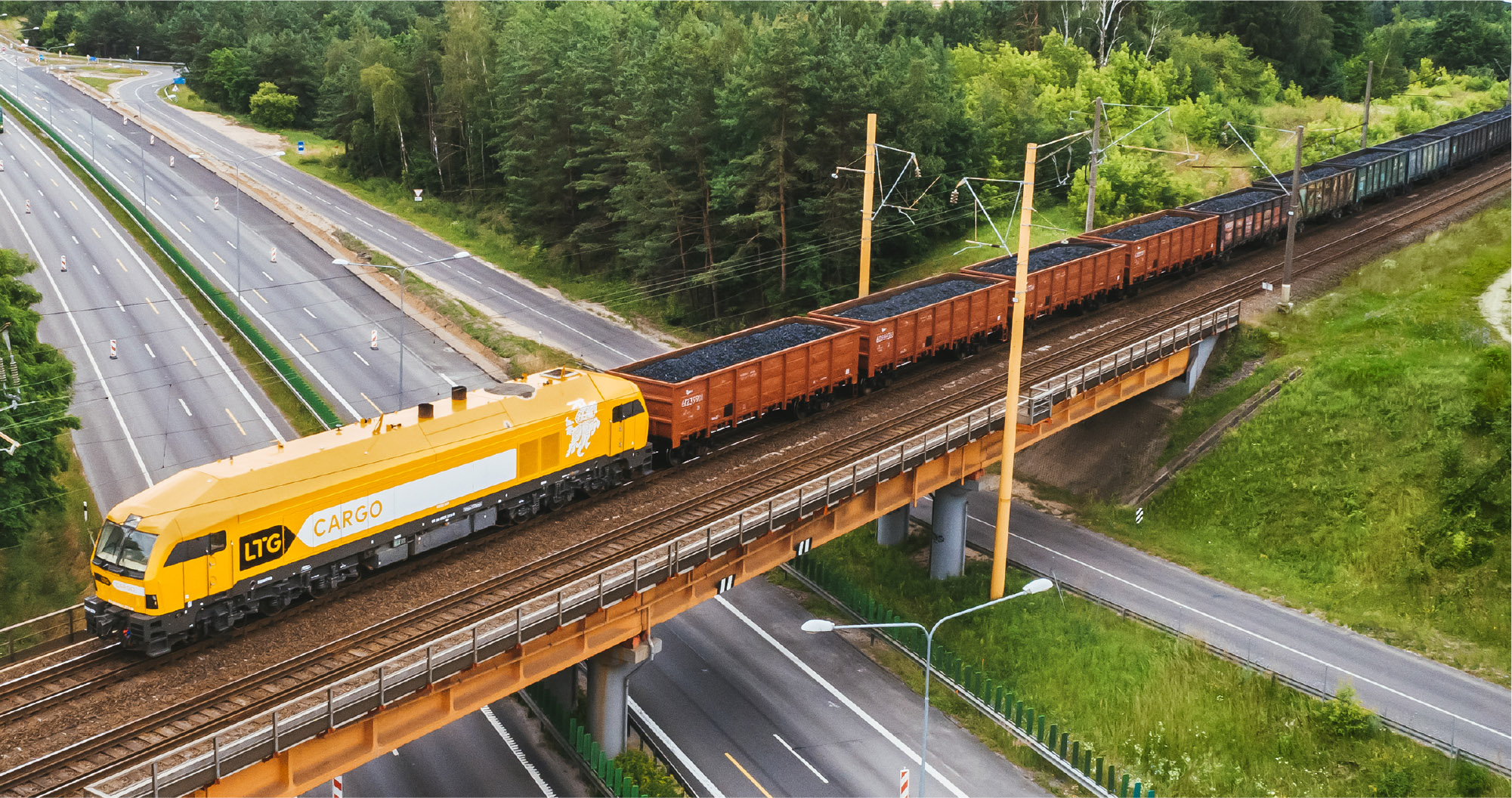
Lithuanian setting: make sure that the photo setting would refer to Lithuania.
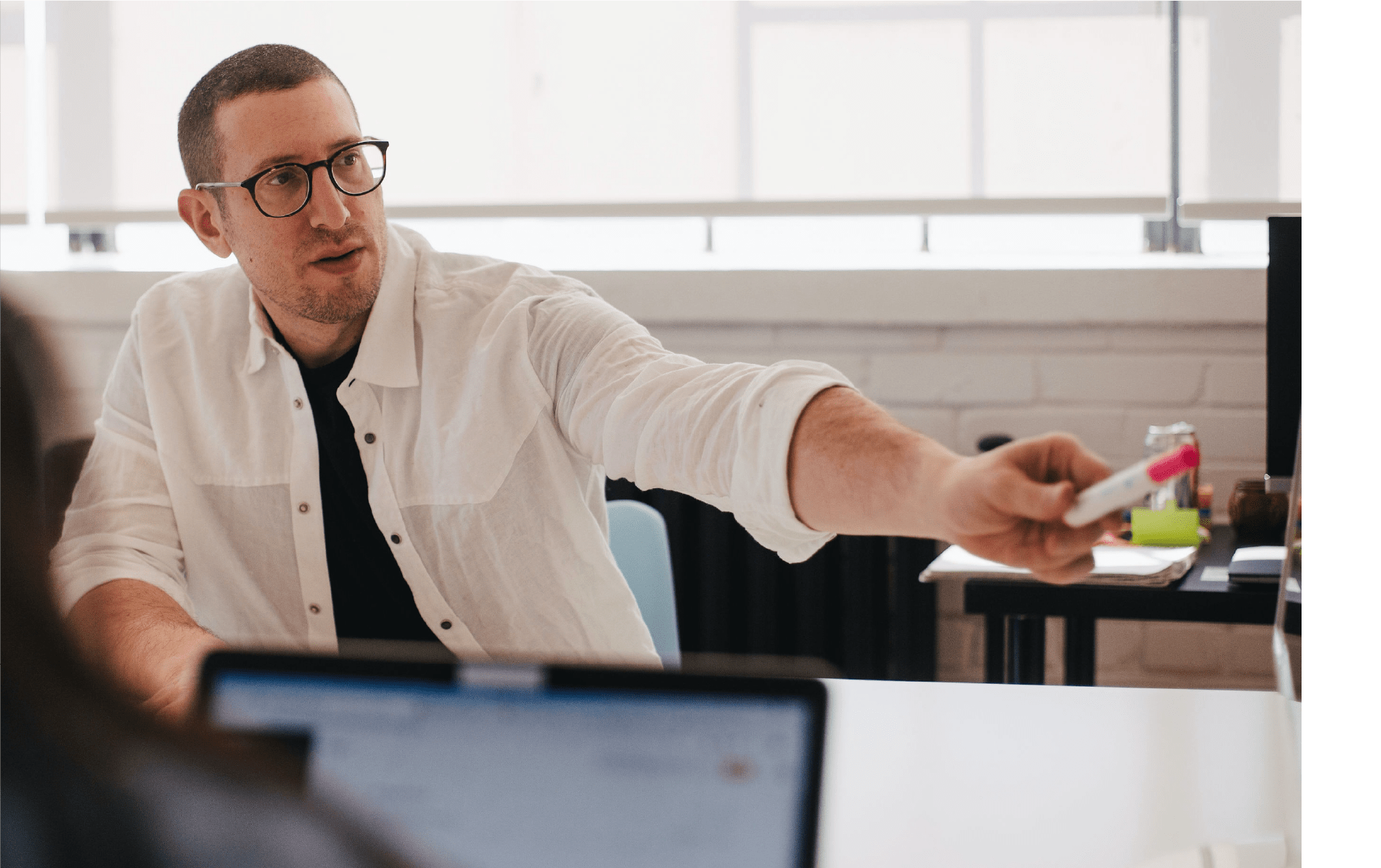
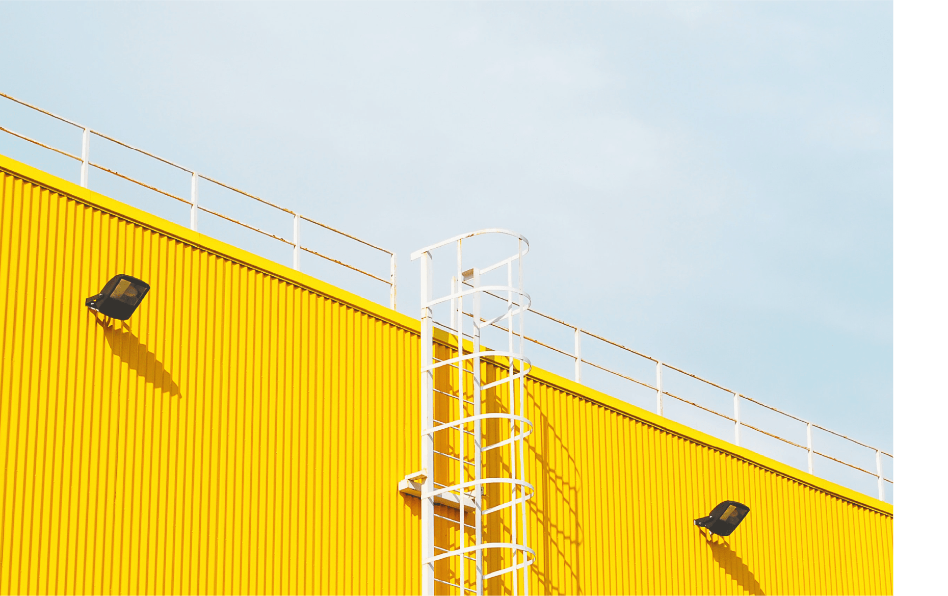
Appropriate scene: a scene that depicts work processes, modern equipment, rails and freight.
Natural light: reminds or depicts natural daylight.
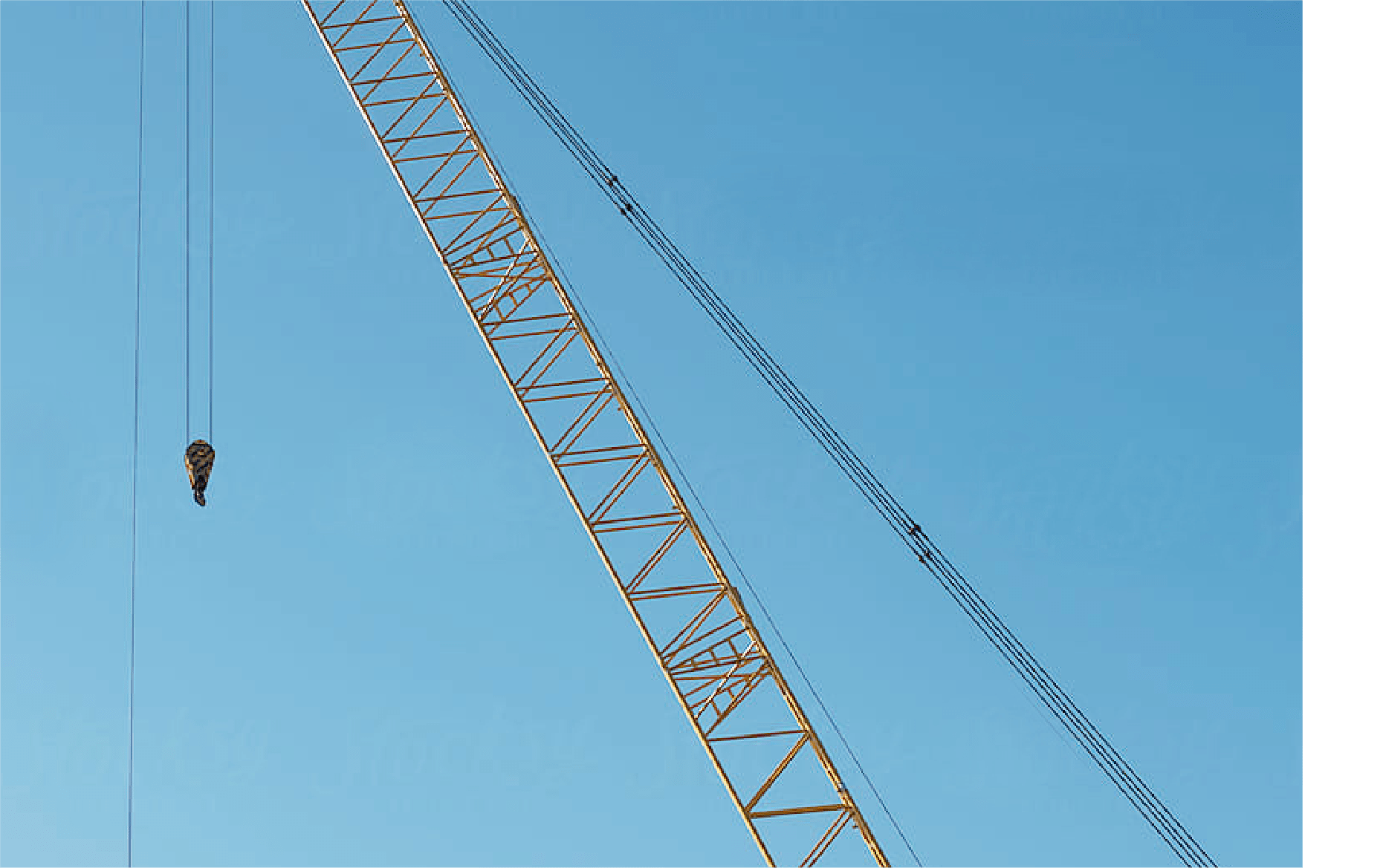
Clean composition: leave space for the object, emphasize uncomplicated backgrounds and situations.
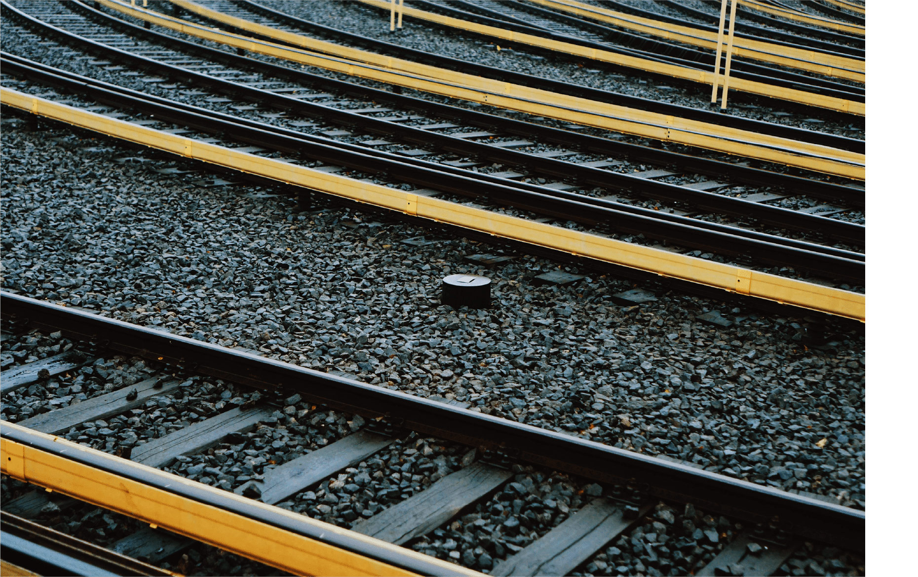
We depict not only rails, structures or freight, but also roads. Images from easily recognizable places and spaces in Lithuania are displayed. The photos reveal work processes and modern equipment.
What to avoid?
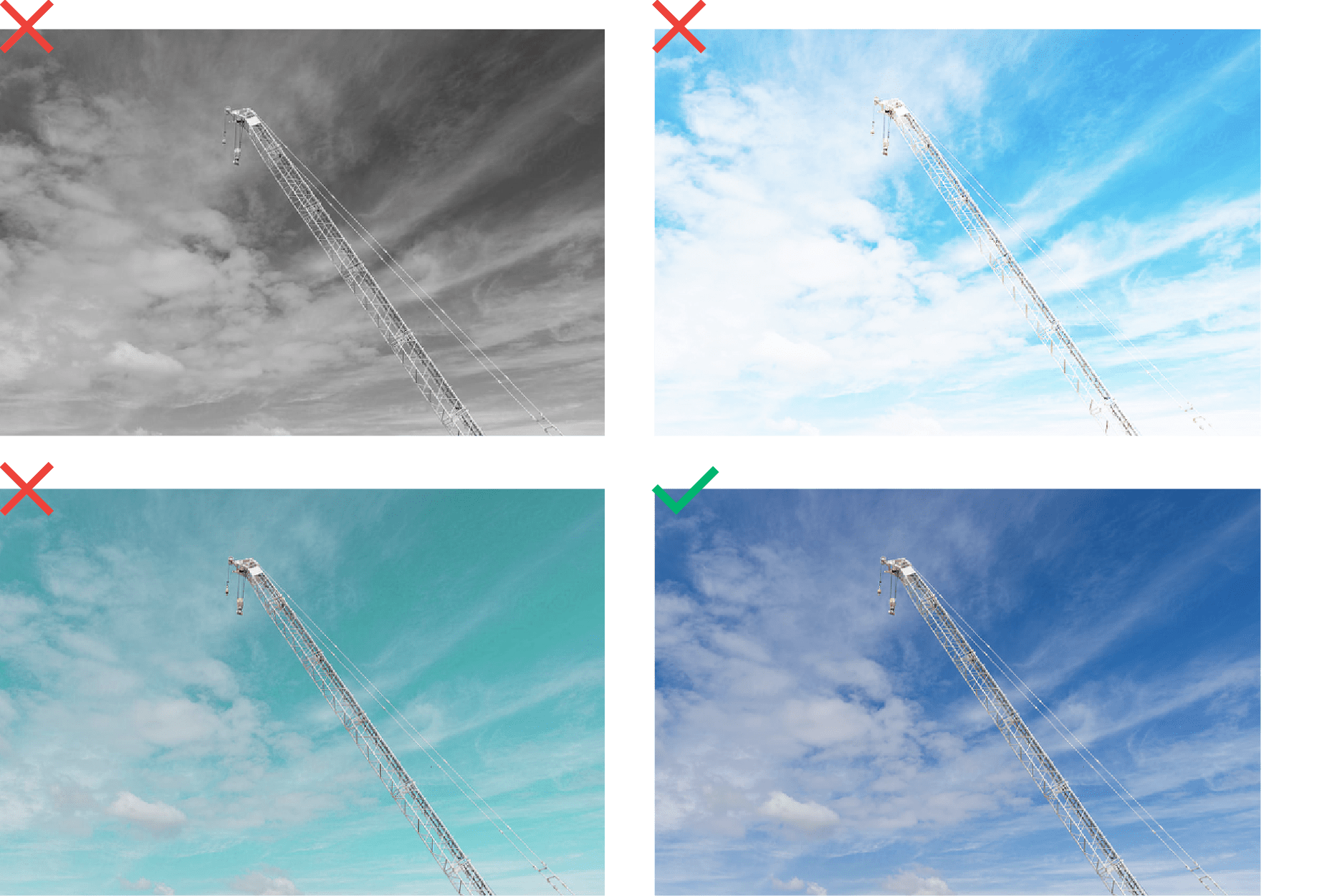
Filters: use of photos with colour filters – artificial colours, black and white filters.
Complicated composition: the depicted object must be clearly visible – we recommend avoiding noisy, intense backgrounds and situations.
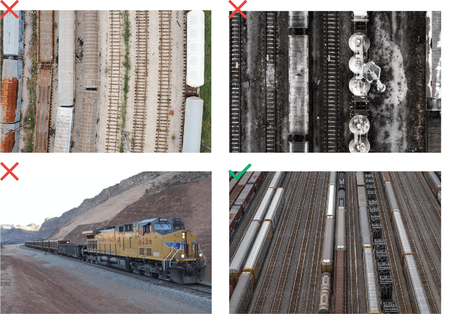
Inadequate setting: the environment must be similar to the Lithuanian landscape / city, we avoid depicting old equipment, overly industrial and dirty setting.
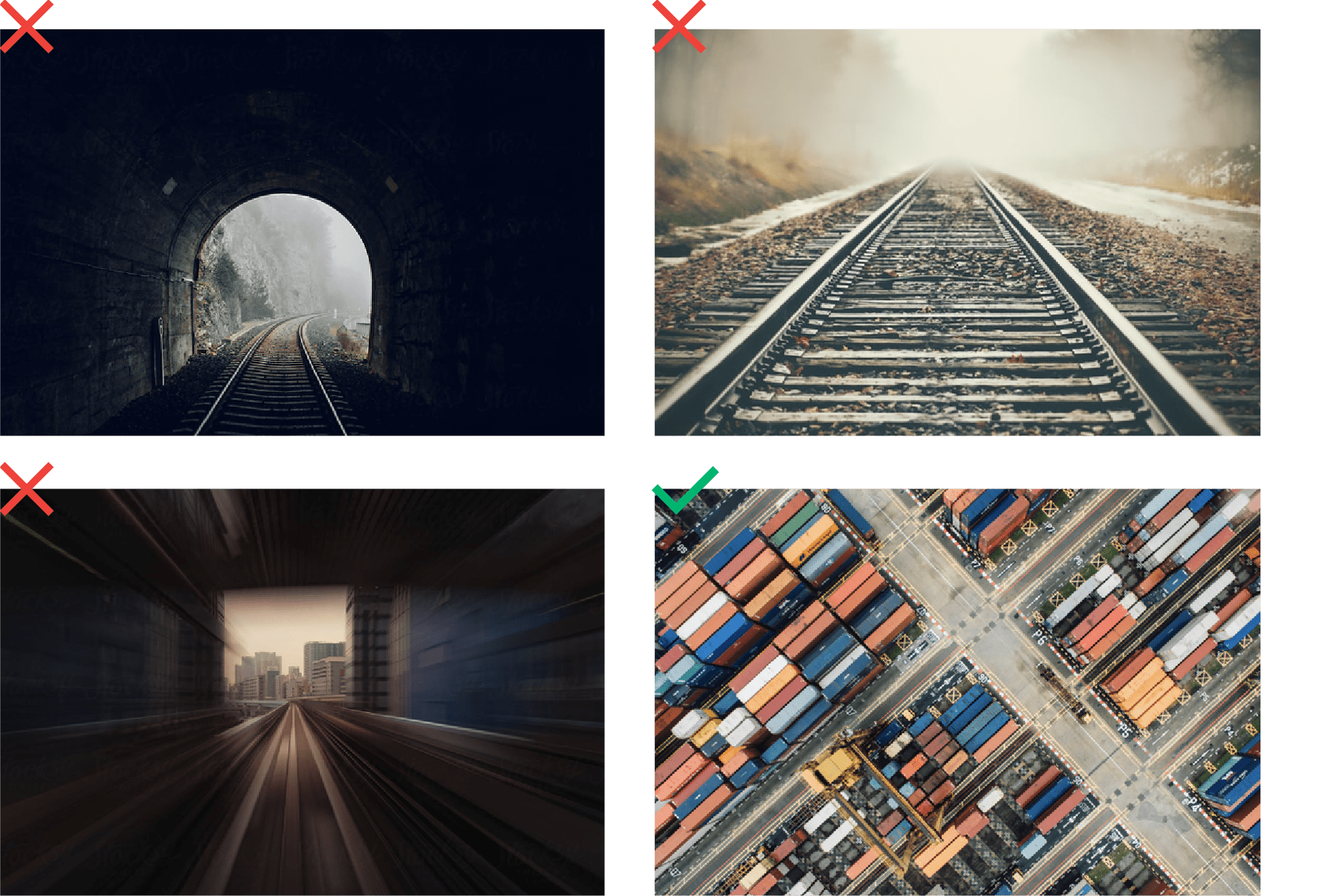
Dramatic, unnatural lighting: the photo lighting ration should not include to much contrast.
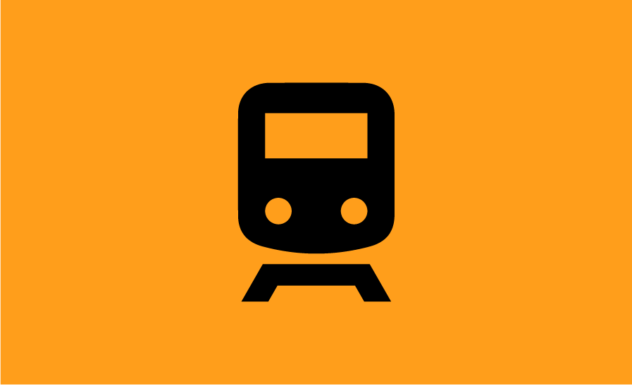
This is the original LTG Cargo iconography collection, designed to reveal the identity style across all necessary visual means. The style of the icons is dictated by the connection of the two elements depicted in the logo. All icons are made up of two colours on each company logo. Icons combine a line and a spot element.

Icon construction
– All icons are created in a 46 × 46 grid of cells.
– Icons always consist of a line and a spot.
– We use two colours in the icon:
dark yellow #ff9e1b (R:255 G:158 B:27 / C:0 M:45 Y:94 K:0 / Pantone 1375 C) and black #000000 (R:0 G:0 B:0 / C:75 M:68 Y:67 K:90 / Pantone Black 6C).
This is the basic set of LTG Cargo icons, illustrating the main services and messages of LTG Cargo. You can download all the icons by clicking the link below.
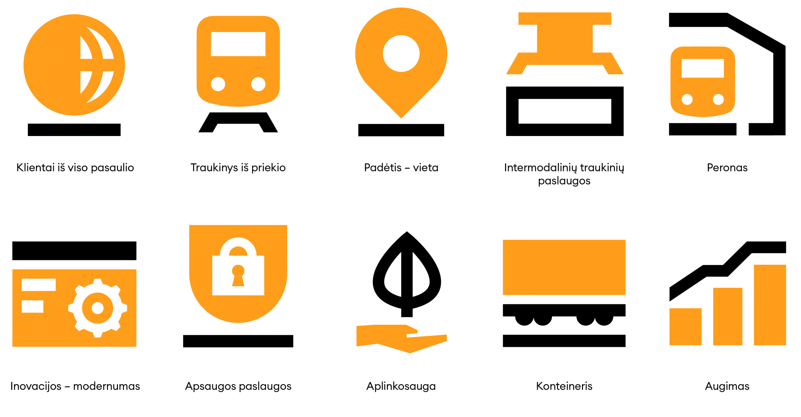
Icon readability
To ensure proper readability of the icons, especially in small formats (smaller than 100 × 100 px), we replace the colour icons with solid black ones.
-
 Correct useage on white background.
 -
 Correct useage on grey background.
 -
 Correct useage on black background.
 -
 Correct useage on dark yellow background.
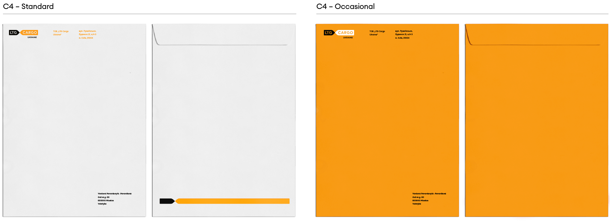
The following is an example of the form design, we recommend that you review and update the details and other personal or legal information before use.
![]()
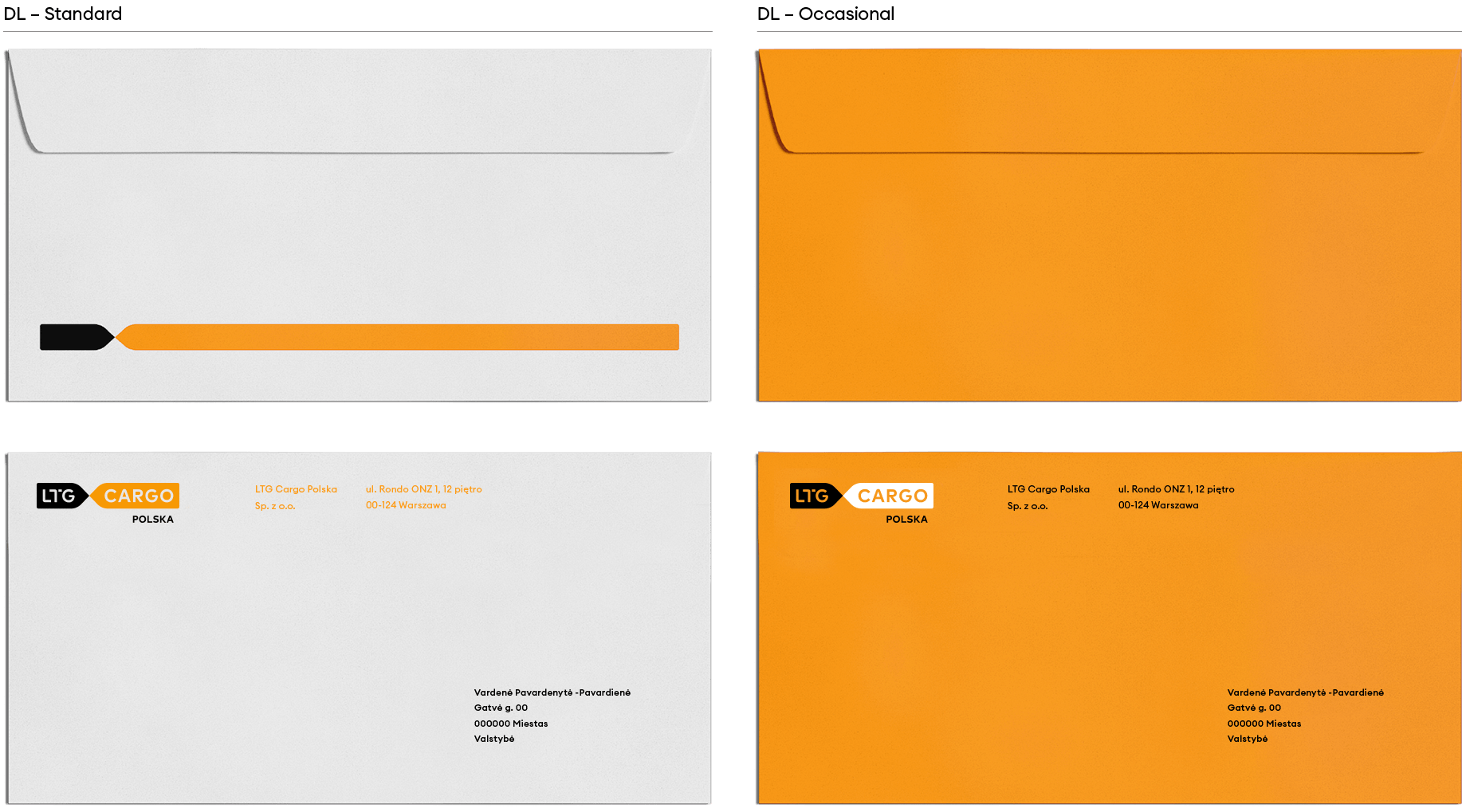
It is recommended to choose grey paper and use a graphic (line) with an embossing.
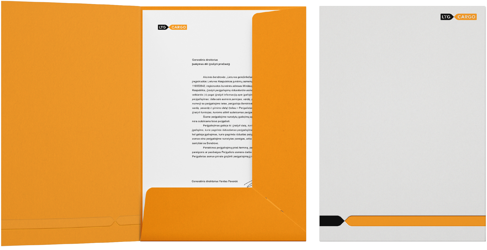
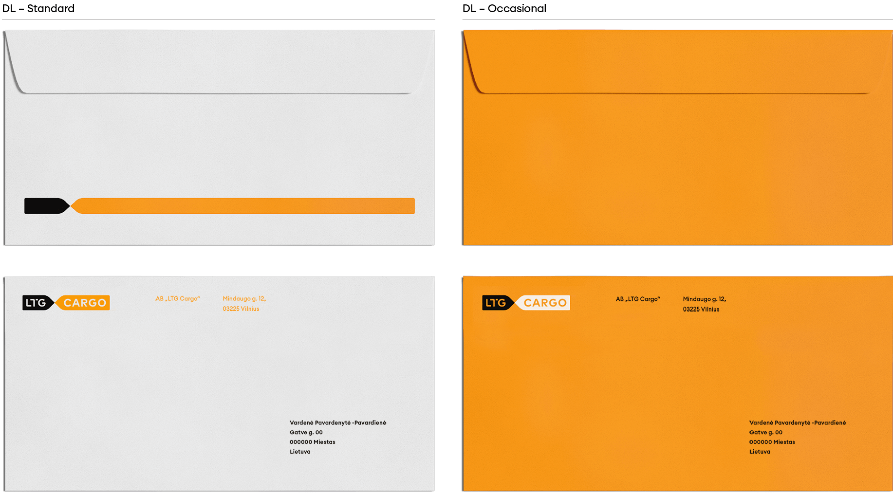
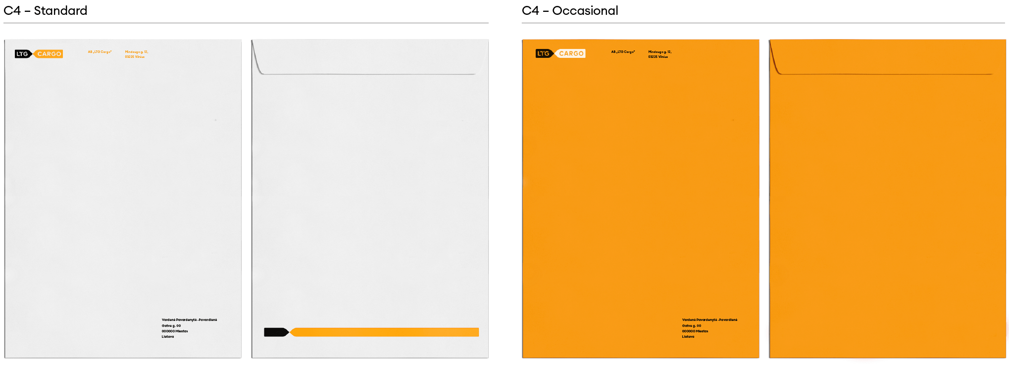
The following is an example of the envelope, we recommend that you review and update the details and other personal or legal information before use.
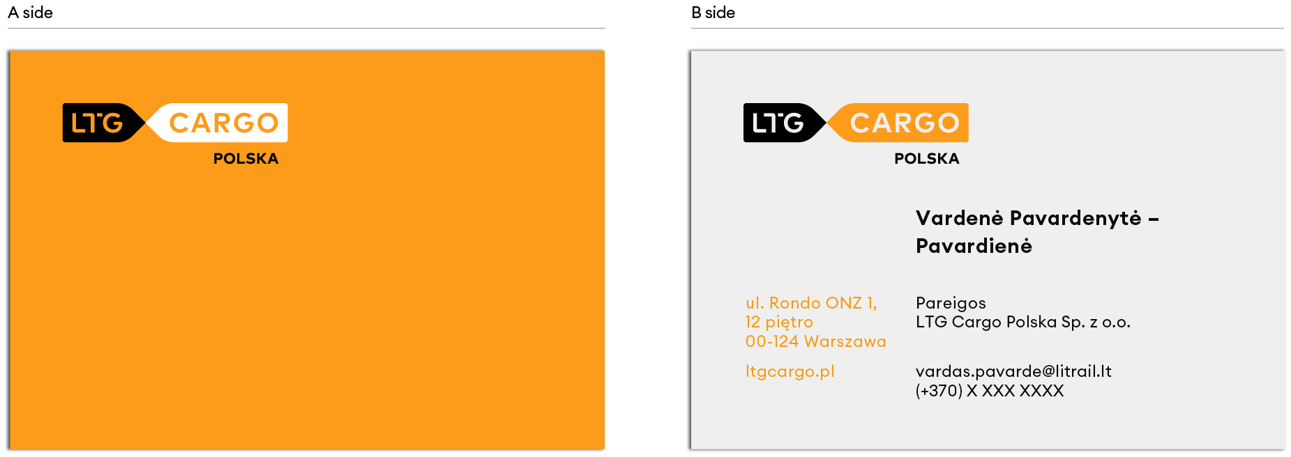
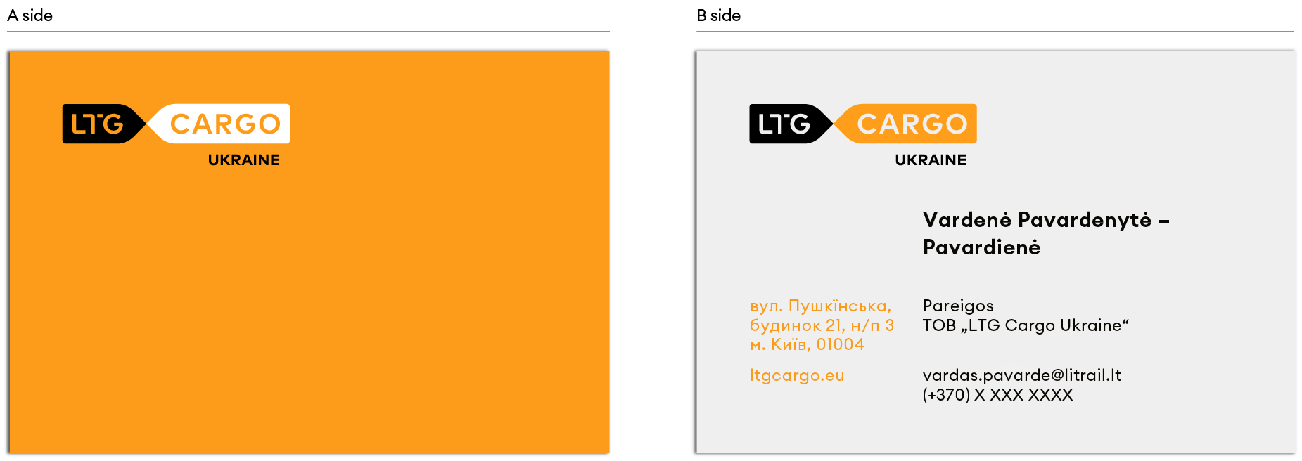
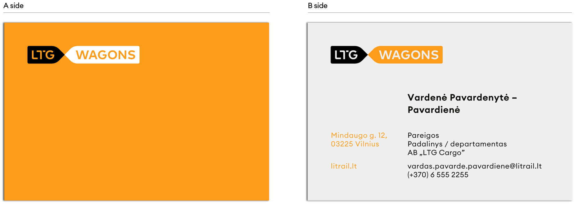
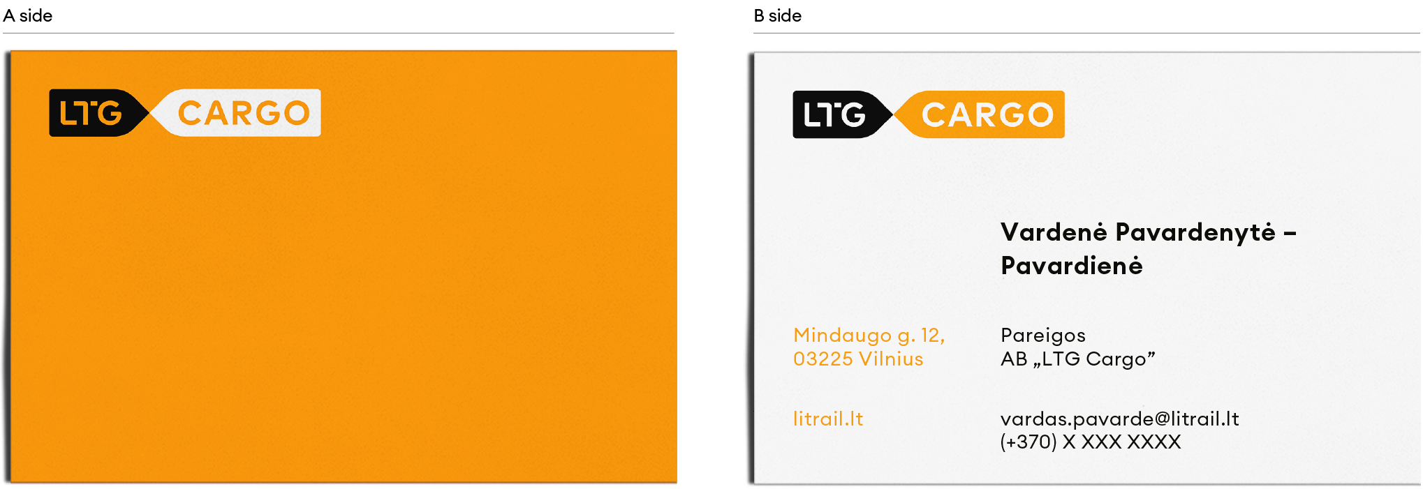
The following is an example of the business card, we recommend that you review and update the details and other personal or legal information before use.
Download business card template
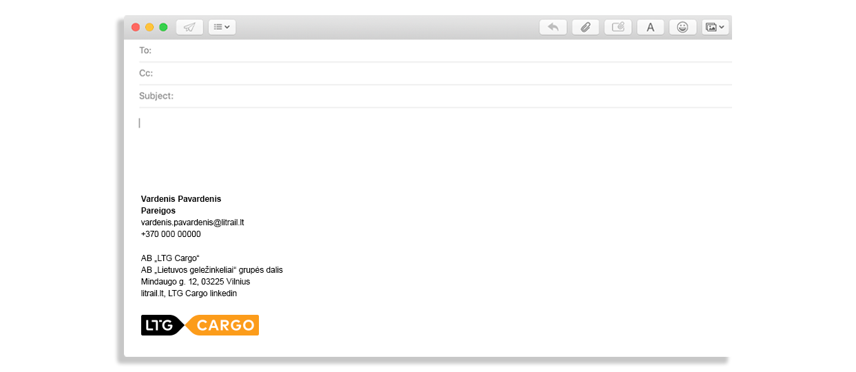
The following is an example of the e-signature, we recommend that you review and update the details and other personal or legal information before use. We use 11 pt Arial font, Bold version to write the name, surname and position / department. For the remaining company details we use 11 pt Arial font, Regular version.
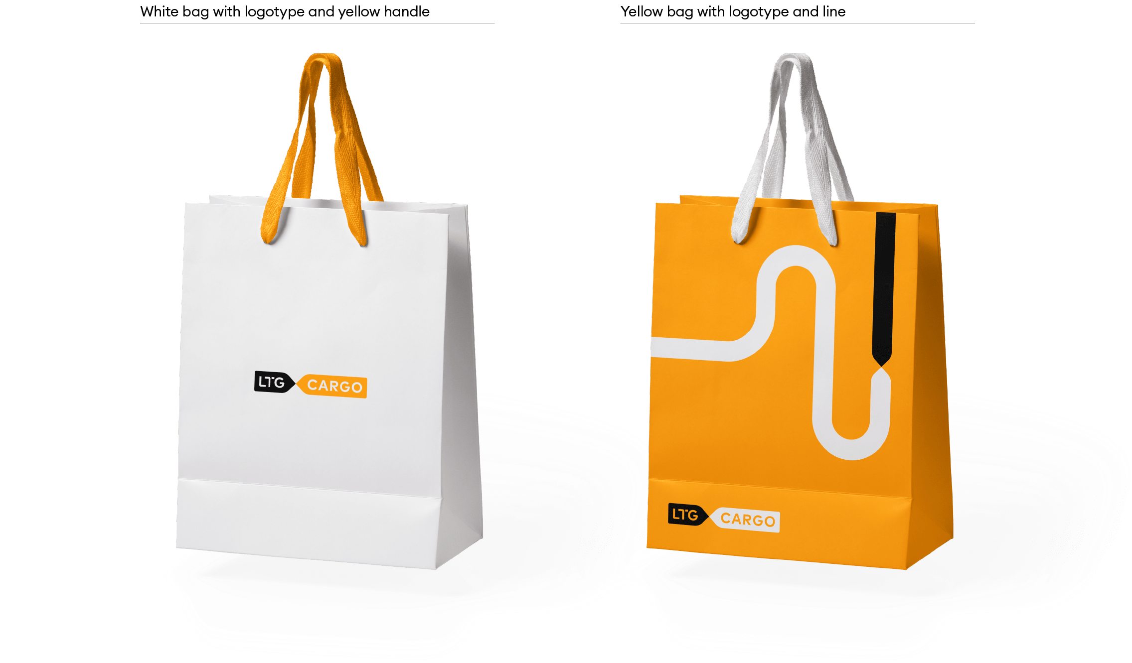
The main version of the logo is used. Dimensions of gift bags:
- Small – 20× 24 cm
- Medium – 26× 5 cm
- Large – 45× 55 cm
-
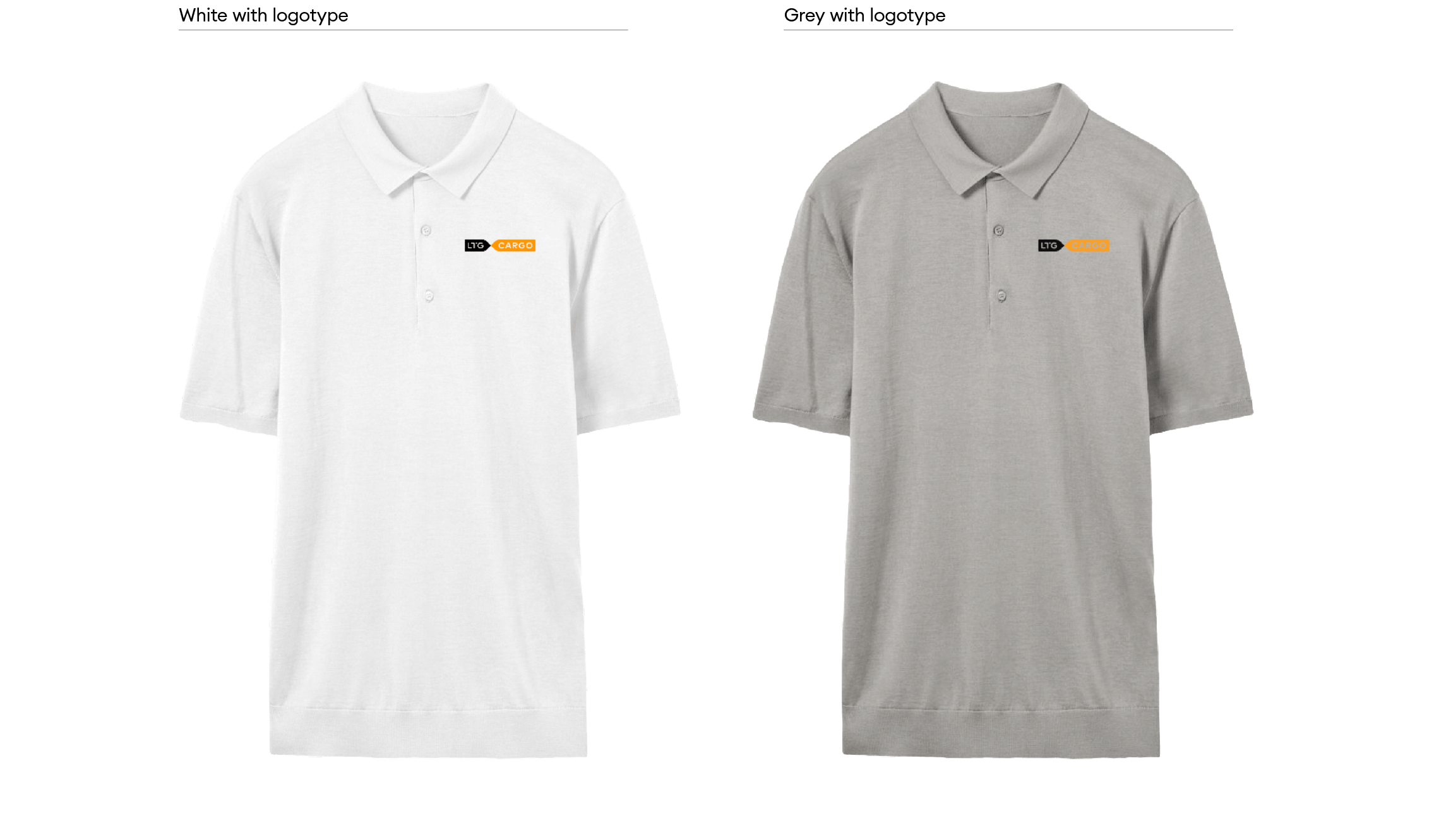
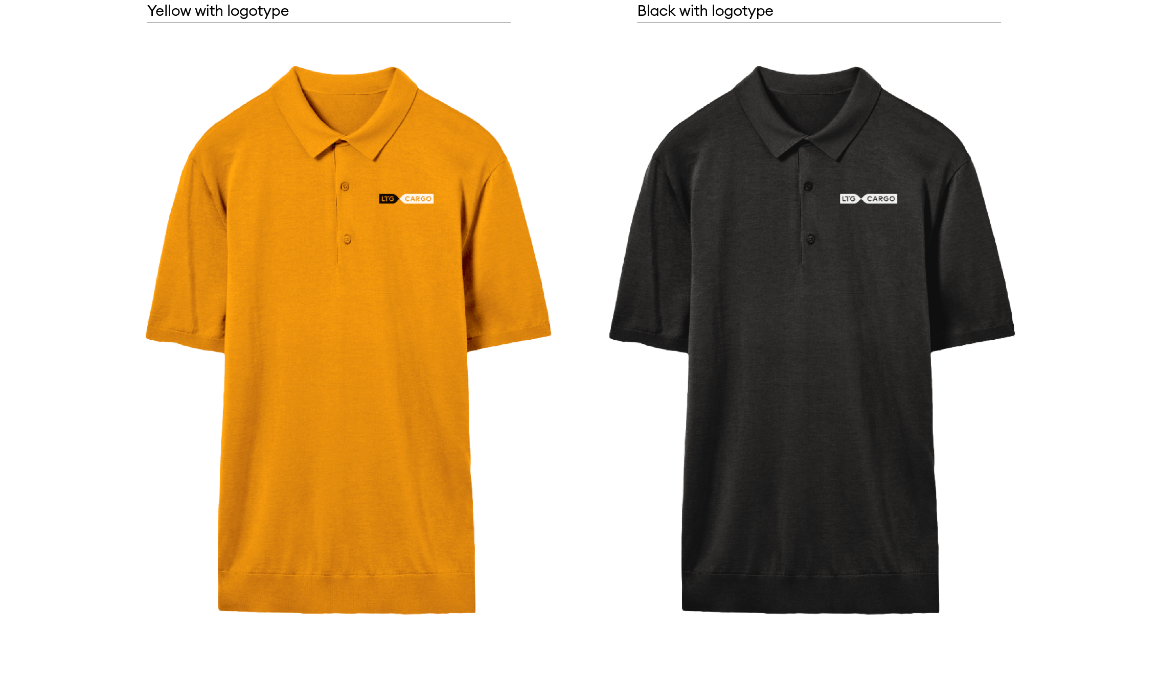
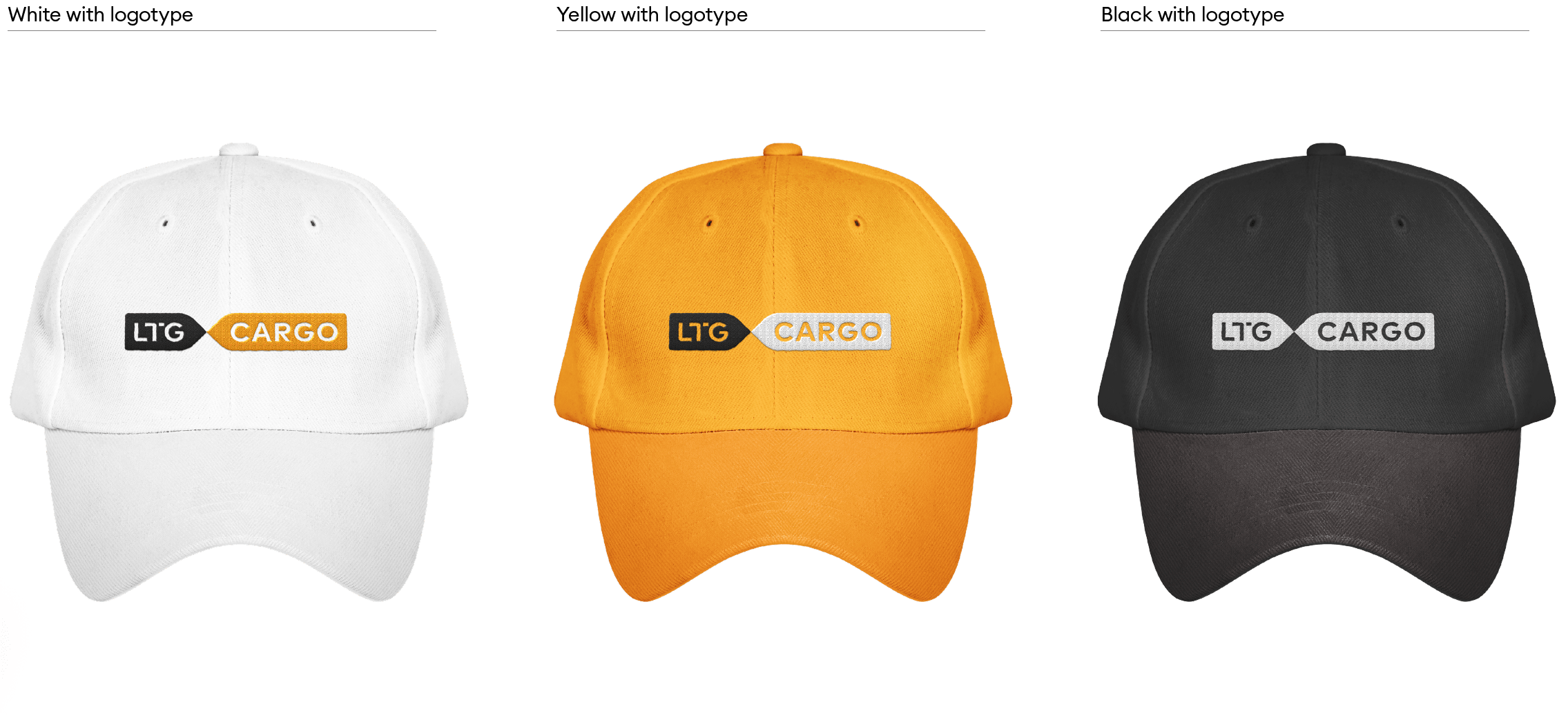
Polo t-shirts
The main version of the logo is used. Logo: if possible – embroidered, if not – printed version. Preliminary logo dimensions: 57 x 10 mm
-
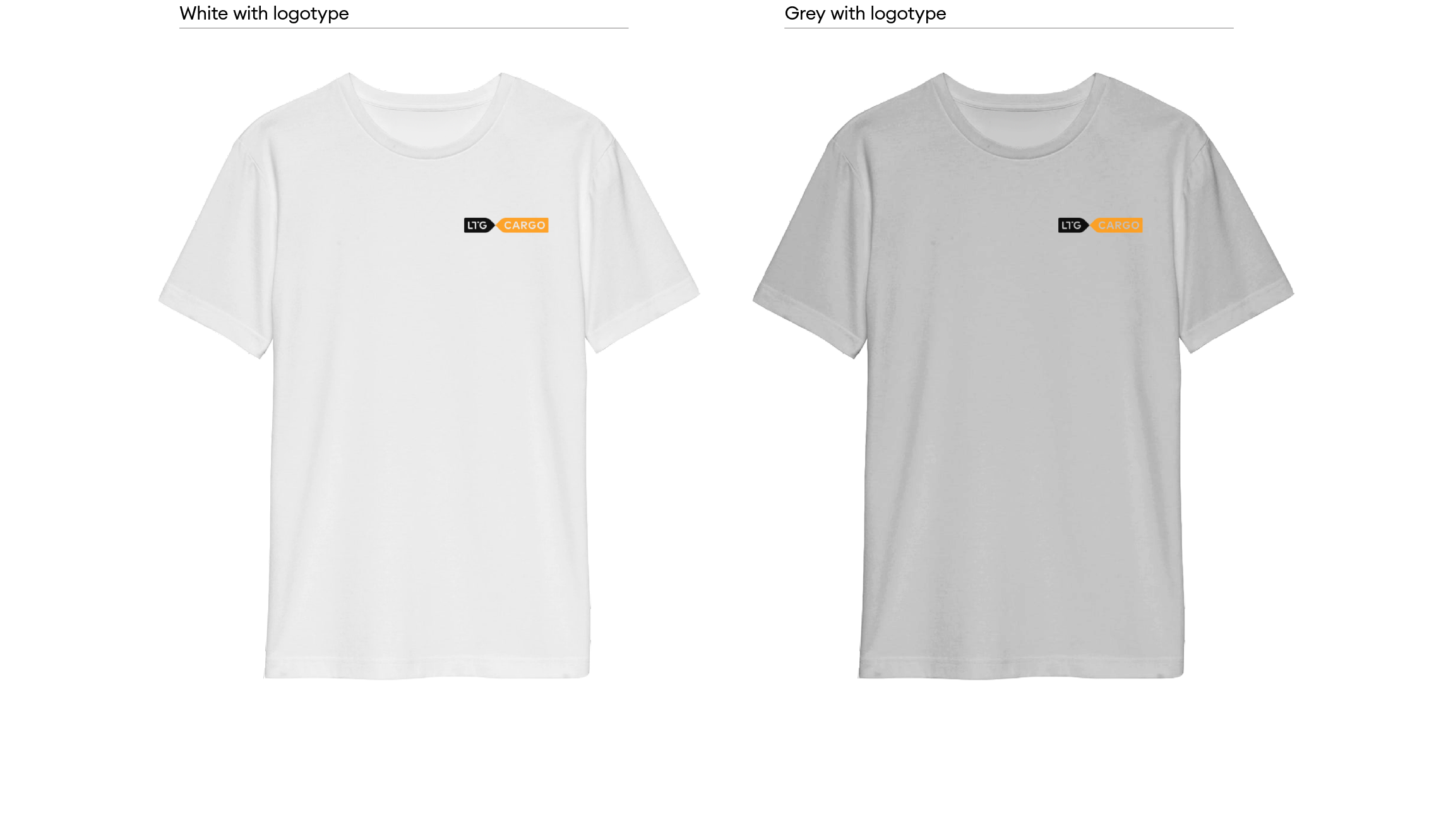
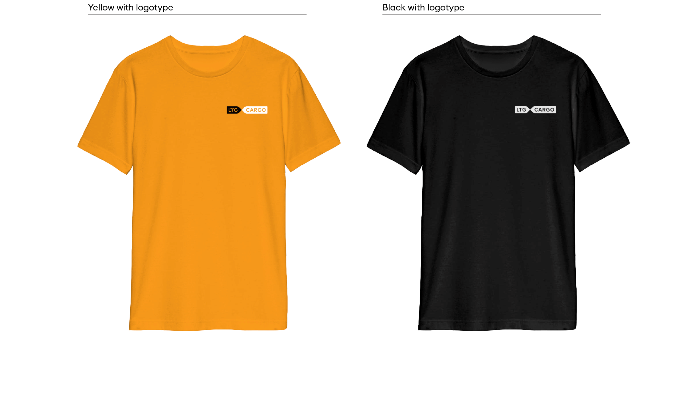
Basic t-shirts
The main version of the logo is used. Logo: if possible – embroidered, if not – printed version. Preliminary logo dimensions: 85 x 15 mm
-
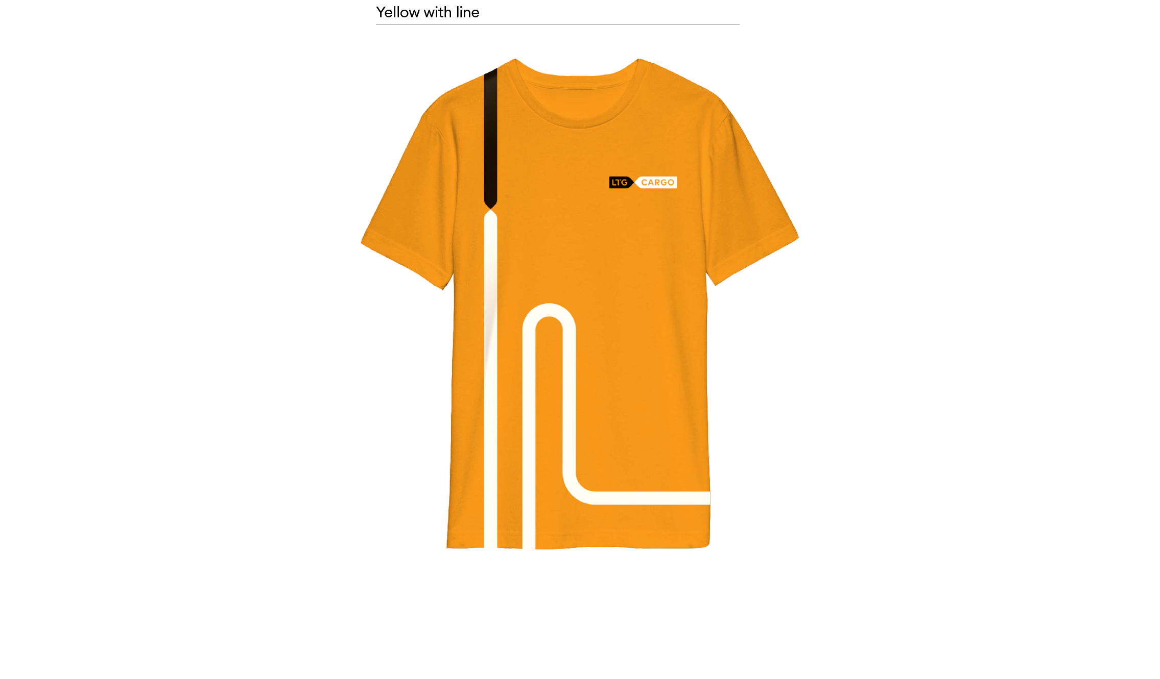
Unique t-shirts
The main version of the logo is used. Logo: if possible – embroidered, if not – printed version. Preliminary logo dimensions: 85 x 15 mm
The main version of the logo is used. Logo: if possible – embroidered, if not – printed version. Preliminary logo dimensions: 57 x 10 mm
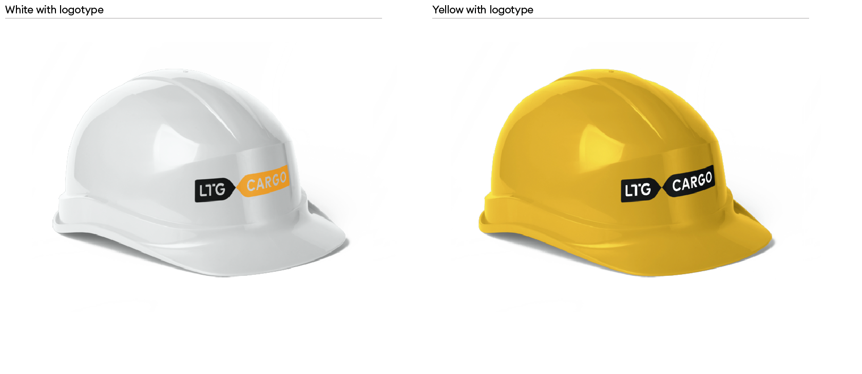
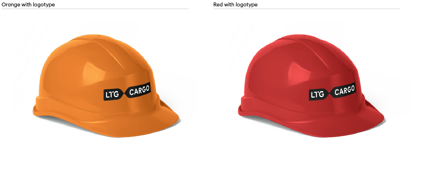
A third version of the logo is used.
The size of the logo is 103.4 x 18 mm
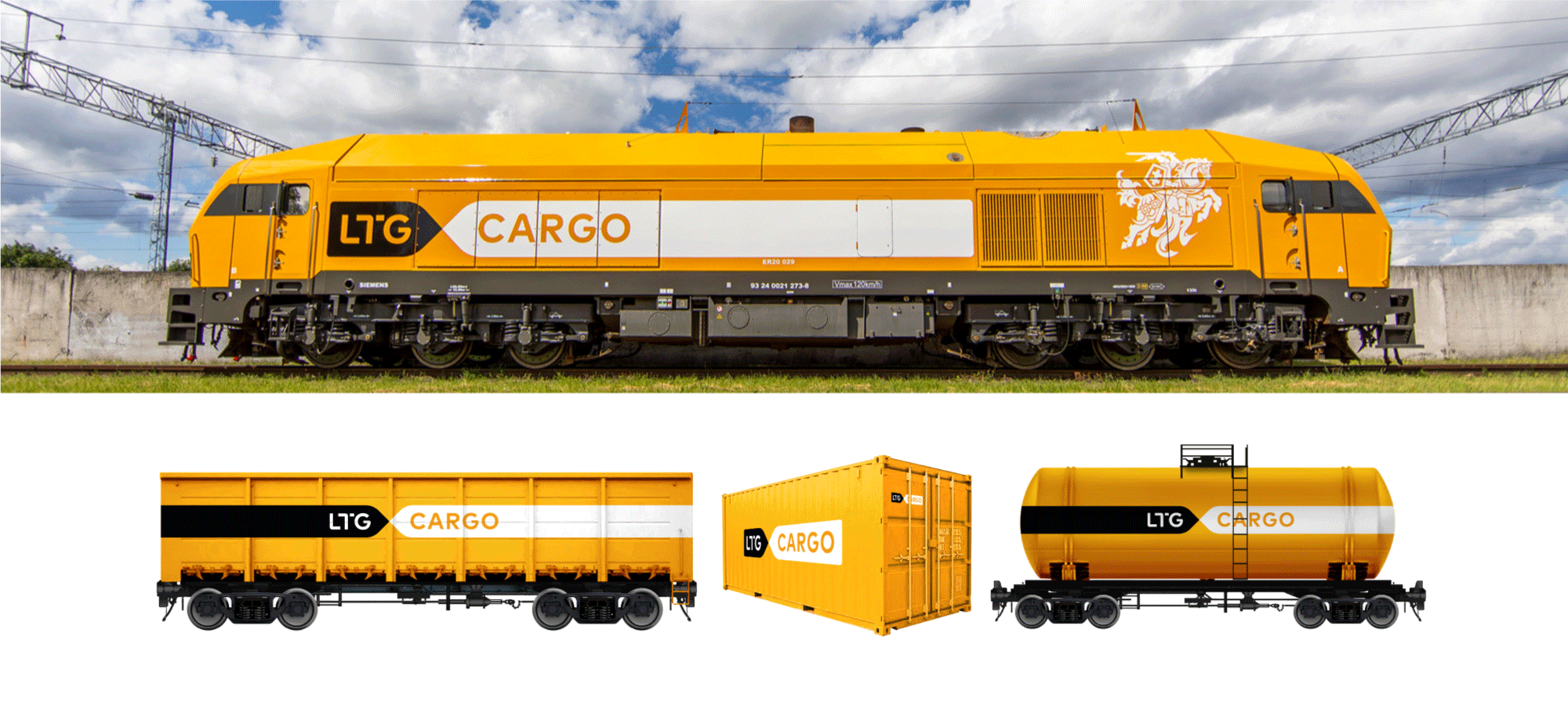
If it is possible to paint the machinery in LTG Cargo colours, an alternative version of the LTG Cargo logo can be used for marking. The main logo or an alternative logo with a white LTG element is used on a grey background. The main logo is used on a yellow background. The stripes of the logo are extended to the fullest possible width after the logo, depending on the relief, is incorporated, ensuring maximum readability. Due to the often complex relief of locomotives, the marking solution is adapted to each model individually.
Logos are glued (adhesive tape) or painted (stencil coating).
Download locomotive marking manual
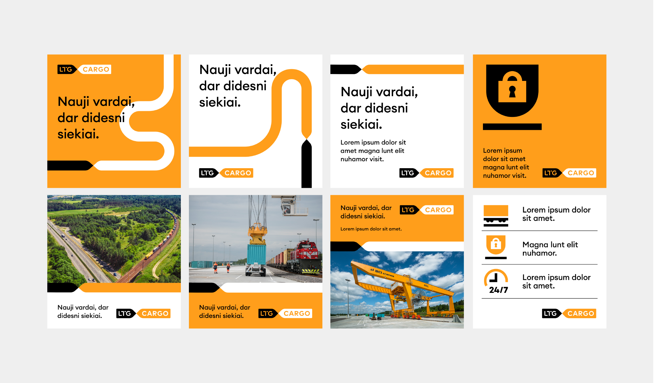
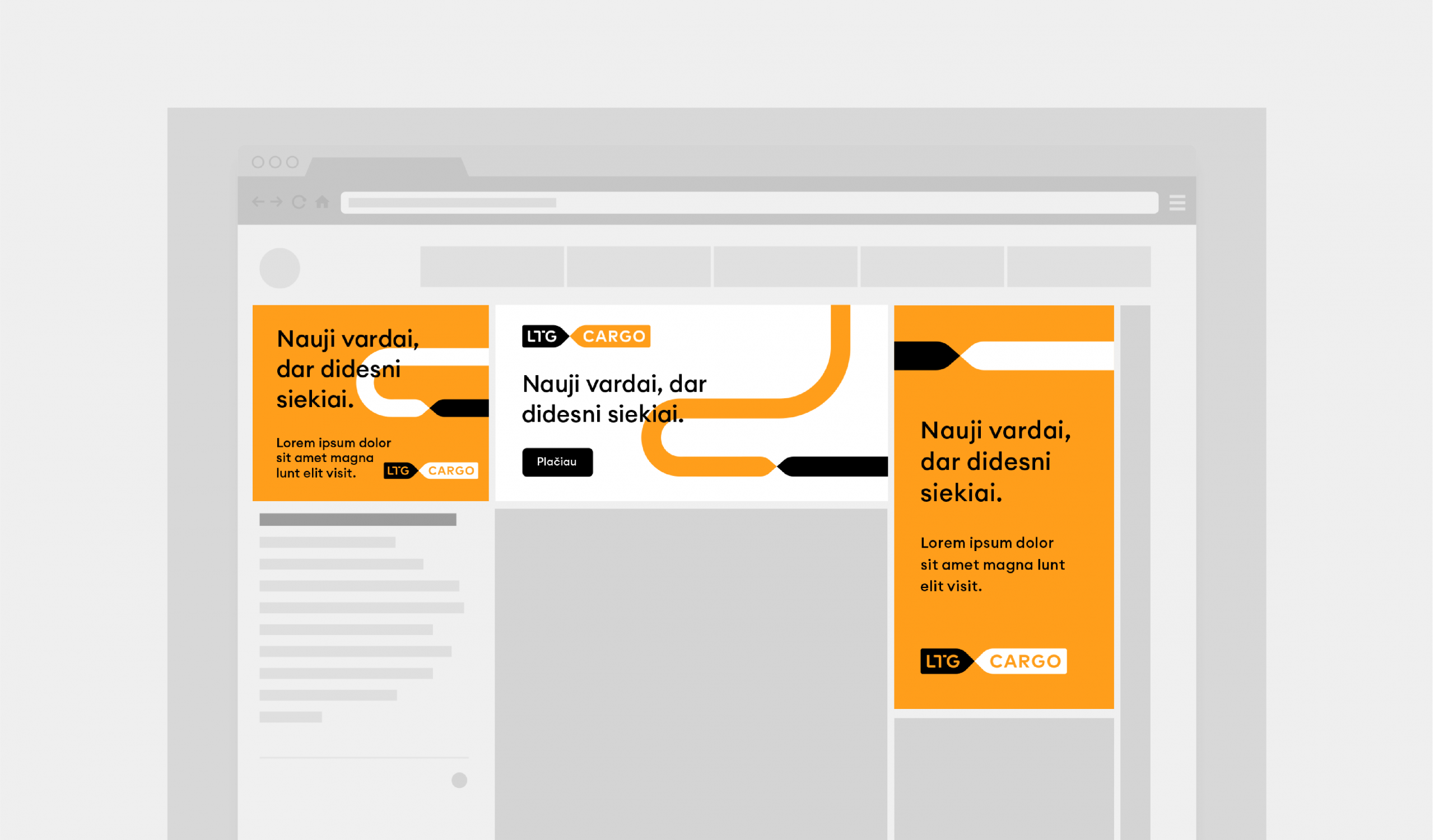
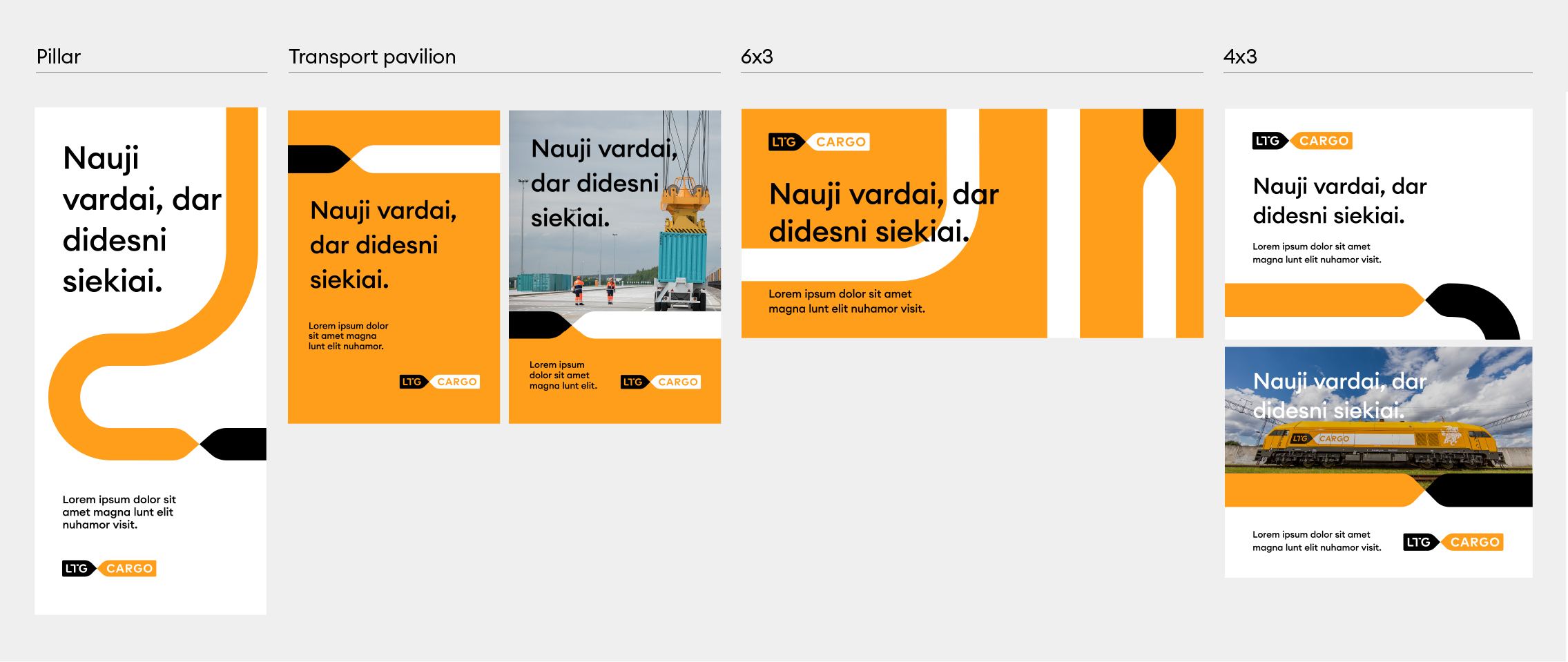
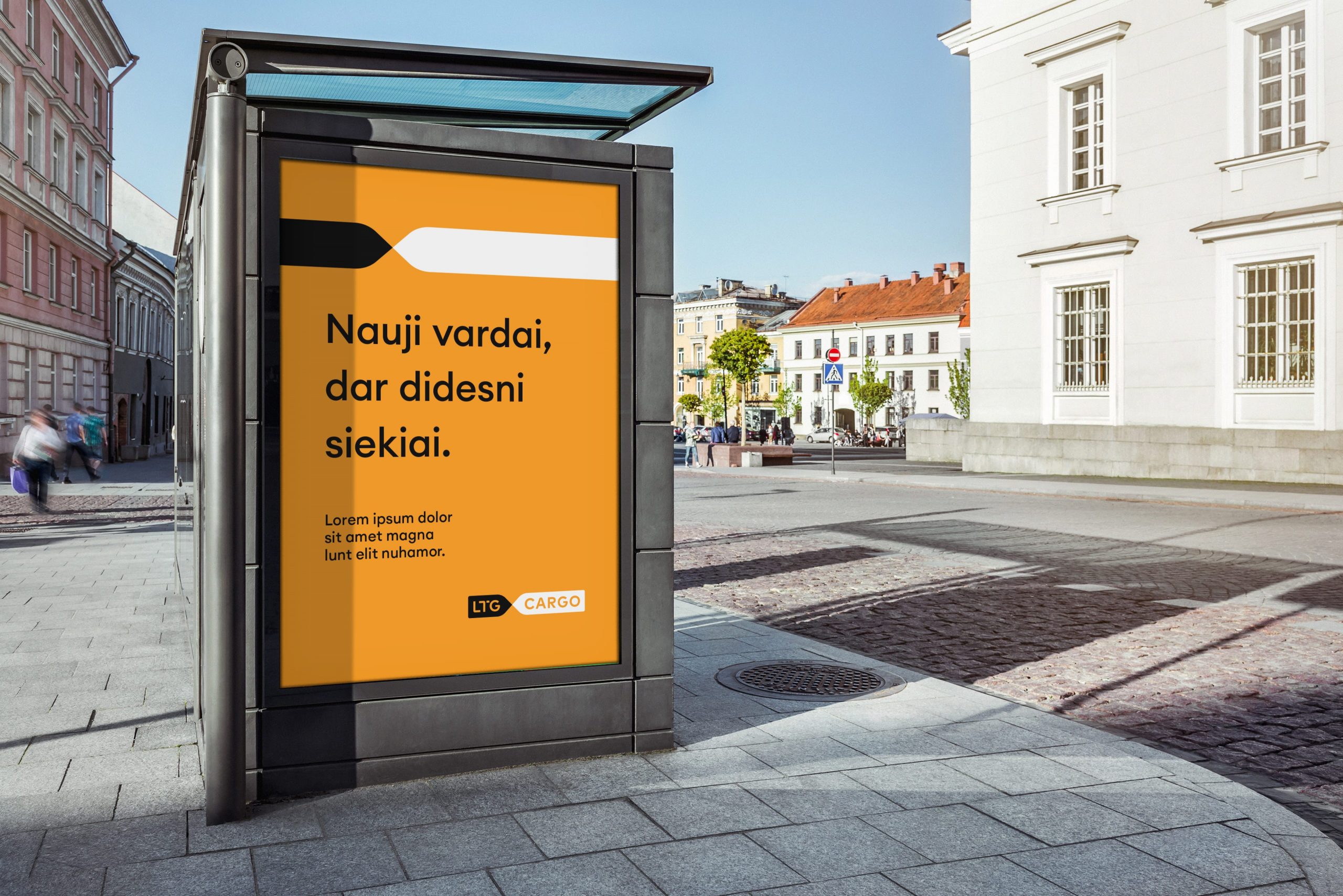
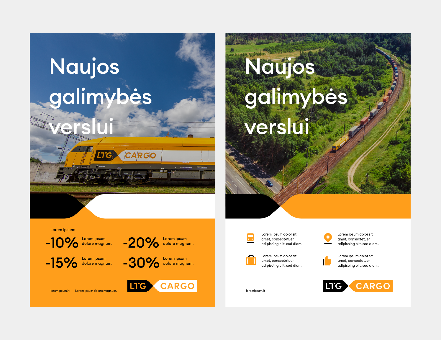
We make a press / advertising layout according to the following criteria:
– We use the main LTG elements to create the layout: colour block, graphic element (arrows), icons. These elements create recognizability throughout LTG communication.
– If proper readability is ensured (the background is not too coloured), we can use the main heading on the photo.
– Secondary information is provided on a single colour background at the bottom of the layout.
– We can use increased numbers and icons to highlight a promotion or offer.
– We do not use illustrations in advertising layouts. Exceptions are possible only for exclusive ad campaigns.