Our logo is only a very small part of our overall identity, but the most recognisable and tangible expression of our company and should be used properly at all times.
Our logotype completely embodies our values of being clear, confident, reliable and modern.
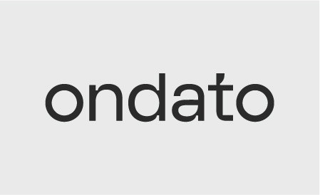
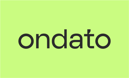
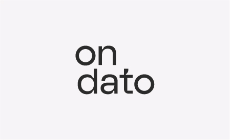
Logo on light
The preferred way to use the logo is on a white/light background. Every attempt should be made to do this in order to retain the integrity of the brand.

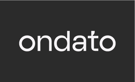
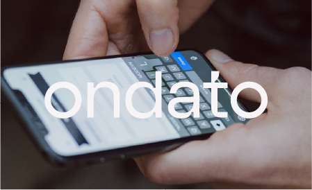
Logo on black
If you are using a black or dark background on your
communication, you may use the Ondato logo reversed out.
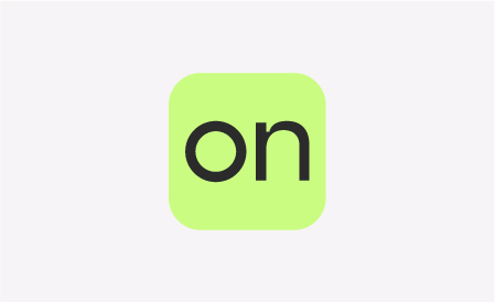
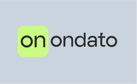
Logomark
The logomark is a compact version of the Ondato logo that works in small contents. It can eventually become recognizable on its own.
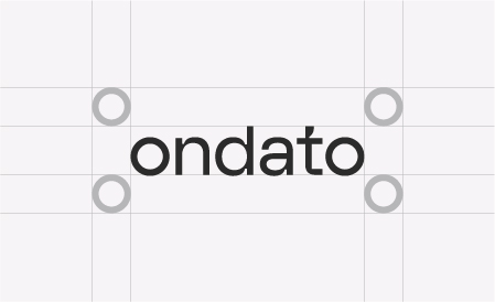
To protect the strength and integrity of the logo, a clear space area, free of competing visual elements, should be maintained.
-
 The safe zone for the vertical logotype
 -
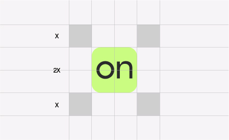 The safe zone for the logomark
Refers to the smallest size at which the logo may be reproduced to ensure its legibility in any print or screen media.
-
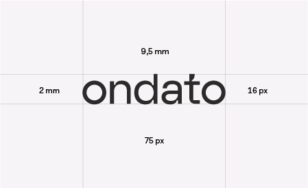 The minimum size of the logo should measure no less than 2mm / 16px in height.
 -
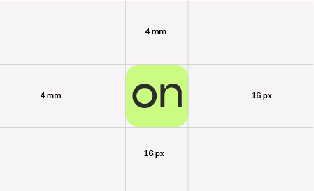 The minimum size of the logomark should measure no less than 4mm / 16px in height.
Always use a 0 degree angle. / Always use correct proportions of the logo. / Always leave the logo some space to breath. / Always use correct logo version on white or dark backgrounds.
Do not rearrange the logo. / Do not alter the proportions of the logo. / Do not change the logo colour. / Do not use the smaller logo than it’s minimum size. / Do not superimpose the logo on any image or background that makes it hard to see.
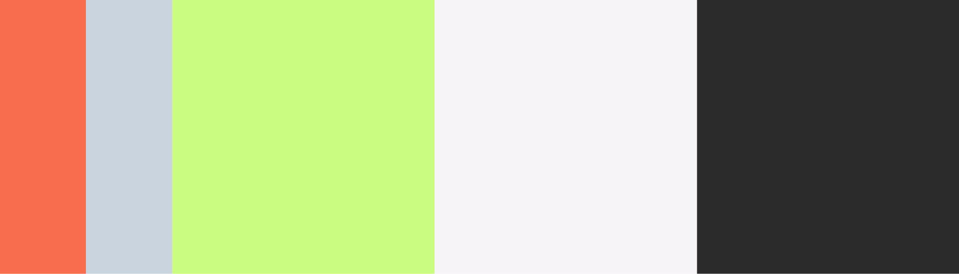
As Ondato communication covers the vast amount of visual content, using brand colour palette is essential in order to prepare distinguishable assets.
Primary colours consists of Lime green, Light black, Warm white and secondary Grey, Orange. This palette should be used in corporate communications, digital applications or any printed materials.
-
#f76d4dOrangeR: 247 G: 109 B: 77C: 0 M: 71 Y: 73 K: 0PANTONE 2024 C
-
#c9d4deGreyR: 201 G: 212 B: 222C: 20 M: 10 Y: 7 K: 0PANTONE 441C C
-
#cafc81Lime greenR: 202 G: 252 B: 129C: 23 M: 0 Y: 65 K: 0PANTONE 373 C
-
#f7f4f6Warm whiteR: 247 G: 244 B: 246C: 02 M: 3 Y: 1 K: 0PANTONE COOL GRAY 1 C
-
#2b2b2bLight blackR: 43 G: 43 B: 43C: 70 M: 64 Y: 63 K: 65PANTONE 447 C
The frequent use of Warm white and Light black accentuates the premium look of the services. It helps to create a clear, functional and trusted visual approach. Lime green communicates a digital aspect of our service and distinct us in crowded marketplace. Orange and Grey are used less frequently (see the example below) yet give us to more flexibility with calmer, solid tones.
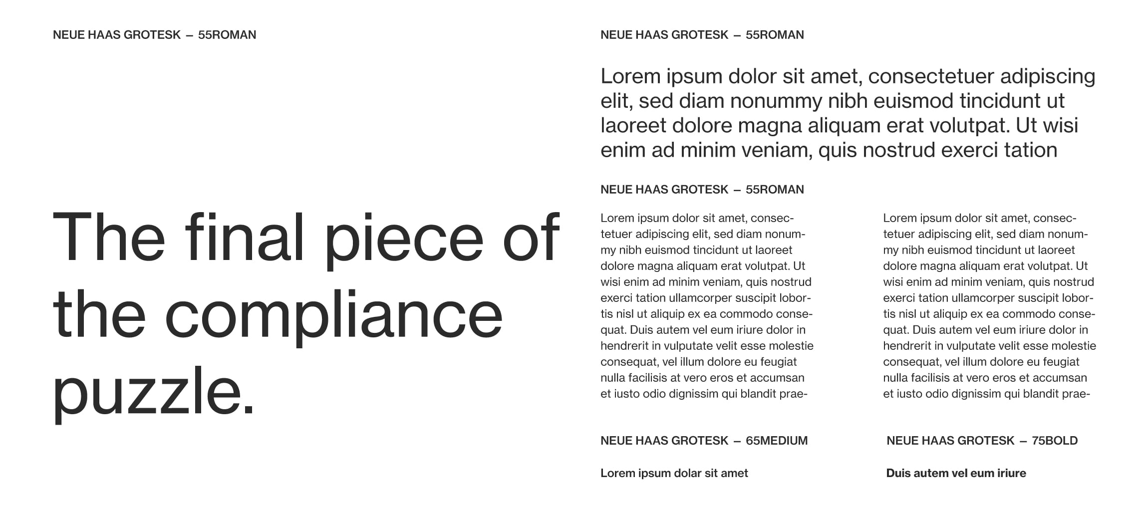
Our typeface is our visual voice, and when used with design consistently, it helps us create our brand personality. Primary typography consists of Neue Haas Grotesk used for headlines, sub-headlines and body text, or any other information. Primary typeface colour is Light black (#2b2b2b)
For the instances, when Neue Haas Grotesk cannot be used (emails and open word documents) – we use our secondary typeface in Light black (#2b2b2b). Read more about our secondary typeface in the next section.
Neue Haas Grotesk is a distinctive geometric sans-serif typeface that works perfectly for small sizes and long paragraphs.
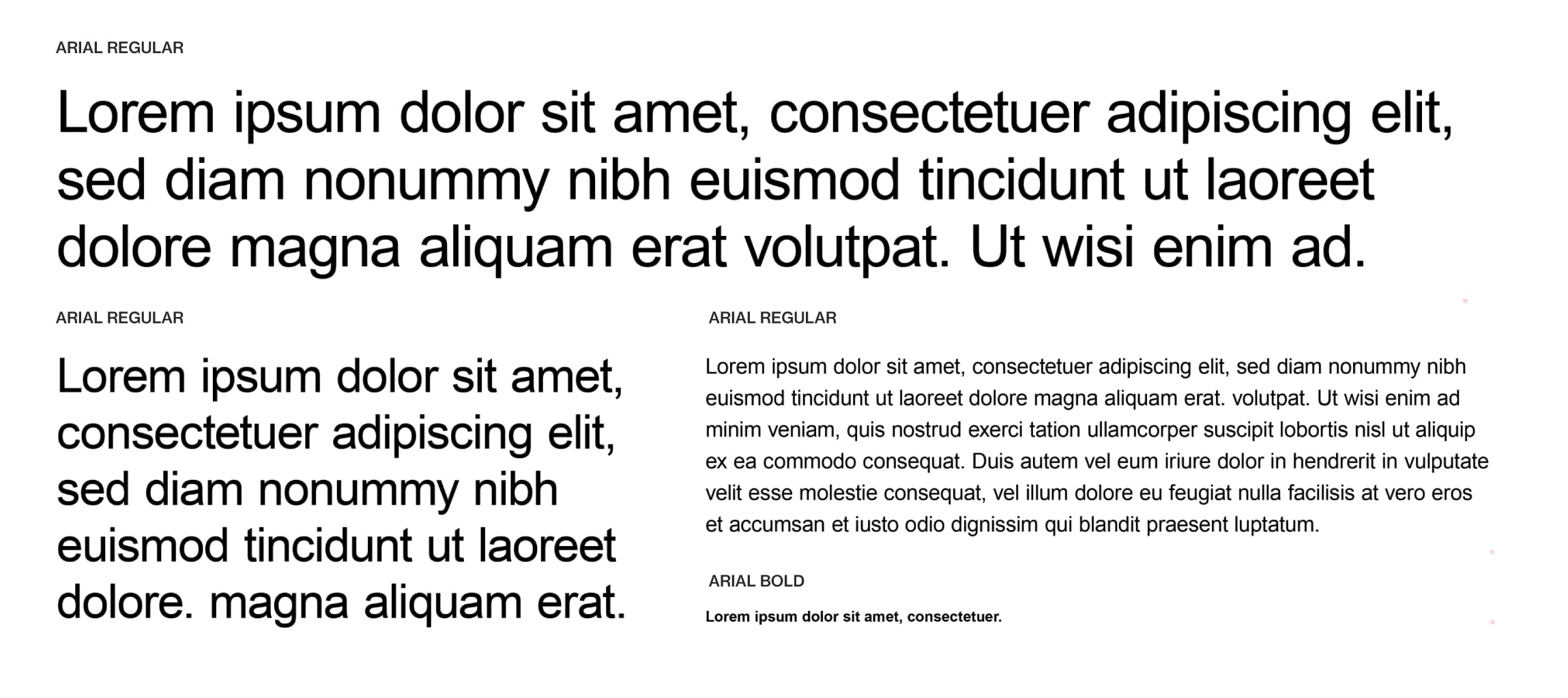
Arial is a secondary typeface and is used in exceptional cases only.
This typeface is installed on all computers and should be used in Word, Excel and email signature. This typeface is never used in external applications such as posters, leaflets, website, etc.