BRANDING THE ŽALGIRIS MENTALITY
For 80 years we have been developing a unique growth, team, and leadership mentality that can help and inspire anyone to become better.
It’s bigger than just physical performance, it’s a mental edge we use to continuously improve and perform in any area.
– We are the team that exceeds expectations
– Our fans constantly outperform themselves
– Our organization has outgrown its potential multiple times
– Our team and our fans are the people who will always be chasing their potential

OUR MENTALITY IS TO:
Outrun ourselves
– Outrun excuses
– Outfight talent
– Outhustle budgets
We have already made history, now we are making the future. We believe that everyone who strives for something in life is like an athlete. And that everyone can become a better player for their team and a bigger fan not only of their own success, but also that of others. We understand that our greatest barriers are not in the outside world, but inside our heads. That’s why we strive every day to outrun our weaknesses, our flaws and opportunities. To outrun ourselves.
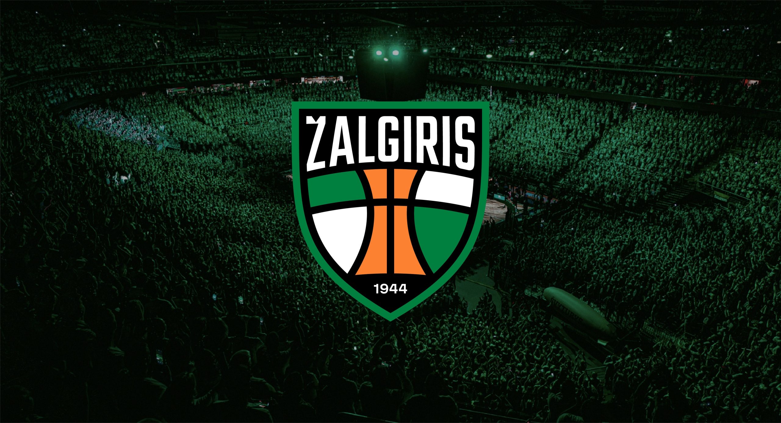
New logo of Žalgiris team and organisation combines historical visual traits of the team with a modern visual approach.
New crest combines bold curved typography, checkered green-white pattern, which is closely related to the team, stylized trophy in the middle, that symbolizes all the victories the team had and the ones that are still to come and the year the club was established, which emphasize the long history of Žalgiris.
Below is our primary version of the logo – Žalgiris crest with a green outline around it. This version should be used in most of the brand assets. Especially in the start of the new logo launch.
The following sections provide rules and examples how this and other versions of the logo should be used when creating brand assets in the future.
All versions of a new Žalgiris logo can be found in the logopack below.
Žalgiris crest has a few different colour versions. These versions ensure, that our logo works well on all the backgrounds and provide more variety when creating merch and brand assets of the team or organization.

Main version – white outline
This a secondary option of our primary Žalgiris crest. This version should be used, when the logo is placed on green coloured backgrounds in a small scale. For example, on players uniforms.

Green & White crest
Green & White version can be used on Žalgiris white, Functional black and Neutral grey colours from our colour palette.

White & Green crest
White & Green version can be used on Žalgiris green, Functional black and Historical green colours from our colour palette.

Black & White crest
Black & White version can be used on Žalgiris green, Žalgiris white and Neutral grey colours from our colour palette.

White & Black crest
White & Black version can be used on Žalgiris green, Functional black and Historical green colours from our colour palette.
Secondary logo versions help us to adapt our main crest to a smaller scale or to create more variety when creating merchandising.
The scheme below shows all the versions of our logo. These versions are:
1. Žalgiris crest (primary version);
2. Žalgiris crest without the year (secondary version);
3. Small crest (secondary version);
4. Small crest without the year (secondary version);
5. Team name (secondary version).


Žalgiris crest without the year
This adaptation of Žalgiris crest without the year is used when we want to adapt our primary crest to a bit smaller sizes. It shouldn’t be used as a replacement of our main crest in sizes where it’s elements are still readable (that are larger or equal to a minimal size of our primary crest). Žalgiris crest without the year has the same colour versions as the main one.

Small crest
This adaptation of Žalgiris crest without the team name is used to create more variety when creating merchandising. It shouldn’t be used as a replacement of our main crest in cases, where there isn’t any familiarity with the team or the organisation. Small crest has the same colour versions as the main one.
Small crest without the year
This version of small crest is used where our logo is used in the smallest sizes. For example, as a website favicon image or as a social media profile icon. Small crest without the year has the same colour versions as the Žalgiris crest.

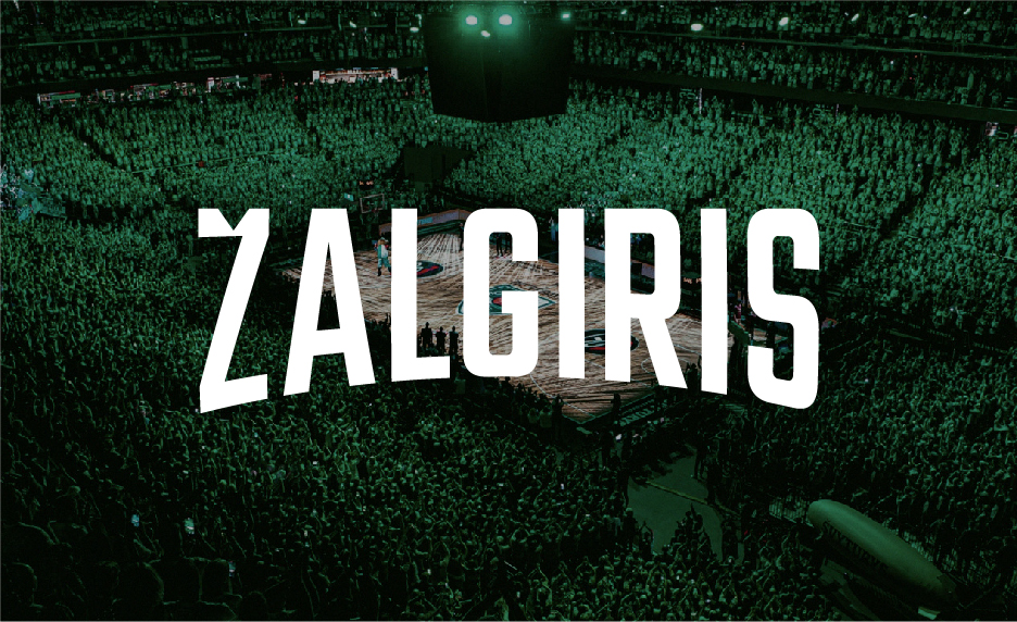
Team name
Our main crest’s typography works as a standalone logotype. Team name logo version is used on merchandising or athletes uniforms. There are three colour options of this version: Black, Green and White.
To ensure visual consistency of our logos, when creating different brand assets, we provide colour codes of the colours that are used in all of the logo versions.
-
#00803fŽalgiris crest greenRGB: 0, 128, 63;CMYK: 88, 25, 100, 12;PANTONE 355 C/U
-
#ffffffŽalgiris crest whiteRGB: 255, 255, 255;CMYK: 0, 0, 0, 0;PANTONE White C/U
-
#000000Žalgiris crest blackRGB: 0, 0, 0;CMYK: 0, 0, 0, 100;PANTONE Black 3 C/U
-
#fc8231Žalgiris crest orangeRGB: 252, 130, 49;CMYK: 0, 60, 89, 0;PANTONE 151 C/U
As Žalgiris isn’t only a basketball team, in some cases the logo may be used with a tagline.
The tagline can only be used with our Team name logo version. This graph shows an example, of the tagline placement and the proportions that should be followed.
Žalgiris Basketball logo can be found in our logopack. Use it as a reference when creating similar adaptations in the future.

To protect the strength and integrity of the logo, a clear space area, free of competing visual elements, should be maintained. Also to ensure its legibility in print or digital formats, the logo shouldn’t be smaller than its smallest possible size.
The safety zones in the schemes below show the minimal safety zones of the logo versions. In some scenarios the safety zone should be increased. For example, when placing logo of a sponsor next to ours.
-
 The safety zone for the primary version of the logo.
 -
 The minimum width of the primary version of the logo should measure no less than 56 px / 18 mm. If using the version without the date: 36 px / 11 mm.
 -
 The safety zone for the small crest version of the logo.
 -
 The minimum width of the small crest version of the logo should measure no less than 56 px / 18 mm. If using the version without the date: 16 px / 8 mm.
 -
 The safety zone for the team name version of the logo.
 -
 The minimum width of the team name version of the logo should measure no less than 29 px / 9 mm.
Correct usage of the logo
-
 Always leave the logo some space to breathe.
 -
 Always use correct proportions and composition of the logo.
 -
 Always make sure that the logo is easily read when it is placed on the photo.
 -
 Always use only the logo versions that are in our logopack.
 -
 Always use a 0-degree angle.
 -
 Always use the correct logo version depending on the background colour.
Incorrect usage of the logo
-
 Don’t change the composition of the logo elements.
 -
 Don’t change the colour of the logo.
 -
 Do not superimpose the logo on any image or background that makes it hard to read.
 -
 Don’t add more outlines to the crest.
 -
 Don’t frame logo in a way that will cover some of its parts.
 -
 Don’t stretch the logo.
 -
 Don’t remove the outline of the logo or use the same background colour as the outline.
 -
 Don’t add any effects to the logo.
As Žalgiris covers a vast amount of visual content, using a brand colour palette is essential in order to prepare distinguishable and visually consistent assets.
Our colour palette consists of primary colours: Žalgiris green, Žalgiris white, Functional black and secondary colours: Historical green, Neutral grey, Digital yellow.
All the colours, except, Digital yellow can be used for backgrounds and graphics (more in the following chapters).
For the typography we only use Žalgiris white and Functional black. Digital yellow is used as a CTA colour.
RGB, CMYK and Pantone values of our colours are provided in the following section.
Use the colour proportions below when creating visual identity adaptations in the future.

-
#1ca256Žalgiris greenRGB: 28, 162, 86;CMYK: 81, 10, 90, 1;PANTONE 2271 C/U
-
#ffffffŽalgiris whiteRGB: 255, 255, 255;CMYK: 0, 0, 0, 0;PANTONE White C/U
-
#000000Functional blackRGB: 0, 0, 0;CMYK: 0, 0, 0, 100;PANTONE Black 3 C/U
-
#054a29Historical greenRGB: 5, 74, 41;CMYK: 89, 42, 93, 47;PANTONE 349 C/U
-
#ecece3Neutral greyRGB: 236, 236, 227;CMYK: 7, 4, 10, 0;PANTONE Cool Gray 1 C/U
-
#b1ff29Digital yellowRGB: 177, 255, 41;CMYK: 38, 0, 100, 0;PANTONE 389 C/U
Our typeface is our visual voice, and when used with design consistently, it helps us create our brand personality.
Žalgiris Sans is a custom headline font, that we use in our visual identity. It creates more distinguishability from other sport organizations and highlights long history of Žalgiris basketball, our victories and fans.

Custom font was inspired by graphics and typography that can be seen in historic images of Žalgiris games.
1. Cut in the letter “Ž” creates a connection with the crest’s typography.
2. Squarish typography was inspired by historic team’s fonts and hand-drawn fans’ posters.
3. Angular-rounded corners creates a distinctive, sporty-looking type characteristic.
4. Tall and narrow characters brings more intensity to the font. While at the same time creating a stronger bond with the Žalgiris crest typography.

Here are all the characters that our font consists of. Some of the letters have secondary options that can be found in “glyphs” window. These letter are “A” – which has a rounded secondary version and “Ž” – which can also be used with a crown instead of a cut. Never use both versions of these letters in one asset.

Our primary typography consists of two typefaces: Žalgiris Sans and Inter.
For the headings we use Žalgiris Sans, for the subheadings and CTA elements – Inter Medium and for the body texts – Inter Regular.
When Žalgiris Sans or Inter typefaces cannot be used (emails and open word documents) – we apply our secondary typeface Arial. Read more about our secondary typeface pairings in the next section.

Arial is a secondary typeface and is used in exceptional cases only. This typeface is installed on all computers and should be used in Word, Excel and email signature. This typeface is never used in external applications such as posters, merchandising, website, etc.
For the headings we use Arial Bold font and for the subheadings, body texts – Arial Regular.

In our communication we cover a wide range of different photography topics and subjects. Our new photo style will help to visually unify the photography that is sourced from stock and made in the photoshoots.
Overall our photo style is based on increased darker tones, desaturated colours, unexpected/more interesting angles. As the team and organization has huge amounts of images to work with, we made a photo filter, that helps to create more consistency between them. More information about it can be found in the following sections.

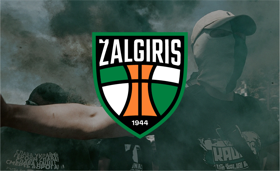
Žalgiris mentality
These photos highlight the outrunning yourself mentality that comes from our strategy. Here the themes are not only basketball related, photos show athletes from different sports, their training and practice.

Games & fans
Shots from the games (basketball, football, etc.) and images of Žalgiris fans help us to promote the support the team has and the achievements they got.

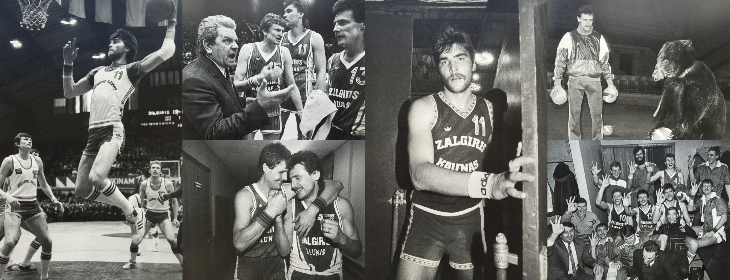
History
Historical images of the teams past will let us to promote the rich history of Žalgiris at the same time while educating the younger generation of fans.
Basketball / Athletes / Training / Football / Urban / Practice / Natural / Unexpected angles
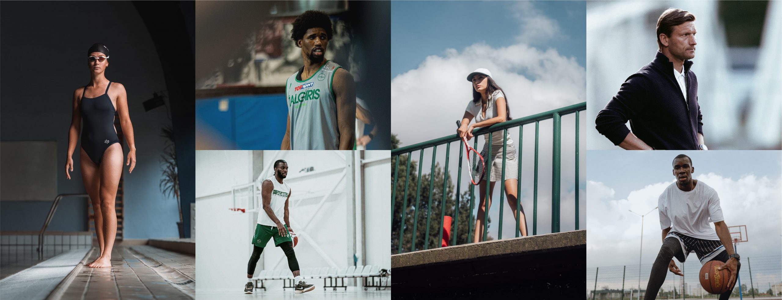
Fans / Support / Emotions / Victories / Teamwork / Passion / Celebrations

Legendary players / History / Victories / Training / Backstage / Historic rivalries / Black&White
Our photo filter creates a more desaturated, dark and grainy look when used on a photo (similar to a film photography). This matches our photo style, helps to achieve more visual consistency and to stand out from the most of the other teams.
Here we provide some examples of how our photo filter works on a photo.
-
 Without photo filter.
 -
 With photo filter.
 -
 Without photo filter.
 -
 With photo filter.
 -
 Without photo filter.
 -
 With photo filter.
Exceptions
Not every picture we take or select from the stock websites needs our filter. Especially darker images: photo filter makes them a bit too dark and hard to understand.
So if selected photo is too dark we can use it as it is (if it matches our overall photo style) or decrease only it’s Saturation and Brightness.
Below we provide some examples of darker images, that we adapted to our photo style. On all of them we decreased brightness and saturation by 10.

Incorrect usage of photography
-
 Don’t use non-historic photos in black & white.
 -
 Don’t use photos that look staged/unnatural.
 -
 Don’t use bright photos without our photo filter.
 -
 Don’t use photos with unnatural lighting.

Checked green and white pattern has been an inseparable part of Žalgiris identity. It can be seen on fans’ flags in the arena, on merchandising, team crest, etc.
We chose this simple, yet easily distinguishable element as core of our graphic language and now it is used to build modular and dynamic layout system, which easily adapts to different compositions.
Below are some examples of how our this pattern moves around the layout.

Here are some examples of vertical layouts. Use them when creating layouts in the future.

Here are some examples of horizontal layouts. Use them when creating layouts in the future.

Here are some examples of square layouts. Use them when creating layouts in the future.

As Žalgiris creates a vast amount of visual content, in some cases it is good to diversify it. In these cases we can use additional graphic elements. They let us to create a post that would stand from our usual content or create new identity adaptations for merchandising.
Our additional graphic elements consists of: Typography frame and Crest photo frame.
Typography frame
Typography frame is made by using Žalgiris Sans font and could be adapted to many scenarios: paired with photography, used in a background on single-coloured visuals or on merchandising.
When used on a photo, frame should wrap around the subject and some parts of the typography should be hidden behind the subject.
Below are some examples of how Typography frame should be used.

Crest photo frame
Crest photo frame is made by using the outlines of Žalgiris crest. It is used to diversify our content in communication platforms.
Never use this frame in the layouts that use checked pattern.
Below are some examples of to use it and how to pair it with a background colour.

Here, we present several examples of how our brand elements can be easily adapted on assets that are used by Žalgiris. Use them as an example when creating visual identity adaptations in the future.


