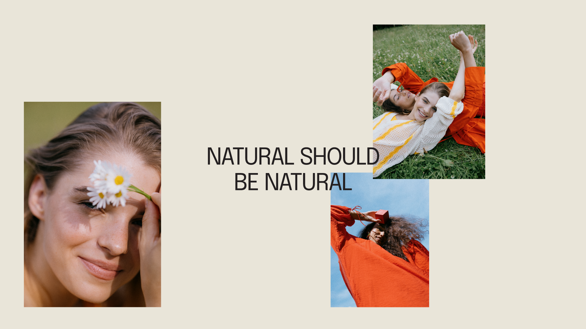
Uoga Uoga is a natural & organic cosmetics brand from Lithuania. With significant growth representing more and more boutiques in Lithuania and major European cities, a crafty look for the natural cosmetic brand required a change. Meaning that the brand’s identity needed to move towards and go more for a contemporary natural look to invite new cosmetic audiences — the ones that care for their bodies even in their constant hustles in the city.
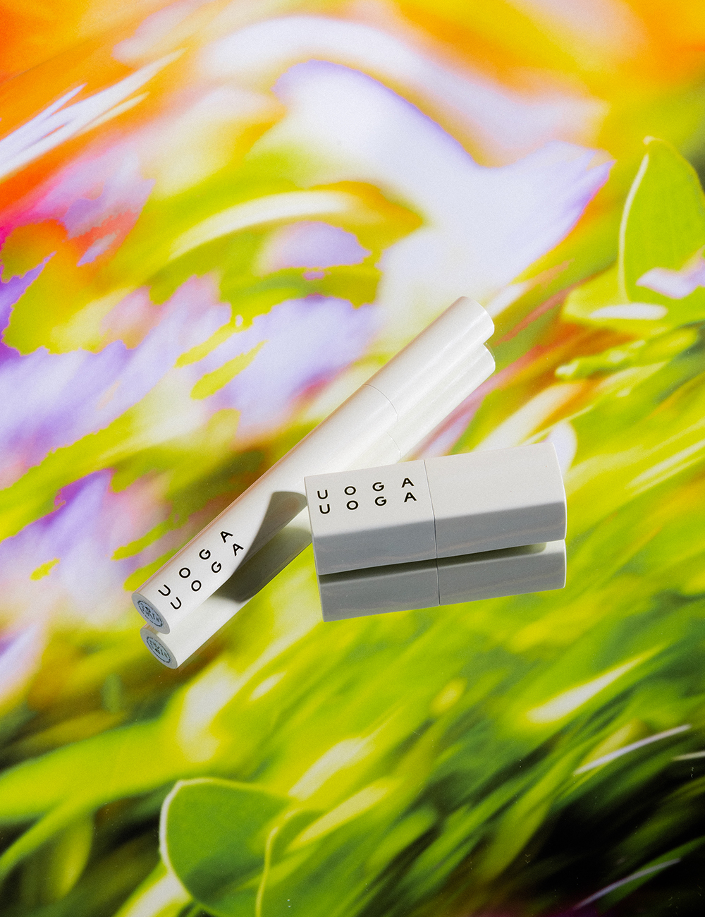
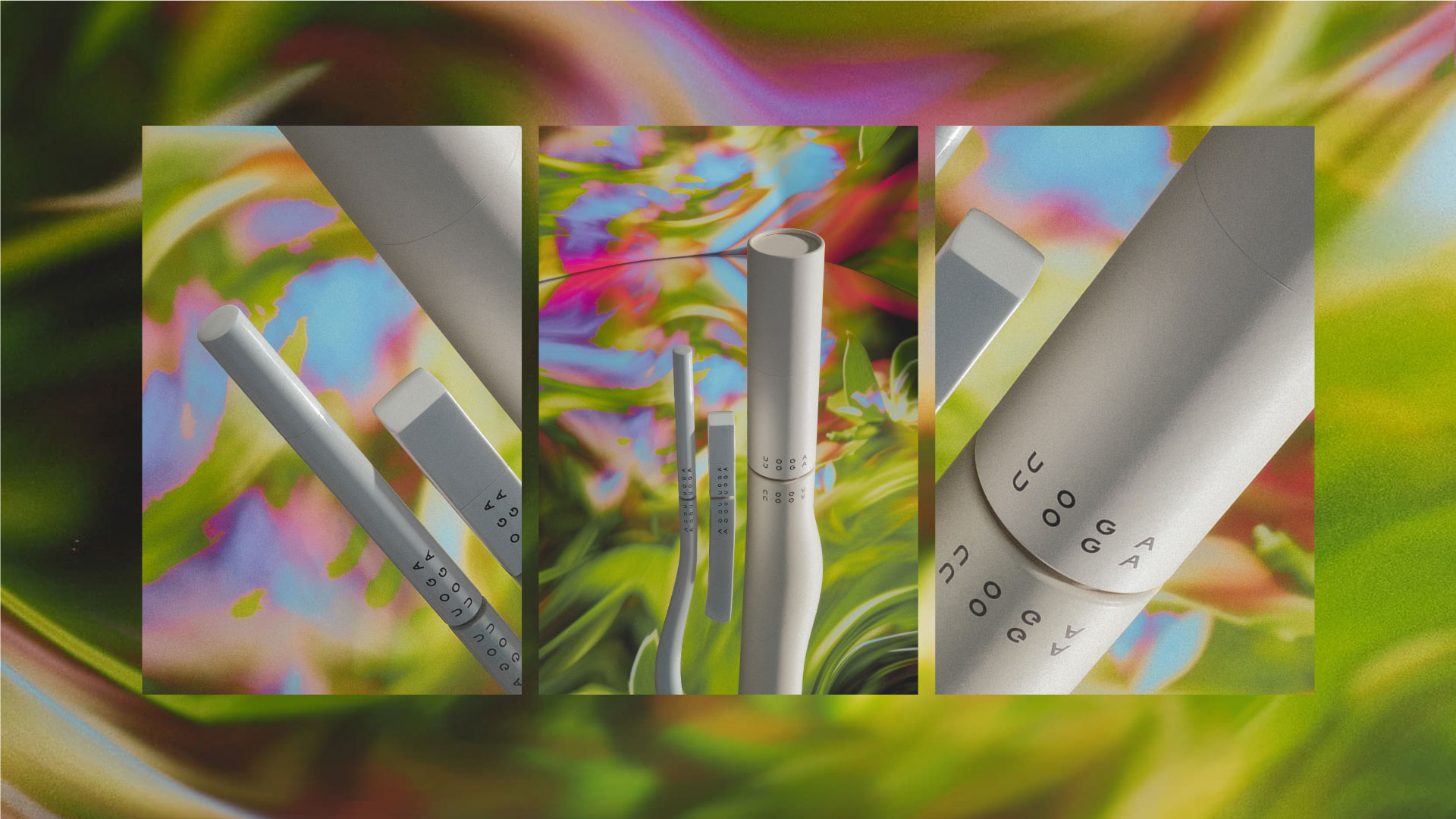
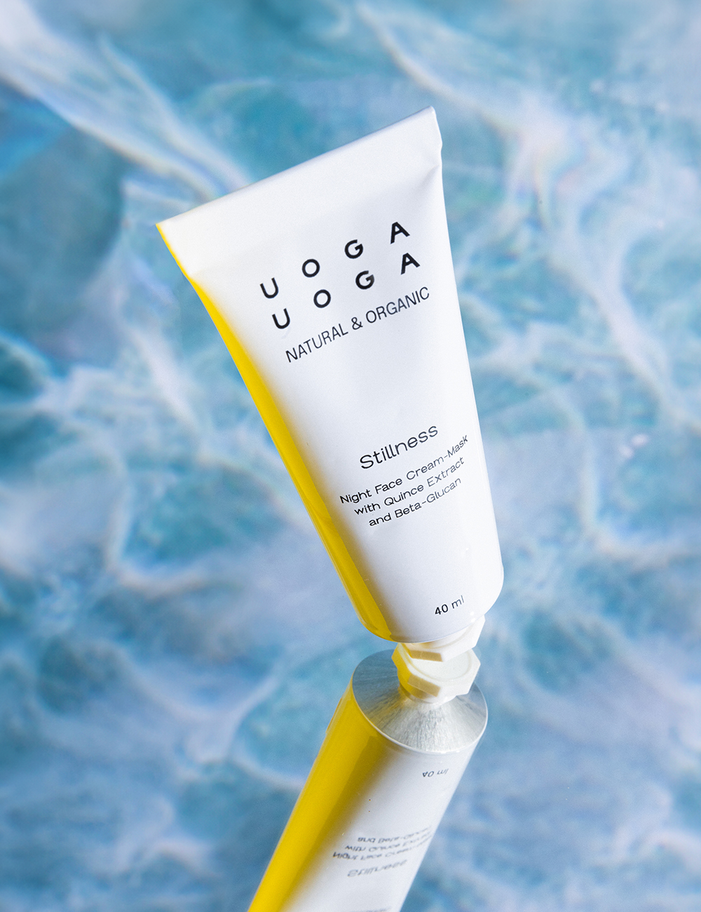
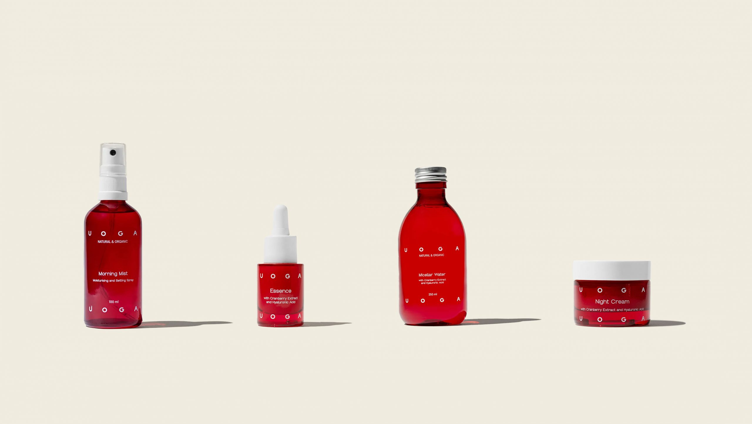
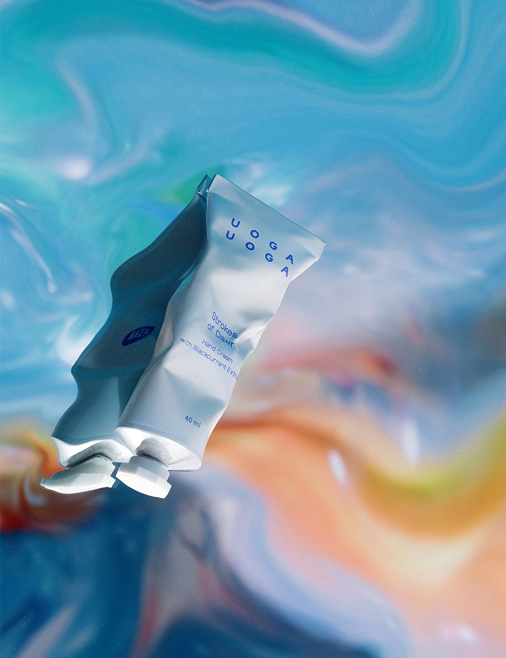
Hence, through a new Uoga Uoga identity, we reveal the message of juiciness that comes from nature, from which the brand takes the ingredients to deliver broadly enjoyable products to bring little joy into our daily life and make our skin shine even more. Juiciness also comes from the brand’s name; thus, it acts as a good communicator for the dynamic brand’s nature. Unlike most boutique brands, Uoga Uoga is bright and colourful, expressing vivid emotions. It also reminds us that we are all different and perceive the world individually.
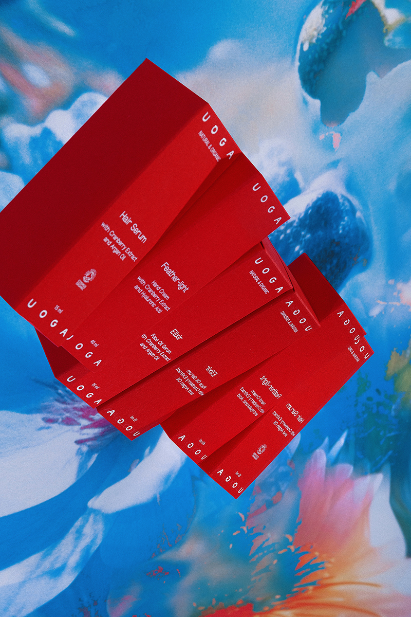
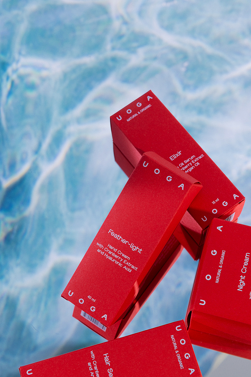
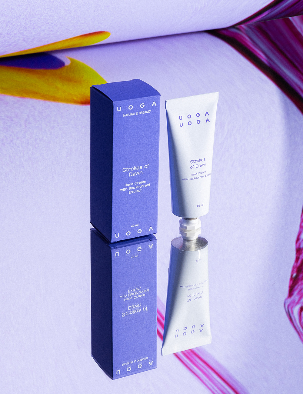
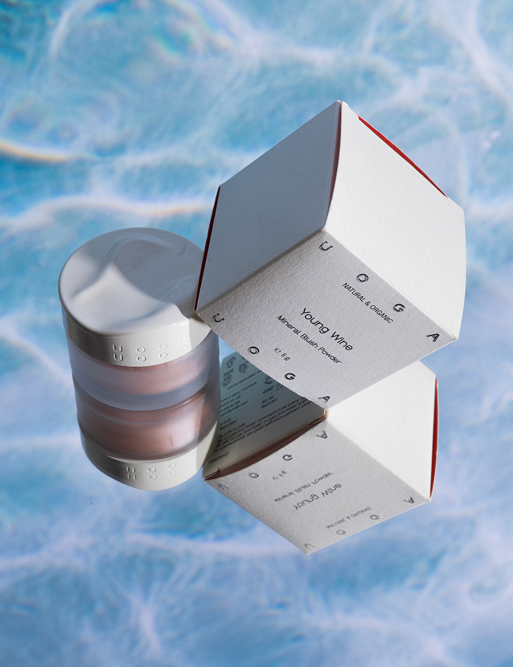
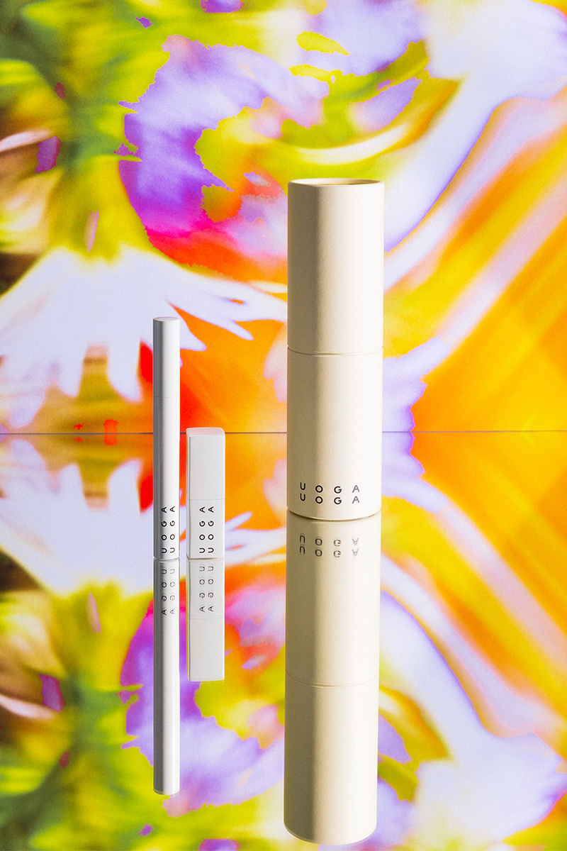
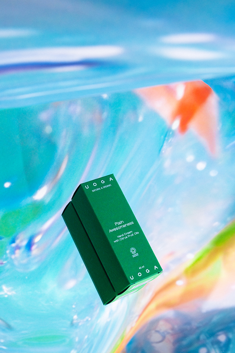
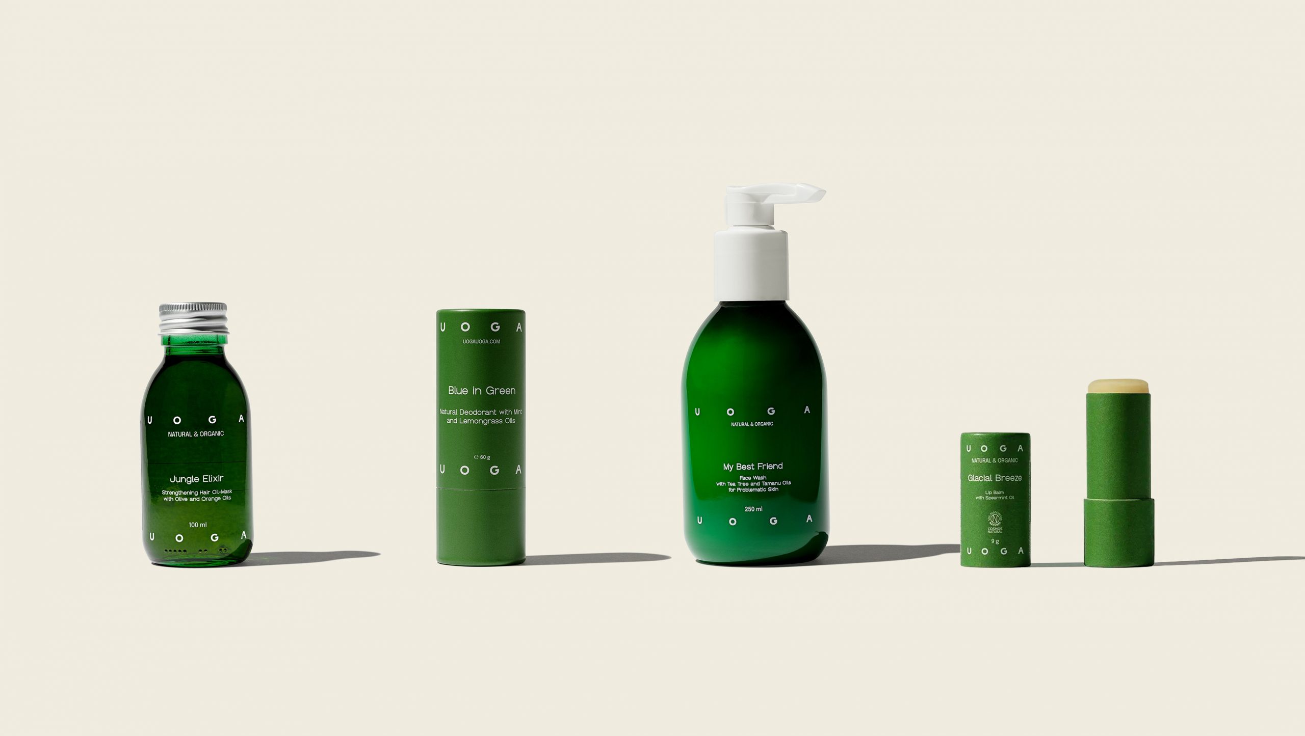
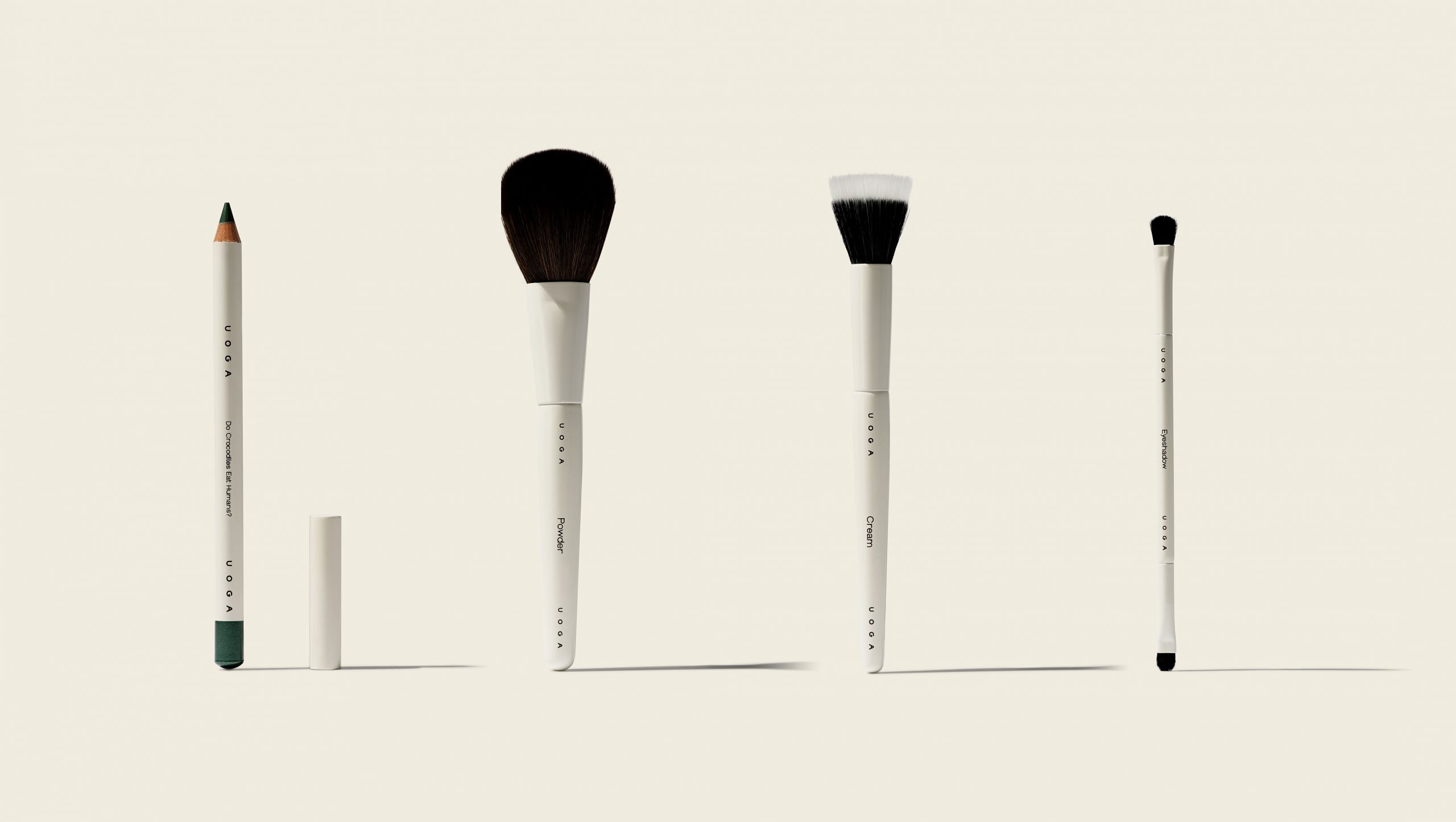
The logo of Uoga Uoga reflects the core values they cherish: a modern approach to synthesising urban and natural poles. The wordmark can also be played around the edges of packaging or digital representation, accompanied by Groteska and Epilogue fonts. When used together, these fonts create an expressive and dynamic whole, revealing the identity’s mood and making it stand out from the competitors who mainly use geometric sans-serifs.
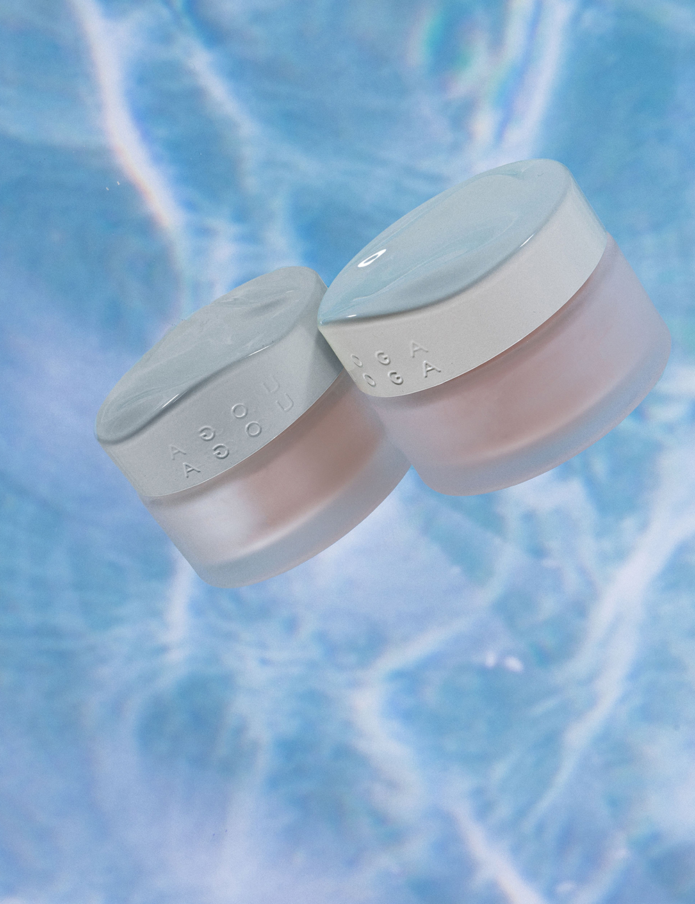
Logotype, typography, and bright colours with natural tones predominating are all integral to the identity. The primary colours, Ivory and Black, are often repeated in the layouts, while additional colours are selected based on the ingredients used in the products.