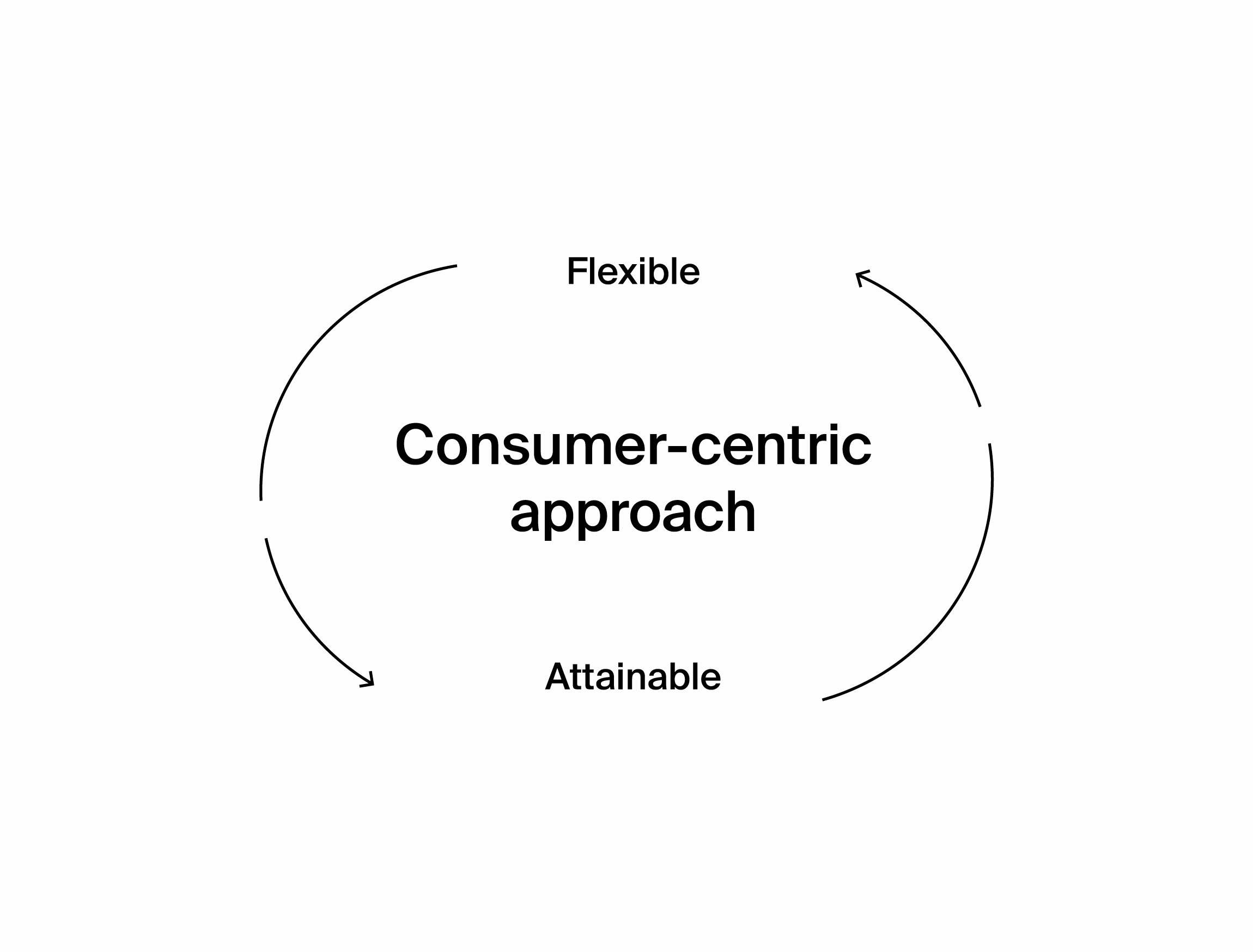
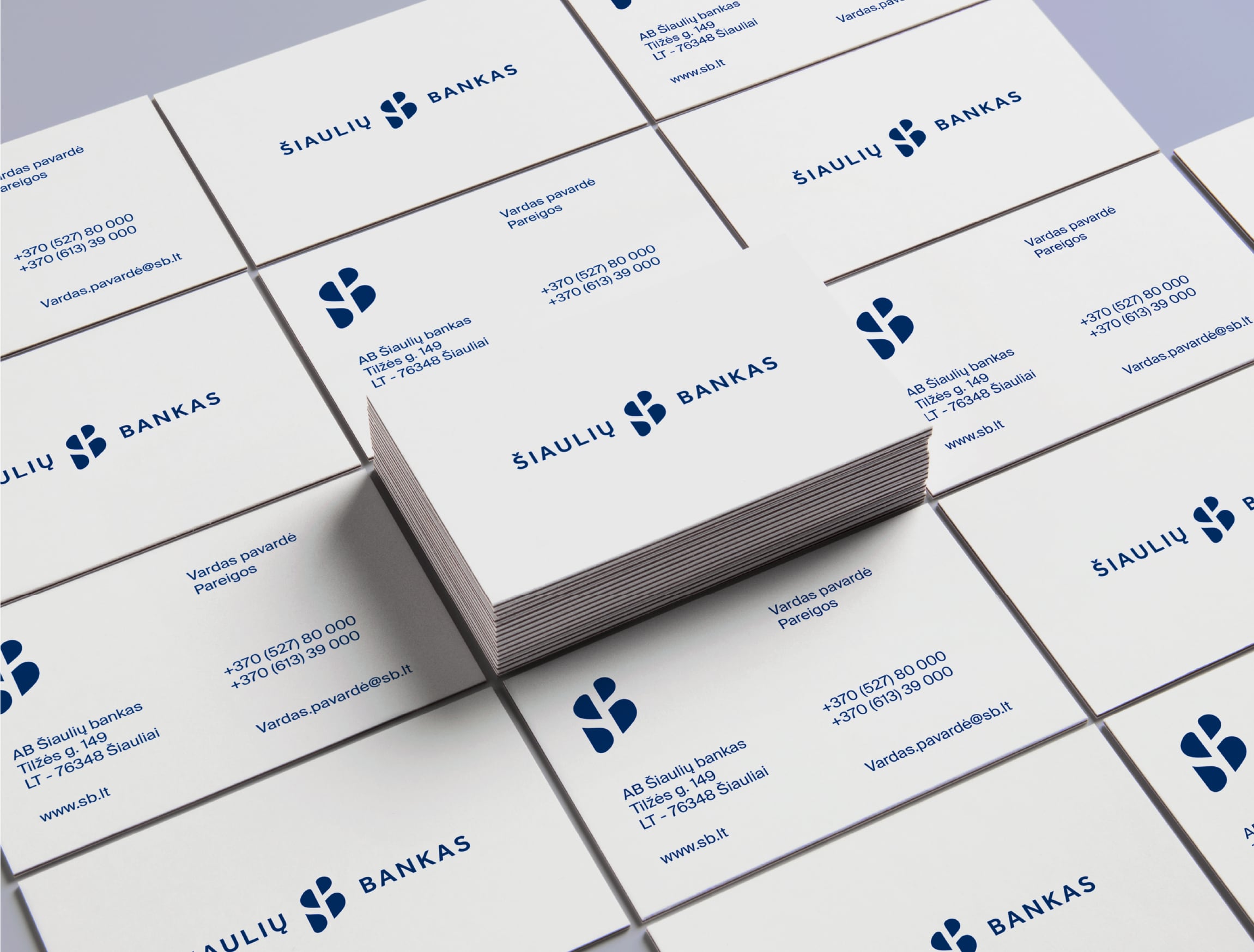
Šiaulių bankas is a local bank with the largest native capital in Lithuania. Contrary to their competitors, which are increasingly shifting their focus to digital channels and closing off physical bank branches — they maintain the biggest branch network in the entire country. This decision stems from a people-centric philosophy, which puts personal customer support, a flexible attitude, and a close relationship with their customers at the centre of everything they do.
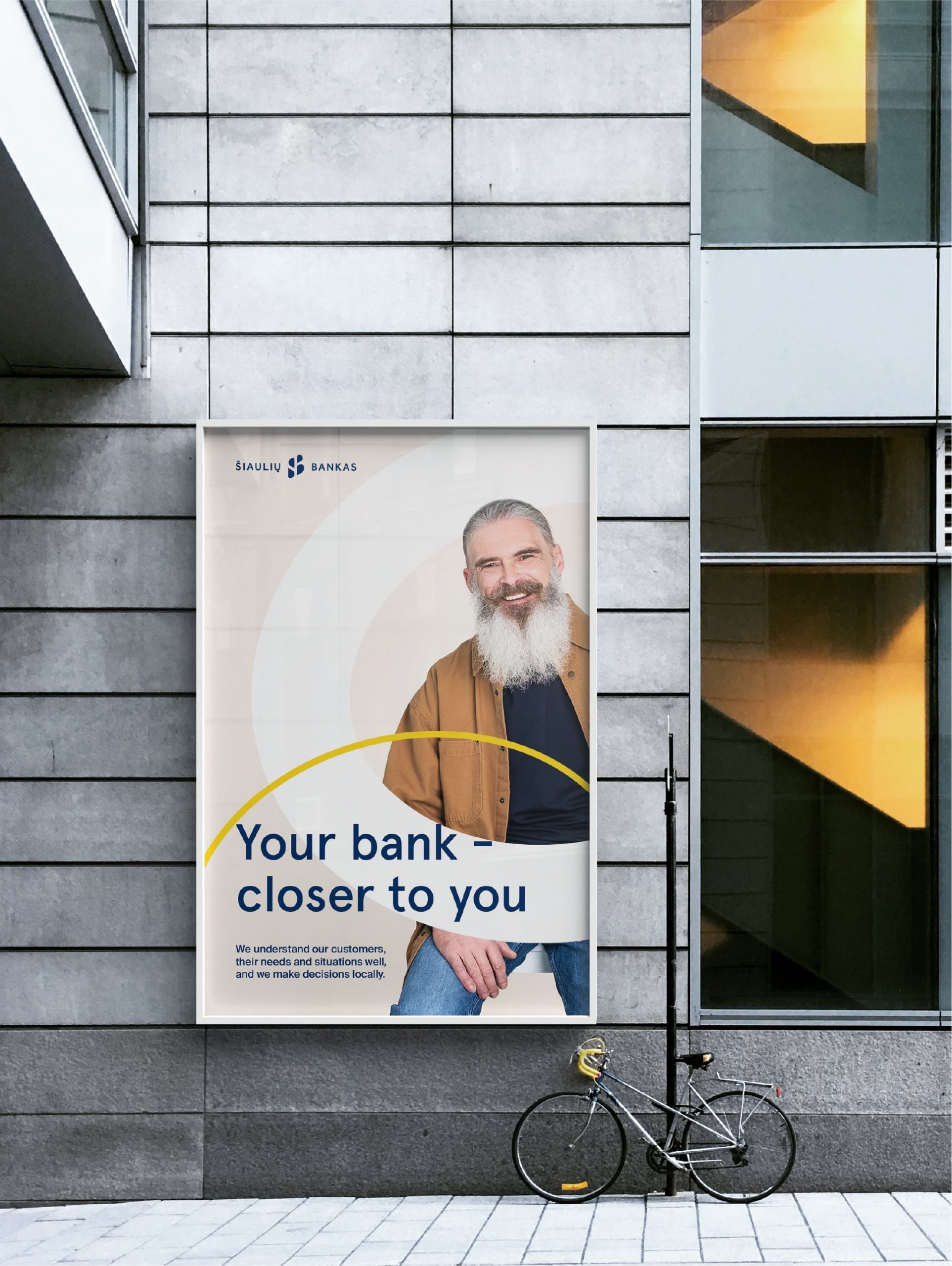
We worked together to translate the “Closer to you” positioning statement of Šiaulių bankas to a visual language that subtly communicates this message to both its core clientele and potential customers.

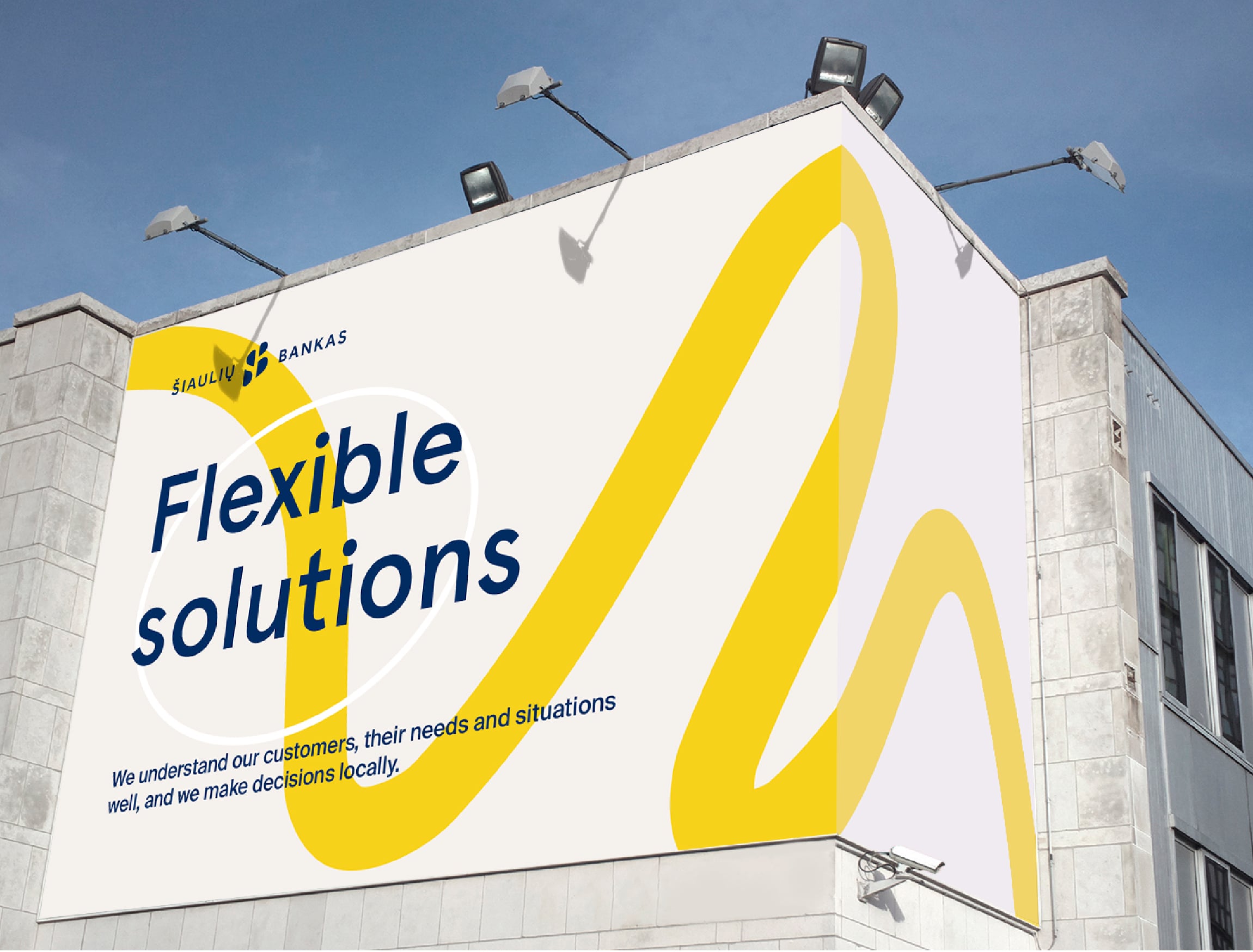
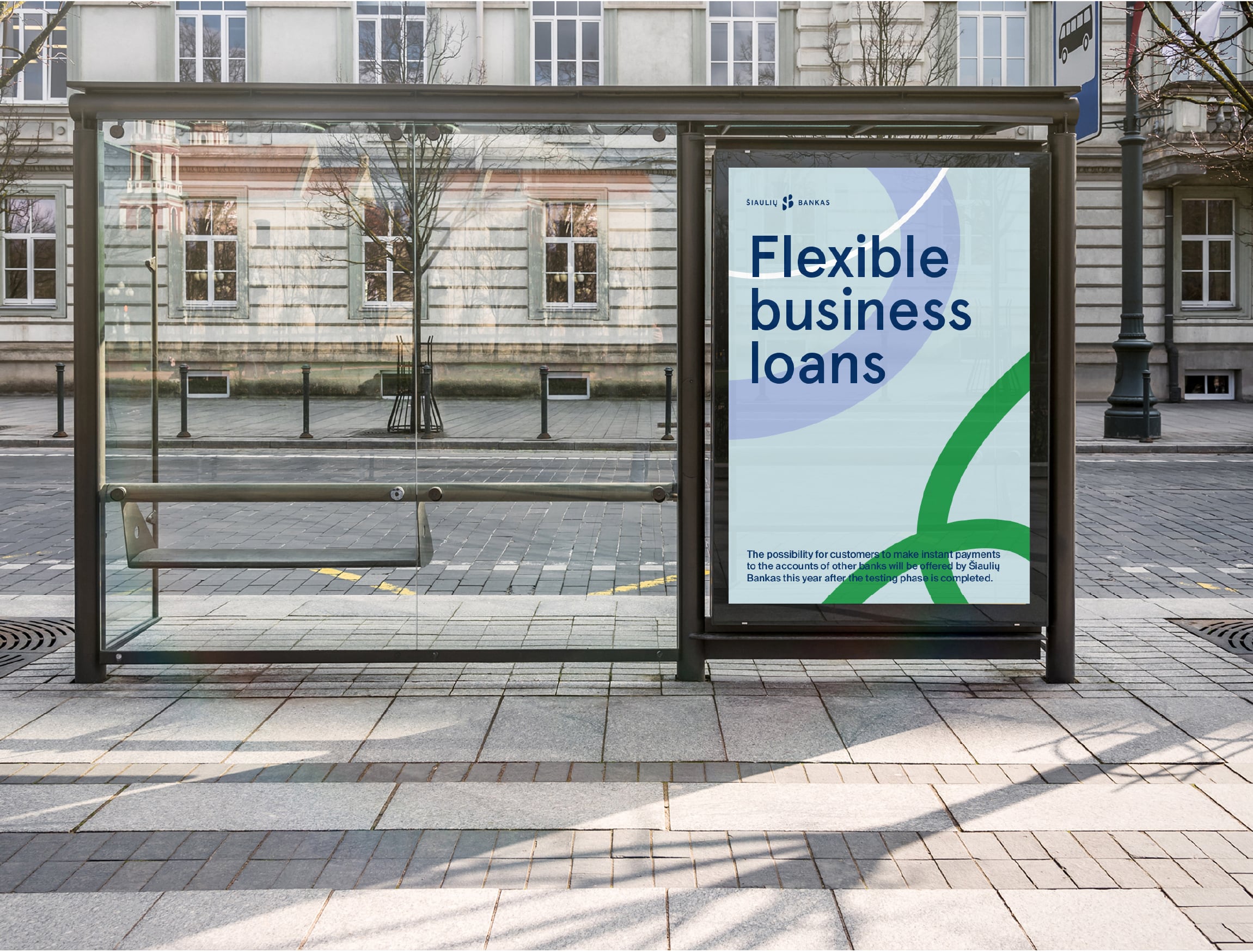
To communicate the main value of closeness, we created a custom linear pattern, accompanied by a new pastel color palette comprised of gentle earthy tones. The delicate shades convey the bank’s hospitality and friendly relationship with its customers.
To personify the core value of Šiaulių bankas — a direct and close connection to their clients, we chose an irregular, rounded line and scaled it across posters and digital platforms. The pattern gives a personal touch to the brand by reflecting the beauty of imperfect handwriting.
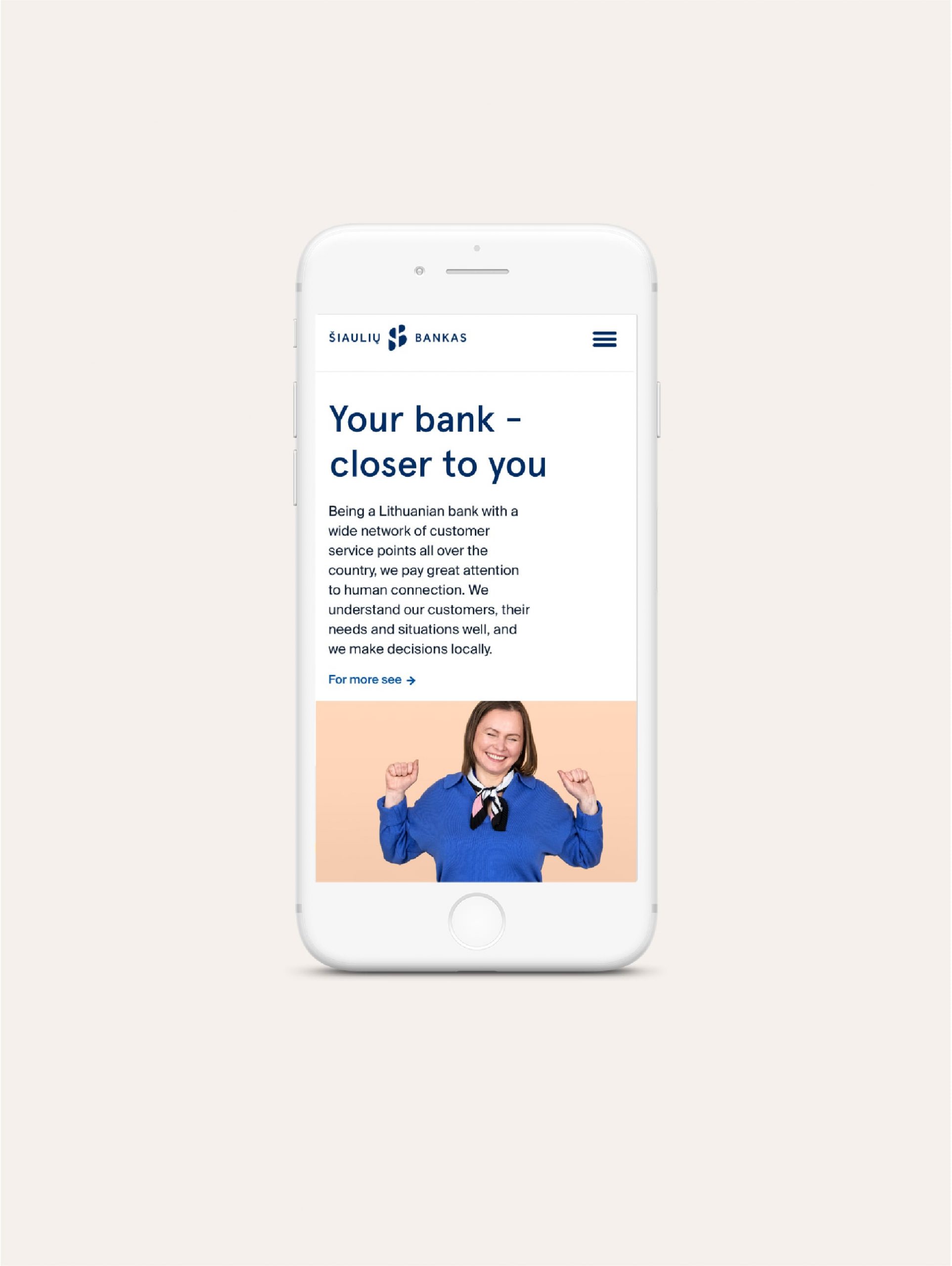
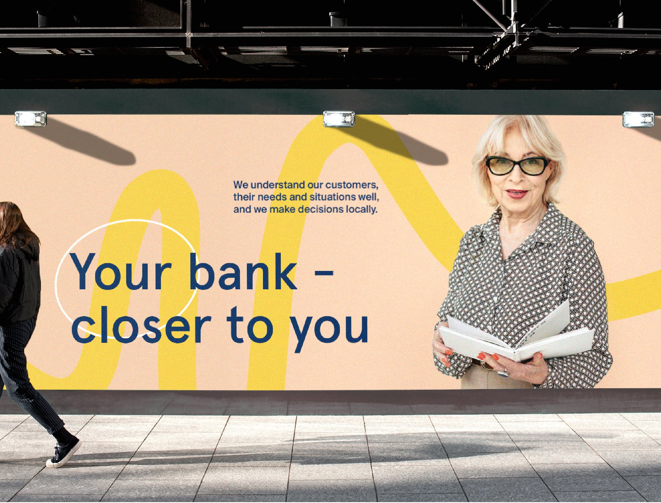
Taking the feeling of closeness further, we have chosen to feature real people instead of models in the visual campaign. Bank employees, clients, friends and family—people who are among us every day. By doing so we changed the image of Šiaulių bankas from the mundane bank next door bank to a memorable, go-to financial partner.


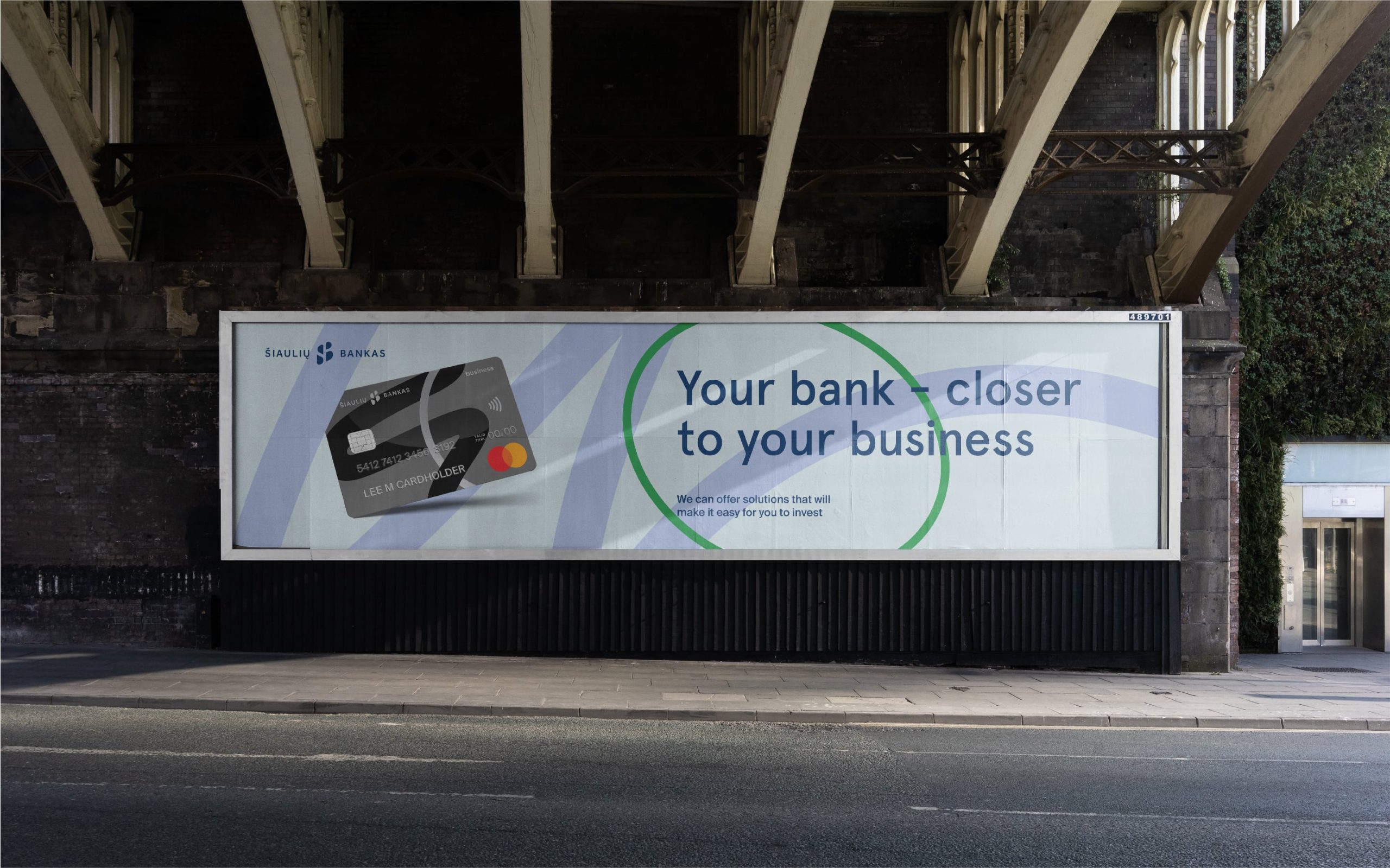
The design of the new bank cards features the same linear pattern in different colour combinations. Each card reveals different plans that Šiaulių bankas suggests – either for credit or debit card holders. For the latter, the branded line even becomes silver or gold, indicating a specific plan they have. This play of different colour and shape combinations speaks of the flexibility that Šiaulių bankas provides to all of its customers.
“The versatile line, colour palette and style of the pictures create a seamless and personal visual language that emphasizes professionalism combined with attentiveness to the client’s needs.”